


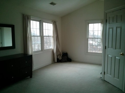
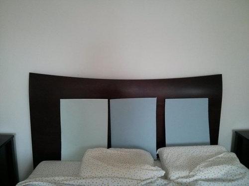
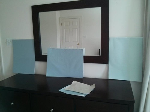
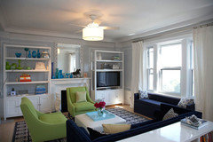
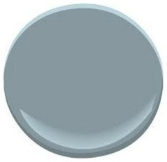
Blue... Blue... Blue... Help!
shhhh
10 years ago

Featured Answer
Sort by:Oldest
Comments (67)

judiegal6
10 years ago
nanny2a
10 years agoRelated Professionals
Tahoe City Interior Designers & Decorators · Greer Furniture & Accessories · Madison Furniture & Accessories · Peachtree City Furniture & Accessories · Carlsbad Furniture & Accessories · Hawthorne Furniture & Accessories · Hoffman Estates Furniture & Accessories · Southchase Custom Artists · Englewood Lighting · Kendall Lighting · Shorewood Lighting · East Setauket Window Treatments · Edmond Window Treatments · Ferndale Window Treatments · Inwood Window Treatments
tibbrix
10 years ago
Karenseb
10 years agonosoccermom
10 years ago
gsciencechick
10 years agostealthecrumbs
10 years agoKevinMP
10 years agoBaroo2u
10 years agokimberlyrkb
10 years agotibbrix
10 years agoshhhh
10 years agotibbrix
10 years agotibbrix
10 years agotibbrix
10 years agonosoccermom
10 years agogeogirl1
10 years agoFamCook
10 years ago
mtnrdredux_gw
10 years agoshhhh
10 years agotibbrix
10 years agoKevinMP
10 years agotibbrix
10 years agosjhockeyfan325
10 years ago
denali2007
10 years agoshhhh
10 years agosjhockeyfan325
10 years agomtnrdredux_gw
10 years agoshhhh
10 years agonosoccermom
10 years agotibbrix
10 years agoWendyB 5A/MA
10 years agosjhockeyfan325
10 years agosjhockeyfan325
10 years agoshhhh
10 years agoshhhh
10 years agotibbrix
10 years agotibbrix
10 years agotibbrix
10 years agoshhhh
10 years agotibbrix
10 years agotibbrix
10 years agotibbrix
10 years agonosoccermom
10 years agoshhhh
10 years agonosoccermom
10 years agomeghnjosh
10 years agotibbrix
10 years agotibbrix
10 years agotibbrix
10 years ago


Related Stories
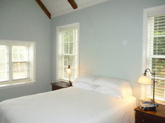
TURQUOISEHow to Pick the Right Blue Paint
Periwinkle, Turquoise, Midnight or Sky? Here's Help Choosing the Blue for You
Full Story
DECORATING GUIDESIn the Navy: What's New With This Dark Blue
Quietly powerful and always classic, navy blue can help rooms from casual contemporary to elegant traditional make a statement
Full Story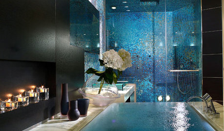
COLORColor Magic: Tap Into Psychology to Better Use Blue at Home
OK, it's backed more by science than magic. But see how expert research can help you create powerful, even bewitching, interior effects
Full Story
DECORATING GUIDESCool Color Palettes: Enviable Green and Blue Spaces
Freshen up tired interiors with dewy to inky hues that harmonize even as they help each other stand out
Full Story
KITCHEN DESIGNKitchen of the Week: Into the Blue in Melbourne
Vivid cabinet colors and a newly open layout help an Australian kitchen live up to its potential
Full Story
LIVING ROOMSDesign Dilemma: Share Ideas for a Navy Blue Room
Help a Houzz Reader Work With a Bold Choice for the Living Room Walls
Full Story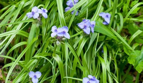
GARDENING GUIDESGreat Design Plant: Tradescantia Ohiensis Adds Shades of Blue
This reliable, adaptable U.S. native provides spider-like foliage and clusters of blue to purple flowers in Eastern gardens each spring
Full Story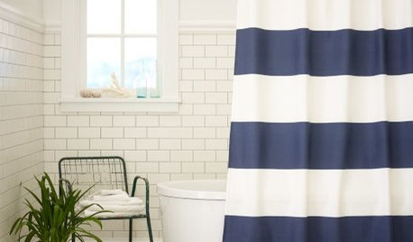
PRODUCT PICKSGuest Picks: Winter Blues
Keep the winter blues at bay with these cool, calming blue picks for every room in the house
Full Story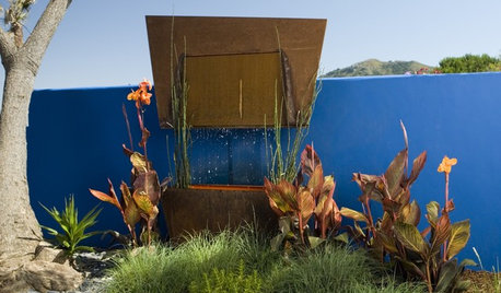
COLORRelax and Reflect in a Blue Landscape
Find sanctuary by introducing this well-loved hue outside
Full Story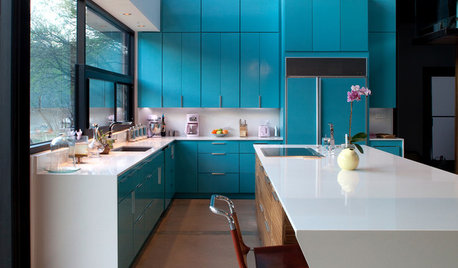
COLORFUL KITCHENSKitchen of the Week: Brilliant Blue Cabinets in a Modern Setting
Lacquered turquoise gives this Lake Austin kitchen a cheerful look without compromising the clean lines
Full Story


shhhhOriginal Author