


Help with paint for entry
15 years ago
Sort by:Oldest
Comments (39)
Related Stories

ENTRYWAYSHelp! What Color Should I Paint My Front Door?
We come to the rescue of three Houzzers, offering color palette options for the front door, trim and siding
Full Story
COLORPick-a-Paint Help: How to Create a Whole-House Color Palette
Don't be daunted. With these strategies, building a cohesive palette for your entire home is less difficult than it seems
Full Story

ARCHITECTUREHouse-Hunting Help: If You Could Pick Your Home Style ...
Love an open layout? Steer clear of Victorians. Hate stairs? Sidle up to a ranch. Whatever home you're looking for, this guide can help
Full Story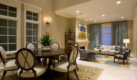
SELLING YOUR HOUSE5 Savvy Fixes to Help Your Home Sell
Get the maximum return on your spruce-up dollars by putting your money in the areas buyers care most about
Full Story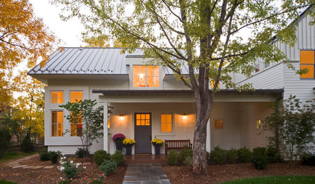
SELLING YOUR HOUSEHelp for Selling Your Home Faster — and Maybe for More
Prep your home properly before you put it on the market. Learn what tasks are worth the money and the best pros for the jobs
Full Story
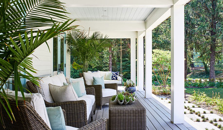
STANDARD MEASUREMENTSThe Right Dimensions for Your Porch
Depth, width, proportion and detailing all contribute to the comfort and functionality of this transitional space
Full Story
REMODELING GUIDESWisdom to Help Your Relationship Survive a Remodel
Spend less time patching up partnerships and more time spackling and sanding with this insight from a Houzz remodeling survey
Full Story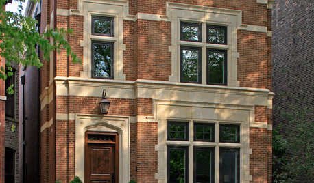
MATERIALSRaw Materials Revealed: Brick, Block and Stone Help Homes Last
Learn about durable masonry essentials for houses and landscapes, and why some weighty-looking pieces are lighter than they look
Full Story

eliza_824
ingrid_vc so. CA zone 9
Related Professionals
Bel Air North Interior Designers & Decorators · Dallas Furniture & Accessories · Fort Wayne Furniture & Accessories · Minneapolis Furniture & Accessories · Simpsonville Furniture & Accessories · Hawthorne Furniture & Accessories · Hilton Head Island Furniture & Accessories · Miami Beach Furniture & Accessories · Pinehurst Furniture & Accessories · Fort Washington Lighting · Antioch Window Treatments · Gadsden Window Treatments · New Baltimore Window Treatments · Seattle Window Treatments · La Jolla Window Treatmentsmarybeth1
iris16Original Author
iris16Original Author
ingrid_vc so. CA zone 9
iris16Original Author
amanda_t
persnicketydesign
iris16Original Author
Happyladi
persnicketydesign
iris16Original Author
clubcracker
iris16Original Author
suero
iris16Original Author
ingrid_vc so. CA zone 9
suero
iris16Original Author
iris16Original Author
suero
iris16Original Author
ingrid_vc so. CA zone 9
iris16Original Author
clubcracker
lilbit77
redbazel
User
suero
ingrid_vc so. CA zone 9
parma42
iris16Original Author
ingrid_vc so. CA zone 9
iris16Original Author
suero
redbazel
suero
iris16Original Author