Shop Products
Houzz Logo Print
hzdeleted_459360

Question for Paint Color Experts

User
10 years ago

We're having a difficult time with paint colors for the basement renovation. The two rooms (and bath) have little in common except continuous brick flooring which runs through the entire space. The front, smaller, room has 10 ft ceilings, a window and a French door. It opens up to a large space with an 8.5' ceiling which is approximately 28 feet wide and 16 feet deep, narrowing with a jog in both side walls to a nook that is about 12' x 12'. At the end of that nook will be a fireplace with a mantel and shallow shelves for DVDs. That is about 5 feet high, and above it is drywall up to 6" crown molding. The wall above the mantel will hold a 60" tv screen. The fireplace and shelves will be faced with 3" tongue and groove paneling. Both rooms have 8" baseboard.

First proposal was to paint everything---all molding and woodwork and walls a dark color. While I like this idea in principle, it is just TOO DARK. Alternatively, I like the idea of painting the fireplace woodwork a darker color than the walls but feel if I do that I would have to paint the baseboards and crown on that wall the darker color also, otherwise we would have one baseboard color, then a paneling color above that, a wall color, then the baseboard color again on the crown.....WAY too much for an eight and a half foot wall, IMO.

So, i am thinking i will find a light latte color with a yellow undertone for the walls and go slightly lighter with the molding and woodwork. I had some leftover paint SW Kestrel White, which we used in my office and I love, so I tried it in the back room. It has a light nutty color back there (completely different from how it looks in my office btw) and I really like it for the walls. However, in the front room it looks PEACH. Cannot have that.

Finally, the question. The RGB value of the Kestrel White is
R-224 G-214 B-201 I need a color slightly lighter than this but with the same color ratio. Knowing that the differences in these values drops 10 between R and G and 13 between G and B, can I just look for a paint that has those same differences and end up with a lighter version? For example, if I look for a paint that is R- 238 G-228 B-241 what will I find and how can I find a color that way?

And then when I have those colors in place I will have to find different colors that look very similar in the front room all over again.

Comments (17)

  • juliekcmo
    10 years ago
    last modified: 9 years ago

    Just curious if you primed under the Kestral White? If your sample went on drywall, its color may be altering what you see. (says the person who loves Kestral white and used in 5 rooms in our home.)

  • User
    Original Author
    10 years ago
    last modified: 9 years ago

    Thanks, Julie, the wall was primed and we had two coats on in both rooms. The color it presents in the back room is like a toasted cashew nut, it is a wonderful backdrop for the brick and furnishings that have been chosen. Even though I know from the RGB values that it has a red undertone, it looks like it has a yellow undertone back there. In front.... It looks peach, getting sun from the southwest---appropriately :-) In my office it looks like a cool tan, if such is possible, much lighter, but there I have two windows for north and one for west exposure. You know, when I am in a paint store and see someone pick up a paint chip and buy two gallons, I have to bite my tongue to stop myself from suggesting they TRY it in the room first!

  • PRO
    Lori A. Sawaya
    10 years ago
    last modified: 9 years ago

    Can not correlate RGB values to paint colors as outlined above.

    RGB applies exclusively to the additive (emitted light) color space. RGB are the three channels of colored light that mix together to create a bunch of different colors. Additive color is emitted light beamed to your eyeballs. i.e. A television, a computer monitor.

    Paint colors are the subtractive color space. Subtractive color is reflected light that bounces off an object and then to your eyeballs. i.e. A red ball, or paint color on a wall.

    There are mathematical formulas to toggle between color spaces. And you toggle for different, very specific reasons. Here's a link to chart of said formulas: http://www.brucelindbloom.com/index.html?Equations.html

    But the bottom line is RGB does not apply in any way whatsoever to paint colors because, again, you're talking additive vs. subtractive. Additive is emitted, subtractive is reflected. Essentially apples and oranges.

    Paint companies started providing RGB and HEX values in the last two or three years in order to help people communicate about their colors as accurately as possible utilizing a wide variety of devices like computers, tablets, and smartphones. Communicating *about* colors using a variety of devices is not the same as physically choosing, using, and applying paint colors to the 3 dimensional built environment.

    What you're reaching for is a formal color order system like Munsell or ACC, Acoat Color Codification System or NCS, Natural Color System. These systems provide a notation for each color.

    Do not confuse a value like RGB or HEX with a notation from a formal color order system.

    A majority of American paint color collections are based on the Munsell Color Order System but they DO NOT provide the notation. Examples are Sherwin Williams and Pratt and Lambert. Some DO provide the notation an example would be California Paints and Dunn Edwards and you can find the full Munsell notation in the fandeck index.

    ICI/Dulux also known as Glidden from the Home Depot utilizes the ACC system. Here again you can find the full ACC notation in the fandeck index.

    Did I mention do not confuse a value like RGB or HEX with a notation from a formal color order system?

    If you have a NOTATION you can indeed use it as describe above. The notation will guide you on factors of hue/chroma/value and very often LRV Light Reflectance Value too. In other words, guide you to more red or less red, for example. Color experts and artists know how to use these 100+ year-old color systems in exactly this way.

    In order to use these formal color order systems, you have to correctly understand the proper structure of color. Undertones are only relevant if the medium is spread at different rates. Many people have the whole undertone thing completely, totally and tragically WRONG.

    If the medium (like paint) is not spread at different rates, then undertone is simply a subjective figure of speech. Undertone is NOT a measurable, plottable nor fully-controllable aspect or attribute of color. That is the reason these 100+ year old color systems do not include undertones.

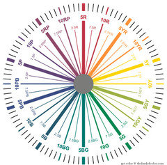
    When you are using color notations from a formal color order system and you are talking about more or less red, more or less yellow, more or less orange you are talking about OVERTONES - not undertones. Overtone speaks to degrees of hue bias. That's why the color systems each have their own custom color wheel. Or, if you've ever seen a random color wheel integrated with a clock or actual degrees it's about plotting OVERTONES.

    The Munsell wheel below demonstrates said degrees of overtones according to its system of human perceptually based color order.

    Hope the info helps.

  • User
    Original Author
    10 years ago
    last modified: 9 years ago

    Thanks, fun! I was hoping to go about finding "lighter" versions of colors i like in a more scientific way, since the cards you get that show five or six colors are obviously not lighter and darker shades of the same color. Anyway, not seeing your post before I set off for Sherwin Williams ( the only actual paint store in town) I did try to select colors based on the differences between the R and G and between the G and B values in one color as compared with another, rather than compare the values themselves. This derivative comparison was actually pretty interesting, and my notes turned up some interesting combinations of colors that I hope will be harmonious.

    Far from helping me winnow down possibilities, this little exercise ended with 18 quarts of paint in my trunk.

    I don't have any problem selecting good, safe combinations, but it is frustrating how different colors look from one room to the next. But the wall color is key, imo, and I has to be exactly right. I am going to take a closer look at the color wheel above and thank you VERY MUCH for this information!

  • PRO
    Lori A. Sawaya
    10 years ago
    last modified: 9 years ago

    I was hoping to go about finding "lighter" versions of colors i like in a more scientific way...

    Not sure what resource you're using to get RGB values, but if it also offers CIELAB you might want to play around with those numbers. CIELAB uses Cartesian coordinates to calculate a color in a color space and is more relevant to what you're wanting to do because it better correlates to how humans, not measurement devices, see color . L* defines lightness, a* denotes the red/green value and b* the yellow/blue value.

    You are correct that the majority of color strips are not the same color just darker to lighter versions of that one color - can't tell you how many people refuse to believe this and will argue this fact.

    It's because the colors on one strip will look very similar because they do indeed share several of the same color characteristics. But if you look at the color data, the results will show a range of differences - like different color families or a sporadic order of Light Reflectance Values. There are a few color collections that are literal let-downs of colors from darker to lighter. Ben Moore's Color Preview is one of those collections.

    Whenever you're working with color data points, you have to consider the quality of the source. What equipment and standards were used? As well as the accuracy, integrity, quality of the sample you have to work with. Is your sample old and faded, etc.?

    Finally, have to question how accurately - and consistently - all of this can translate to material or an actual can of paint.

    Consistency and repeatability is the essence of every, established and valid system for color. With subjectivity being nothing but calamitous.

  • User
    Original Author
    10 years ago
    last modified: 9 years ago

    When you pull the individual SW colors up on their site the RGB values are stated, as well as the hexadecimal value and the LRV. I am looking further into this, I know there are scientific reasons that some color combinations are so pleasing.....it can't be simply a matter of what people like, because they have no reason to like one shade of white over another.

  • deegw
    10 years ago
    last modified: 9 years ago

    I am enjoying this thread. I am also completely annoyed to learn that color strips are often not lightened versions of the darkest color. It explains the horrible time I had trying to coordinate our house color and porch floor color by playing with colors on the house color strip.

    Lisa - Good luck working with your 18 samples. I hope you didn't start a long waiting line in the paint store!

  • User
    Original Author
    10 years ago
    last modified: 9 years ago

    I was almost the only one in the store, Dee. (I'm not Lisa, btw, that is another poster :-) Shwewin Williams has nice tables and chairs, a lot of natural light, and a light box in which you can change the color of the light (indoor, outdoor, fluorescent, etc.). I was working with about 40 color chips, and the salesman lent me a pair of scissors and some white copier paper to spread out on the table....it's amazing how much the maple wood color of the table influenced the colors on the chips! I cut the pertinent colors off the strips, if they were on one, and laid them out by eye in color families. Then I used my iPad to bring up each color and looked at the RGB values. I did some obvious eliminating (too pink, too green, or too lavender) and then went from there with my pencil and notebook, comparing the numbers.

    I am trying to come up with a scheme for the darker back room for
    1. walls
    2. base and crown molding
    3. Fireplace paneling

    and THEN find a parallel scheme for the much lighter front room for

    1. Walls
    2. Base and crown molding
    3. Siding on the front interior wall

    that are different actual colors altogether but either LOOK the same as the back room or are a subtle but harmonious shift from them. If I don't come up with the perfect scheme for this, it won't be for lack of trying.

  • PRO
    Lori A. Sawaya
    10 years ago
    last modified: 9 years ago

    I know there are scientific reasons that some color combinations are so pleasing...

    Correct again. Doesn't matter what primary colors you choose to comprise a color wheel (Red/Yellow/Blue or Cyan/Magenta/Yellow) in every case, harmonious color relationships are mathematical based on varied distances around the wheel.

    For example complementary color schemes means the two colors are opposite at 180 degrees. Analogous colors are neighbors on the color wheel at an angle of 60 degrees. Triadic means all three colors are equidistant at 120 degrees --- and so on.

    And that applies to the whole color sphere moving in all the way towards chromatic grays, not just the outside rim of the color wheel.

    Again, when you start dissecting color at this level, you start to understand how color really works and why it's so important to have a correct understanding of the proper structure of color.

    This is also where the miscellaneous color systems and processes people conjure up start to fracture into the disparate inaccuracies that they are.

    For example, just one popular 'method' is to collect a bunch of color chips and take them all home and then perform a process of elimination. When you understand how and why color works they way it does, you realize how ridiculous those approaches are.

    But. When people don't have the proper knowledge, they're left to their own devices. And when people are left to their own devices, they'll fill in the blanks the best they can. They make stuff up so color makes sense to them. It's an effort to shift color from something that's confusing to somethings that is manageable. Understandable how and why that happens.

    What's unfortunate is when the unfounded, inaccurate made-up stuff gets traction and takes on a life of its own to the extent that the mass consciousness then start to perceive it as fact. So instead of just one person being confused about color, you have many that are misguided and misinformed.

    It can be argued that the internet has not been a positive force when it comes to color education. Rather, it's done a lot of damage by providing a platform for the misguided and misinformed to spread their wealth of misinformation.

  • User
    Original Author
    10 years ago
    last modified: 9 years ago

    "It can be argued that the internet has not been a positive force when it comes to color education. Rather, it's done a lot of damage by providing a platform for the misguided and misinformed to spread their wealth of misinformation."

    Amen! And "it" has also egregiously misled everybody on the planet by displaying colors through millions of screens that are ALL grossly inaccurate!

    There I go, demonizing the internet, lol. Let's call it the color monster ;-)

  • PRO
    Ashworth Design Studio
    8 years ago

    If you want a lighter version of a color you like, you can ask the paint store to add white in a greater proportion when mixing your order. I have successfully done this with trim and ceiling paint. Select your wall color, then for door and window trim have the store create a formula of that color in a 10% +/_ for the "white" trim.

    i disagree that taking color chip samples home to review is "ridiculous". It is the best way to narrow down what works in your space with your daylight and artificial lighting conditions. From that point you can choose two or three samples to have made up in quarts, then paint out large sample areas directly on your wall or on large foam core boards.

    I've developed a keen color eye over many years as an interior designer and feel for peole I see at the paint stores trying to figure it all out. There are times when I can't help myself from offering unsolicited advice, and I've only ever found people to be greatful for assistance. Of course I can't choose a color for them because we aren't in their home, but I can give suggestions for what to consider in their process.

    Color-work is an art and no one should feel incapable if they don't get it right the first time or two. I read an explanation once that always comes to mind; that artists don't mix a color on their palette, apply it and never touch it again. There is give and take as adjacent colors play off each other, more shading or highlight is needed, etc..

  • PRO
    Lori A. Sawaya
    8 years ago

    Here's exactly what I said:

    "For example, just one popular 'method' is to collect a bunch of color chips and take them all home and then perform a process of elimination."

    I did not say that taking color chip samples home to review is "ridiculous".

    Ashworth Landscape and Design Studio, if you're going to reference something I posted on the forum, I'd appreciate it if you'd state it correctly.

    Again, what I take issue with is the idea of going to the paint store and grabbing a crap-load of paint chips willy-nilly with zero strategy, and taking home said crap-load of paint chips and trying to choose color via a process of elimination.

    I think it's a stupid thing to tell people. Because...

    There is zero guarantee that you will grab the RIGHT paint chip within that crap-load of paint chips you're taking home because you grabbed the chips with zero planning or strategy.

    As far as adding white, that's bad advice as well. Depending on the color, it can take a crap-load of white paint to even make somewhat of a dent in the chromaticity (colorfulness).

    It is not an exaggeration to say that you could start out trying to cut a color with white and before you know it, you end up with 3 gallons of paint that doesn't look much different from the original color. And when it's over you've wasted a crap-load of paint and time.

    Keyword for this post, btw, seems to be crap-load. :)

  • PRO
    Lori A. Sawaya
    8 years ago
    last modified: 8 years ago

    Oh not offended at all. For better or worse, I'm just blunt and direct when I write. As a result, some people love to read my posts and, well... some don't. I like to think I'm an acquired taste. :)

    Long time ago our profiles were anonymous and many here on the forum assumed I was a man. The shock when someone figured out I was not a man was kinda funny.

  • Ariel Ford
    6 years ago

    I know this is an old thread, but I have been down this RGB rabbit hole for the last 3 days trying to do obscure calculations in order to find a white between other whites that's not too yellow and not too brown - not to bright and and not too muted. When I read kswl2 's words I laughed outloud and my husband loudly rolled his eyes. I relate to this and the 18 quarts of sample paint! I'd love to know how this finally turned out.

  • amanda j
    6 years ago

    Ditto what Ariel said - but I found this thread after 3 hours, not three days. Fortunately. Thanks.

  • HU-844022192
    3 years ago

    I am painting my house Sherman Williams Shiitake with SW Dark Night on the front door. I am struggling with the trim color and have only a few selections on my HOA list. I am down to SW Dover White vs

    SW Kestrel White. I lean toward muted colors and my Florida house has a north face. What is your opinion?