


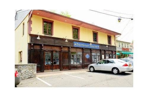
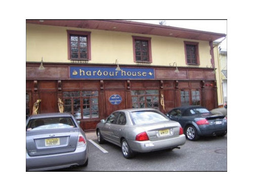
Photoshop help for Restaurant Exterior
positano
10 years ago


Sort by:Oldest
Comments (32)
Related Stories

EXTERIORSHelp! What Color Should I Paint My House Exterior?
Real homeowners get real help in choosing paint palettes. Bonus: 3 tips for everyone on picking exterior colors
Full Story
COLORPick-a-Paint Help: 11 Ways to Mine Your World for Colors
Color, color everywhere. Discover the paint palettes that are there for the taking in nature, shops and anywhere else you roam
Full Story
UNIVERSAL DESIGNMy Houzz: Universal Design Helps an 8-Year-Old Feel at Home
An innovative sensory room, wide doors and hallways, and other thoughtful design moves make this Canadian home work for the whole family
Full Story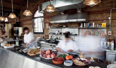
KITCHEN DESIGN16 Practical Ideas to Borrow From Professional Kitchens
Restaurant kitchens are designed to function efficiently and safely. Why not adopt some of their tricks in your own home?
Full Story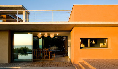
COLORExterior Color of the Week: 5 Ways to Make Orange Work for You
Whether you opt for a little or a lot, bold orange will bring drama to your home
Full Story
EXTERIORSInvigorate Your Home's Exterior With Color
For curb appeal and a knockout first impression, consider paint in shades from subtle to bright for the exterior of your home
Full Story
HOUZZ TOURSHouzz Tour: Farmhouse Style With an Unusual Inspiration
Comfort and sophistication are no surprise inside this Colorado home, but the exterior has an unexpected backstory
Full Story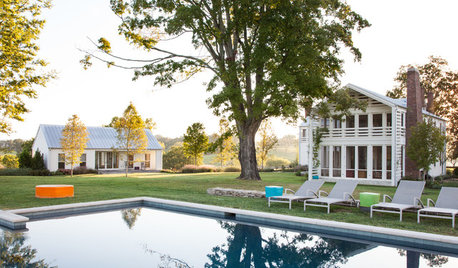
HOUZZ TOURSWe Can Dream: An Expansive Tennessee Farmhouse on 750 Acres
Wood painstakingly reclaimed from old barns helps an 1800s farmhouse retain its history
Full Story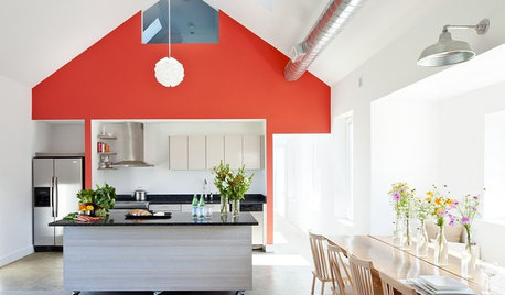
MODERN ARCHITECTUREBuilding on a Budget? Think ‘Unfitted’
Prefab buildings and commercial fittings help cut the cost of housing and give you a space that’s more flexible
Full Story
MOST POPULAR5 Ways to Hide That Big Air Conditioner in Your Yard
Don’t sweat that boxy A/C unit. Here’s how to place it out of sight and out of mind
Full StoryMore Discussions


joaniepoanie
tibbrix
positanoOriginal Author
BeverlyFLADeziner
TxMarti
tibbrix
tibbrix
teacats
Annie Deighnaugh
jterrilynn
joaniepoanie
positanoOriginal Author
positanoOriginal Author
yayagal
jterrilynn
Elraes Miller
awm03
joaniepoanie
awm03
jterrilynn
positanoOriginal Author
awm03
suero
jterrilynn
shanghaimom
suero
lazydaisynot
oldbat2be
positanoOriginal Author
oldbat2be
Annie Deighnaugh
Arapaho-Rd