


Craftsman/Arts and Crafts exterior columns: pics?
walkin_yesindeed
16 years ago
Sort by:Oldest
Comments (11)
Related Stories
REMODELING GUIDESRenovation Detail: The Tapered Craftsman Column
Squared, simple and perfectly proportioned, tapered columns add Craftsman-style beauty to porches, porticoes and interiors
Full Story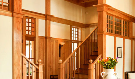
DECORATING GUIDESSo Your Style Is: Arts and Crafts
With a dual focus on nature and craftsmanship, Arts and Crafts home interiors have a wholesome, organic appeal
Full Story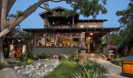
CRAFTSMAN DESIGNHouzz Tour: Radiant Restoration of a 1910 Arts and Crafts Bungalow
A single-story bungalow in San Diego gets a second floor and so much more
Full Story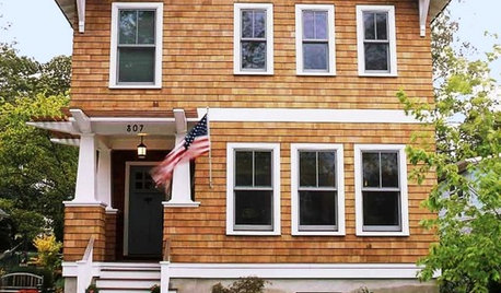
HOUZZ TOURSHouzz Tour: A Modern Take on Arts and Crafts
A love of surfing, proximity to the coast, and major life changes inspire a relaxing and thoughtful design
Full Story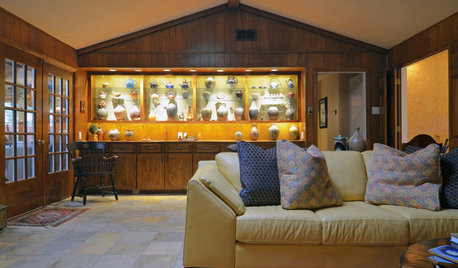
HOUZZ TOURSMy Houzz: Ranch House Gets a Craftsman Upgrade
Inspired by the Arts and Crafts movement, a Dallas couple reimagines their traditional ranch house
Full Story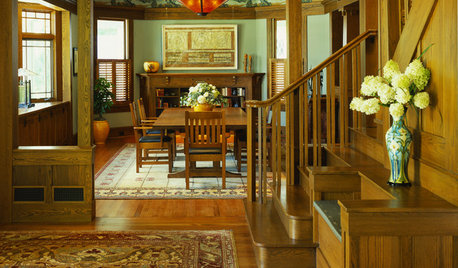
CRAFTSMAN DESIGNHow Arts and Crafts Style Beautifies Today's Interiors
Based on beauty and purity, this movement from more than a century ago is still influencing design elements in home interiors
Full Story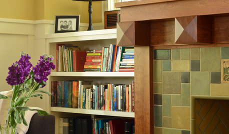
CRAFTSMAN DESIGN9 Beautiful Craftsman Touches
Embrace an Arts and Crafts design element or two to give your home natural appeal without a full-on overhaul
Full Story
ROOTS OF STYLEArt Deco, Art Nouveau, Arts and Crafts: What’s the Difference?
If the zigzag and swirly designs of the past leave your head spinning, these descriptions will straighten you right out
Full Story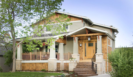
CRAFTSMAN DESIGNAmerican Architecture: The Elements of Craftsman Style
Proud of its handiwork details and with nature as inspiration, Craftsman architecture stands out for its purity of style
Full Story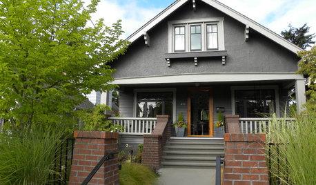
ARCHITECTURERoots of Style: See What Defines a Craftsman Home
Charming features and intimate proportions have made Craftsman houses an American favorite. See their common details and variations
Full Story

kgwlisa
patti_bee
Related Professionals
Ashwaubenon Interior Designers & Decorators · East Hanover Interior Designers & Decorators · La Habra Interior Designers & Decorators · Linton Hall Interior Designers & Decorators · Tahoe City Interior Designers & Decorators · North Myrtle Beach Furniture & Accessories · Peachtree City Furniture & Accessories · Fair Lawn Furniture & Accessories · Fort Carson Furniture & Accessories · Fountain Furniture & Accessories · Mundelein Furniture & Accessories · Egypt Lake-Leto Lighting · La Jolla Lighting · Boston Window Treatments · Gadsden Window Treatmentswalkin_yesindeedOriginal Author
littledog
johnmari
magnaverde
walkin_yesindeedOriginal Author
magnaverde
wodka
wodka
magnaverde