


Please lend me your eye for colour so I can finalize kitchen
ontariomom
10 years ago


Sort by:Oldest
Comments (28)
Related Stories

DECORATING GUIDESNo Neutral Ground? Why the Color Camps Are So Opinionated
Can't we all just get along when it comes to color versus neutrals?
Full Story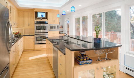
UNIVERSAL DESIGNHow to Light a Kitchen for Older Eyes and Better Beauty
Include the right kinds of light in your kitchen's universal design plan to make it more workable and visually pleasing for all
Full Story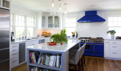
KITCHEN DESIGNSo Over Stainless in the Kitchen? 14 Reasons to Give In to Color
Colorful kitchen appliances are popular again, and now you've got more choices than ever. Which would you choose?
Full Story
PRODUCT PICKSGuest Picks: Eye-Pleasing Candles and Candleholders
Darkness is falling earlier at night, thanks to daylight saving time's end. Stave off the gloom with comforting, flattering candlelight
Full Story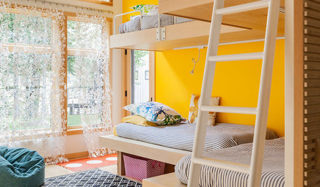
COLORDreaming in Color: 8 Eye-Opening Yellow Bedrooms
Start your day energized and cheerful with bedroom hues that sing of sunshine or golden fields
Full Story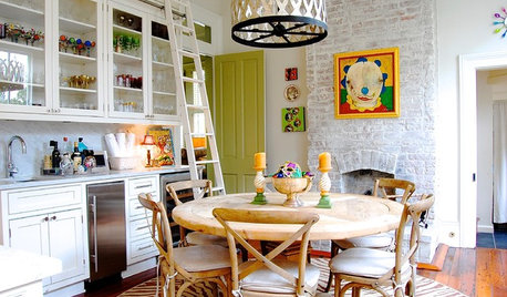
HOUZZ TOURSMy Houzz: Eye Candy Colors Fill an 1800s New Orleans Victorian
Take your fill of teal and pink patent leather, shots of chartreuse and vibrant artwork spanning the rainbow
Full Story
COLOR PALETTESRecessive Color: 8 Eye-Catching Niches, Nooks and Crannies
Create a focal point with a small chunk of a big hue
Full Story
12 Eye-Candy Appliances That Enchant With Color
Move over, stainless. These rainbow-colored confections are bringing a delicious, unexpected note to kitchens and laundry rooms
Full Story
KITCHEN DESIGNWake Up Your Kitchen With Eye-Catching Color
Stencils, stripes and saturated hues can energize your kitchen without the effort of a full overhaul
Full Story
KITCHEN DESIGNEye-Catching Colors for Your Kitchen Floor
Revitalize a tired wooden floor with a paint or stain in an unexpected color
Full Story


maggiepie11
ontariomomOriginal Author
Related Professionals
Gloucester City Interior Designers & Decorators · Mount Laurel Interior Designers & Decorators · Rosaryville Interior Designers & Decorators · Atlanta Furniture & Accessories · Des Moines Furniture & Accessories · St. Louis Furniture & Accessories · Surprise Furniture & Accessories · Fillmore Furniture & Accessories · Glenview Furniture & Accessories · Hoboken Furniture & Accessories · Stamford Furniture & Accessories · Jacinto City Furniture & Accessories · Gainesville Custom Artists · Centreville Lighting · Chicago Window TreatmentsontariomomOriginal Author
ontariomomOriginal Author
three3apples
yayagal
ontariomomOriginal Author
lascatx
ontariomomOriginal Author
susanlynn2012
ontariomomOriginal Author
lascatx
ontariomomOriginal Author
mtnrdredux_gw
lascatx
ontariomomOriginal Author
ontariomomOriginal Author
ontariomomOriginal Author
detroit_burb
Faux68
Faux68
Faux68
ontariomomOriginal Author
susanlynn2012
lascatx
Faux68
ontariomomOriginal Author
Faux68