Hi everyone,
Love this forum. Been lurking for years. :)
Hope you don't mind me stepping in to ask for your help.
My DH and I are finally nearing the finish line on what has become a 4 year home building adventure. We have done all the work ourselves. Now that it's about time to start picking out "fun" things, I think my brain is fried, lol. Just can't seem to make any decisions.
It's almost time for paint. I've been flipping through my BM fan deck for weeks (we will be using Natura throughout the house, maybe some Aura).
My style is very primitive country with some whimsy if that makes any sense.
Most of the rooms will be different colors.....mostly soft-ish blues and ????
All trim will be white and the kitchen cabs will most likely be white. All ceilings will be white. I'd prefer all three of these things be painted the same white and I'm leaning toward BM White Dove. I haven't yet compared the shade to my factory painted Andersen windows that are done in white.
Basically I want a bright white for those areas, but not blinding white. Soft-ish and on the verge of creamy....without looking yellow in any way. Maybe I'm wrong about the White Dove, so please feel free to give your input.
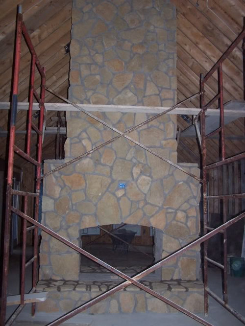
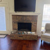
That shade of white will also need to go with the white paint for the very large living and dining room areas that are separated by my monstrous, stone fireplace. I really want to keep that giant space bright......and prefer painting it a shade of white for several reasons. The first is because my DH prefers white......and every other room in the home will not be white. He put an enormous amount of time into building this area of our home and it only seems fair. Another reason is because of it's simplicity. And also because it seems like white would really make the fireplace "pop" (like it needs any help, LOL). The fireplace is the centerpiece and main focal point of our home.
So anyhoo, the white I'd like to use for the walls (cathedral ceiling will be same white as walls in this room) should go with the strange orange tones, tans, and grey of the fireplace. And with the possible choice of the White Dove trim.
Again, I don't want a yellow-y white. I am not a fan of most creams because I have a fear of them looking dirty or smoked in, but I'm willing to compromise and would love to hear your opinions on what you think would work best in this large space.
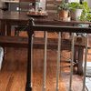
To summarize, lol, I'm looking for a white shade of paint for room w/ cathedral ceiling that will go with our fireplace, and with whatever white shade is chosen for trim. See pics below........
This pic was taken before we washed the stone, so the color is a tad off because it's dusty....
And this one is pretty accurate color wise, but hard to see because the lighting wasn't great and we have it all saran wrapped to keep it clean, lol........
The stone came from our property. They are beautifully glittery up close. I'm not the #1 fan of the oranges in the stone, but it's common in our area from the iron (that's what a well driller told me). Using local materials was important.......and they were free!
I'd love to see any pics or ideas/inspiration you can share. That would really help. TIA.
Also, has anyone ever seen distressed trim? I am considering giving all the trim a very slight distressing treatment......possibly a quick wash of a darker paint with the white over top....then a little roughing up of the edges so the dark shade shows through. I'm not set on this idea yet.....but it's one of the many circling my brain. Just curious if anyone has ever seen this done and what you thought of the results?
I'm so sorry about the length of this post, my rambling, and if I have confused you in anyway. :)
I have a toddler in his terrible twos ruling the roost around here so it's taken me all day to get this post up in my spare seconds.
Thank you so much for any opinions you can share!


wi-sailorgirl
dawnp
Related Professionals
Charleston Interior Designers & Decorators · Fort Smith Interior Designers & Decorators · Dallas Furniture & Accessories · Evanston Furniture & Accessories · Madison Furniture & Accessories · Midland Furniture & Accessories · North Bergen Furniture & Accessories · Northbrook Furniture & Accessories · Potomac Furniture & Accessories · Palmetto Bay Furniture & Accessories · Hastings Custom Artists · Bellevue Lighting · Decatur Lighting · Wells Branch Lighting · Inwood Window TreatmentsValerie Noronha
mamabirrdOriginal Author
Oakley