


Can you help me with display of these plates on my wall please?
natureperson
10 years ago

Sort by:Oldest
Comments (27)
Related Stories

MOST POPULAR9 Real Ways You Can Help After a House Fire
Suggestions from someone who lost her home to fire — and experienced the staggering generosity of community
Full Story
LIFEThe Polite House: Do I Have to Display Decor Given to Me as a Gift?
Etiquette columnist Lizzie Post tackles the challenge of accepting and displaying home decor gifts from frequent visitors
Full Story
HOUSEPLANTSMother-in-Law's Tongue: Surprisingly Easy to Please
This low-maintenance, high-impact houseplant fits in with any design and can clear the air, too
Full Story
STUDIOS AND WORKSHOPSYour Space Can Help You Get Down to Work. Here's How
Feed your creativity and reduce distractions with the right work surfaces, the right chair, and a good balance of sights and sounds
Full Story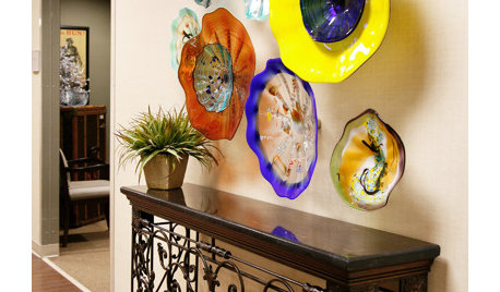
ARTWall Candy: Dish Up Colorful Glass Art Plates
These gorgeous handblown plates may look good enough to eat, but they're better off admired on the walls
Full Story
HOME OFFICESQuiet, Please! How to Cut Noise Pollution at Home
Leaf blowers, trucks or noisy neighbors driving you berserk? These sound-reduction strategies can help you hush things up
Full Story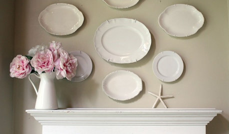
DECORATING GUIDESDIY: The Secret to Hanging a Plate Collection
Save your walls! Here's how to get your art grouping right
Full Story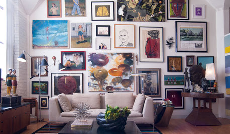
DECORATING GUIDES10 Look-at-Me Ways to Show Off Your Collectibles
Give your prized objects center stage with a dramatic whole-wall display or a creative shelf arrangement
Full Story
More Discussions


bluestarrgallery
Olychick
Related Professionals
Little Egg Harbor Twp Interior Designers & Decorators · Long Beach Furniture & Accessories · Toledo Furniture & Accessories · Crofton Furniture & Accessories · Culver City Furniture & Accessories · Glenview Furniture & Accessories · Tamalpais-Homestead Valley Furniture & Accessories · Bethlehem Custom Artists · Paradise Custom Artists · Saratoga Custom Artists · Oklahoma City Window Treatments · Orange County Window Treatments · Salt Lake City Window Treatments · St. Louis Window Treatments · Sun Lakes Window Treatmentshoovb zone 9 sunset 23
naturepersonOriginal Author
naturepersonOriginal Author
naturepersonOriginal Author
alex9179
nursetammi
naturepersonOriginal Author
Olychick
naturepersonOriginal Author
naturepersonOriginal Author
naturepersonOriginal Author
pattyxlynn
naturepersonOriginal Author
bbstx
Holly- Kay
Faux68
Olychick
lauraintexas
naturepersonOriginal Author
Arapaho-Rd
naturepersonOriginal Author
naturepersonOriginal Author
busybee3
chispa
geokid