


Paint too matchy matchy with rug? pics
Pipdog
13 years ago


Sort by:Oldest
Comments (25)
Related Stories
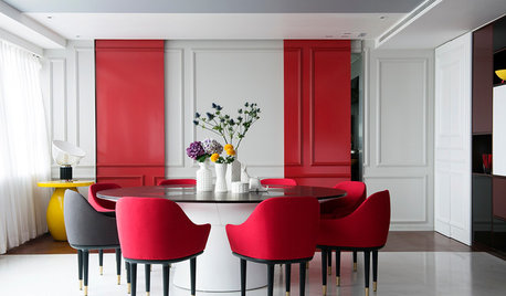
DECORATING GUIDESHaving a Design Moment: The Dining Room
Consider these 14 tweaks to bust your dining room's look out of a matchy-matchy furniture-set slump
Full Story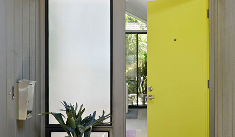
CURB APPEAL10 Ways to Dress Up the Stoop
Create entryway appeal even in a pint-size area by decorating with plants, paint, rugs and more
Full Story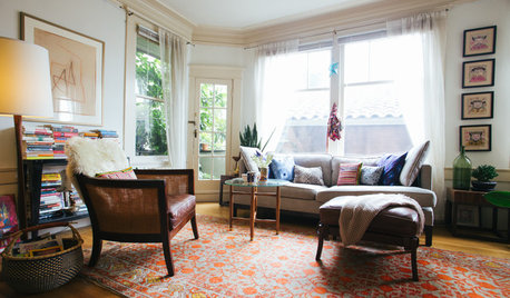
HOUZZ TOURSMy Houzz: It All Started With a Rug
One floor covering from Kazakhstan inspires a whole global vibe in a traveler’s San Francisco apartment
Full Story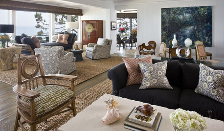
DECORATING GUIDESHow to Combine Area Rugs in an Open Floor Plan
Carpets can artfully define spaces and distinguish functions in a wide-open room — if you know how to avoid the dreaded clash
Full Story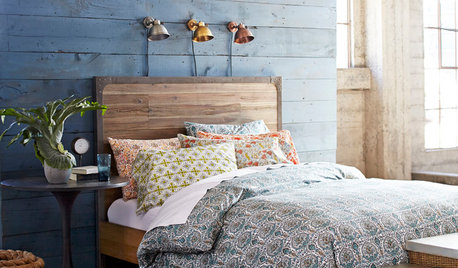
BEDROOMSHouzz Quiz: What Color Should You Paint Your Bedroom Walls?
Cool and soothing, or warm and spicy? Answer these questions and learn what hue is right for you
Full Story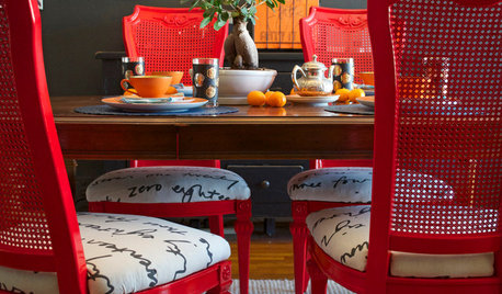
DIY PROJECTSDining Set Makeover: Paint and Tea-Tinted Fabric Make Old Chairs New
Reclaim dated dining chairs for far less than buying new, using spray paint, modern fabric and a handful of tea bags
Full Story
TRIMWhat Color Should You Paint Your Trim?
Learn the benefits of painting your trim white, black, neutral, a bold color and more
Full Story
CURB APPEAL5 Bright Palettes for Front Doors
Splash bold green, blue, orange or red on your front door, then balance it with a more restrained hue on the rest of the house
Full Story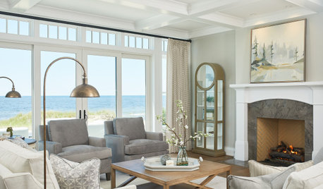
COLORHow to Choose a Paint Color
Designers offer tips for examining your closet, memories and daily life to find the right paint colors for your home
Full Story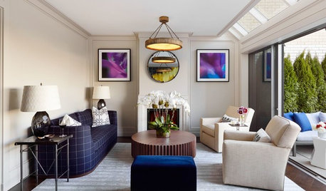
DECORATING GUIDESDecorating 101: How to Start a Decorating Project
Before you grab that first paint chip, figure out your needs, your decorating style and what to get rid of
Full Story

Olychick
jab65
Related Professionals
Garden City Interior Designers & Decorators · Linton Hall Interior Designers & Decorators · Chambersburg Furniture & Accessories · Easton Furniture & Accessories · Mesa Furniture & Accessories · St. Louis Furniture & Accessories · Wilmington Furniture & Accessories · Park Ridge Furniture & Accessories · Sahuarita Furniture & Accessories · Wellesley Furniture & Accessories · Riverton Furniture & Accessories · Jacinto City Furniture & Accessories · Mill Valley Custom Artists · Berkley Window Treatments · Riverside Window Treatmentsteacats
User
User
nutmegxo
sashasmommy
Oakley
catkin
Jeane Gallo
PipdogOriginal Author
ummm
marthaelena
loribee
Kathleen McGuire
htnspz
gwbr54
prill
bh401
PipdogOriginal Author
Bumblebeez SC Zone 7
ummm
prill
PipdogOriginal Author
prill