


Best Powder Room Colors
Vertise
11 years ago
Sort by:Oldest
Comments (18)
Related Stories
BATHROOM DESIGN7 Striking Paint Colors for Your Powder Room
Whether you opt for a little or a lot, see why the petite bathroom is the perfect place for a fun hue
Full Story
COLOR12 Fresh Palettes for Color Lovers
These unexpected color pairings create compelling displays in everything from powder rooms to great rooms
Full Story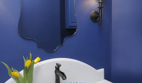
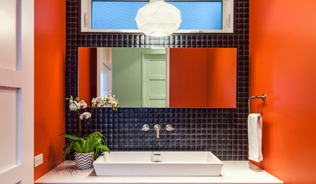
BATHROOM DESIGN8 Bold Paint Colors for Your Powder Room
Turn your powder room into a exclamation point with a bold shot of red, raspberry, hyacinth, rich brown or stormy blue
Full Story
DECORATING GUIDESPalatable Palettes: 9 Bold Bathroom Color Schemes
Give your bathroom or powder room a bright new look with beautiful colors that energize the space and please the eye
Full Story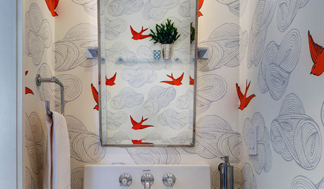
MOST POPULAR102 Eye-Popping Powder Rooms
Flip through our collection of beautiful powder rooms on Houzz and fill your eyes with color and style
Full Story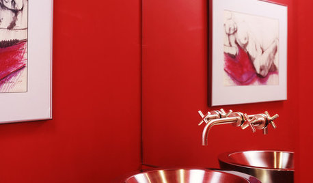
BATHROOM DESIGNSensible Style for Your Holiday Powder Room
Seasonal color and pretty, practical touches create a fun and functional powder room for the holidays
Full Story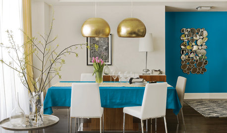
COLORBest Uses for the Boho Blue Color of 2015
PPG Pittsburgh Paints’ Color of the Year is a bold bohemian blue best used in small doses
Full Story
DECORATING GUIDESColor Guide: How to Use Light Blue
Whether you call it powder, sky or baby blue, this ultratraditional color lends fresh-faced appeal
Full Story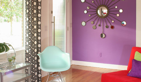
COLORBest Ways to Use Radiant Orchid, Pantone's Color of 2014
Learn how to work in this bold fuchsia-pink-purple successfully around the home, and give it a yay or nay in the Houzz poll
Full Story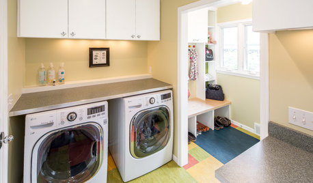
MOST POPULARA Colorful Place to Whiten Whites and Brighten Brights
This modern Minnesota laundry-mudroom gets a smarter layout and a more lively design
Full StoryMore Discussions

patricianat
crl_
Related Professionals
Bloomingdale Interior Designers & Decorators · Clinton Township Interior Designers & Decorators · East Hanover Interior Designers & Decorators · Fernway Interior Designers & Decorators · Linton Hall Interior Designers & Decorators · Kearny Furniture & Accessories · San Diego Furniture & Accessories · St. Louis Furniture & Accessories · Newton Furniture & Accessories · Northbrook Furniture & Accessories · Peachtree City Custom Artists · Summerville Custom Artists · Florida City Lighting · Warwick Lighting · Rolling Meadows Window TreatmentsVertiseOriginal Author
LuAnn_in_PA
Annie Deighnaugh
VertiseOriginal Author
palimpsest
VertiseOriginal Author
patty_cakes
muse-decor.com
Sueb20
kitchendetective
yayagal
Oakley
lynxe
Janice742
sis3
booboo60