


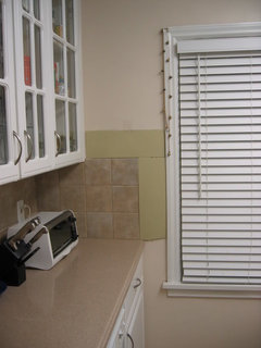
Need help choosing a new color for my kitchen (pics)
madtown_2006_gw
15 years ago

Featured Answer
Sort by:Oldest
Comments (51)

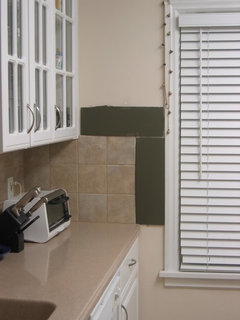
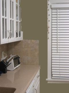
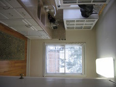
madtown_2006_gw
15 years agomadtown_2006_gw
15 years agoRelated Professionals
Lake Elsinore Interior Designers & Decorators · Beaufort Furniture & Accessories · Dallas Furniture & Accessories · Roseville Furniture & Accessories · Toledo Furniture & Accessories · Culver City Furniture & Accessories · Greenwood Village Furniture & Accessories · Naples Furniture & Accessories · Norwalk Furniture & Accessories · Bellwood Custom Artists · Englewood Lighting · Greenville Lighting · Whittier Lighting · Feasterville Trevose Window Treatments · San Rafael Window Treatments
msrose
15 years ago
CaroleOH
15 years agofunkyart
15 years agorosesstink
15 years agodanihoney
15 years agoKaren_sl
15 years agoles917
15 years ago
Circus Peanut
15 years agoCircus Peanut
15 years agomsrose
15 years agotrk65
15 years agojejvtr
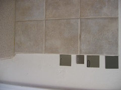
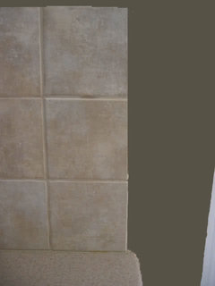
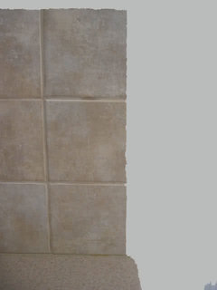
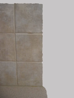
15 years agomadtown_2006_gw
15 years agomadtown_2006_gw
15 years agomadtown_2006_gw
15 years agomadtown_2006_gw
15 years agoles917
15 years agoCircus Peanut
15 years agobettycbowen
15 years agoronbre
15 years agomadtown_2006_gw
15 years ago
susanlynn2012
15 years agomarybeth1
15 years agobonniee818
15 years agomsrose
15 years agoniecieb
15 years agomahatmacat1
15 years agoronbre
15 years agomadtown_2006_gw
15 years agoflowerpwr45
15 years agoparma42
15 years agotfm1134
15 years agogigib_08
15 years agomadtown_2006_gw
15 years agohaley_comet
15 years agobuddyrose
15 years agolevelyn42
15 years agomsrose
15 years ago
Lyban zone 4
15 years agoCircus Peanut
15 years agonewdawn1895
15 years agopbrisjar
15 years agomadtown_2006_gw
15 years agoboxiebabe
15 years agolorriekay
15 years agotimber.j
15 years agomariap
14 years ago


Related Stories
DECLUTTERINGDownsizing Help: Choosing What Furniture to Leave Behind
What to take, what to buy, how to make your favorite furniture fit ... get some answers from a homeowner who scaled way down
Full Story
KITCHEN DESIGN3 Steps to Choosing Kitchen Finishes Wisely
Lost your way in the field of options for countertop and cabinet finishes? This advice will put your kitchen renovation back on track
Full Story
KITCHEN CABINETSYour Guide to Choosing Kitchen Cabinets
Updating your kitchen? See designers' top choices for kitchen cabinet styles, hardware choices, colors, finishes and more
Full Story
KITCHEN DESIGNKitchen Countertops 101: Choosing a Surface Material
Explore the pros and cons of 11 kitchen countertop materials. The options may surprise you
Full Story
MATERIALSKitchen Ideas: How to Choose the Perfect Backsplash
Backsplashes not only protect your walls, they also add color, pattern and texture. Find out which material is right for you
Full Story
KITCHEN CABINETSCabinets 101: How to Choose Construction, Materials and Style
Do you want custom, semicustom or stock cabinets? Frameless or framed construction? We review the options
Full Story
KITCHEN BACKSPLASHESHow to Choose a Backsplash for Your Granite Counters
If you’ve fallen for a gorgeous slab, pair it with a backsplash material that will show it at its best
Full Story
MOST POPULARHow to Choose the Right Kitchen Sink
Learn about basin configurations, sink shapes, materials and even accessories and specialty sinks
Full Story
KITCHEN CABINETSChoosing New Cabinets? Here’s What to Know Before You Shop
Get the scoop on kitchen and bathroom cabinet materials and construction methods to understand your options
Full Story
DECORATING GUIDESHow to Choose an Awesome Area Rug No Matter What Your Space
High use, a low door, kids and pets running amok — whatever your area endures, this insight will help you find the right rug for it
Full Story


Oakley