


Lets look at 5 show homes
lacombe
15 years ago
Related Stories
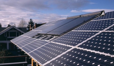
GREEN BUILDINGLet’s Clear Up Some Confusion About Solar Panels
Different panel types do different things. If you want solar energy for your home, get the basics here first
Full Story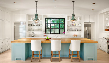
MOST POPULARHouzz TV: Let’s Go Island Hopping
Sit back and enjoy a little design daydreaming: 89 kitchen islands, with at least one for every style
Full Story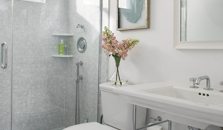
HOUZZ CALLHouzz Call: Show Us Your 8-by-5-Foot Bathroom Remodel
Got a standard-size bathroom you recently fixed up? We want to see it!
Full Story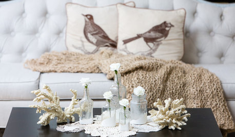
DECORATING GUIDESBudget Decorator: Let’s Go Thrifting
Dip into the treasure trove of secondhand pieces for decor that shows your resourcefulness as much as your personality
Full Story
HEALTHY HOMEDecorate With Intention: Let Your House Help You De-Stress
Break free of automatic TV time and learn how to really unwind and recharge with these easy ideas that don't cost a dime
Full Story
ARCHITECTUREHouzz Tour: Easy, Breezy Home Lets the Light Shine In
Despite its narrow site, a serene new family home is flooded with natural light, thanks to a glass-lined internal courtyard
Full Story
HOUZZ TOURSMy Houzz: Quality Shows in a Contemporary Dutch Home
Materials as hard wearing as they are lovely now fill this once-commercial space in the Netherlands
Full Story
Houzz Call: Show Us Your Paint Makeovers
Let your newly repainted house or room do the "How d'ya like me now?" strut right here — it might just be featured in an upcoming ideabook
Full Story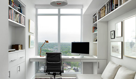
THE HARDWORKING HOMEHouzz Call: Show Us Your Hardworking Home Office
We’re looking to showcase workspaces that are well organized, tech savvy and comfortable. Share your pictures!
Full Story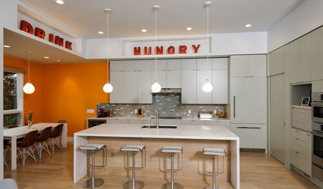
HOUZZ CALLShow Us the Best Kitchen in the Land
The Hardworking Home: We want to see why the kitchen is the heart of the home
Full StoryMore Discussions


msrose
ingrid_vc so. CA zone 9
Related Professionals
Dallas Furniture & Accessories · Huntersville Furniture & Accessories · Kearny Furniture & Accessories · Reno Furniture & Accessories · San Diego Furniture & Accessories · Sioux Falls Furniture & Accessories · Union City Furniture & Accessories · Washington Furniture & Accessories · Wichita Furniture & Accessories · Woodbury Furniture & Accessories · La Mirada Furniture & Accessories · Miami Beach Furniture & Accessories · La Vista Window Treatments · Patchogue Window Treatments · Placerville Window Treatmentsdaisyadair
Oakley
laxsupermom
tracey_b
black-thumb
brutuses
chloe203
parma42
parma42
amysrq
lacombeOriginal Author
tracieb
brutuses
daisyadair
jakabedy
susanlynn2012
les917
learn_as_i_go
susieq07
lindybarts
kswl2
eagle100
lacombeOriginal Author
igloochic
sandsonik
jojoco
Window Accents by Vanessa Downs
graycern
littledog
robin_DC