


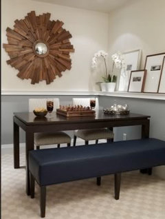
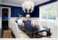
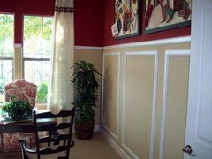
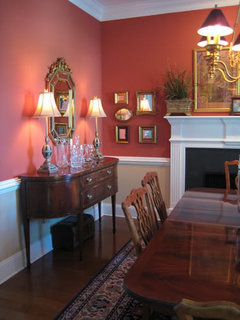
Chair rail in dining room - darker color on top or bottom?
jamaraz
14 years ago
Featured Answer
Sort by:Oldest
Comments (21)

denali2007
14 years agolast modified: 9 years ago
cyn427 (z. 7, N. VA)
14 years agolast modified: 9 years agoRelated Professionals
Garden Acres Interior Designers & Decorators · Fayetteville Furniture & Accessories · Fort Wayne Furniture & Accessories · Franklin Furniture & Accessories · Lebanon Furniture & Accessories · Madison Furniture & Accessories · Owasso Furniture & Accessories · Alpharetta Furniture & Accessories · Atlantic Beach Furniture & Accessories · Peachtree City Custom Artists · University Lighting · York Lighting · Arden-Arcade Window Treatments · Aurora Window Treatments · La Vista Window Treatments
vampiressrn
14 years agolast modified: 9 years agoUser
14 years agolast modified: 9 years agoboxerpups
14 years agolast modified: 9 years agoball_of_fun
14 years agolast modified: 9 years ago
Kathleen McGuire
14 years agolast modified: 9 years agowi-sailorgirl
14 years agolast modified: 9 years agomzdee
14 years agolast modified: 9 years ago
My3dogs ME zone 5A
14 years agolast modified: 9 years agompmg46
14 years agolast modified: 9 years agosweeby
14 years agolast modified: 9 years agomagnaverde
14 years agolast modified: 9 years agojamaraz
14 years agolast modified: 9 years agoloribee
14 years agolast modified: 9 years ago
graywings123
14 years agolast modified: 9 years agodawnp
14 years agolast modified: 9 years agoRhonda Love
3 years ago
azma othman
2 years agomzdee
2 years ago


Related Stories
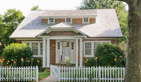
DECORATING STYLESOutfit a Cottage-Style Remodel, Top to Bottom
If you're renovating with a cottage look in mind, these fixtures, finishes and accessories will bring on the charm
Full Story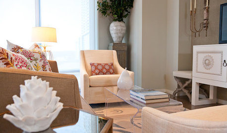
DECORATING GUIDESRoom of the Day: Designer Outfits a Condo Top to Bottom in 5 Weeks
Soft touches warm this modern Texas living space, and bold colors brighten the neutral palette
Full Story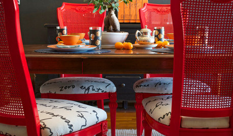
VINTAGE STYLEBet Your Bottom Dollar on Cane Chairs for Stylish Seating
Cane and Chippendale-style chairs are so easy to customize, you can make one work in a dining space or home office of any style
Full StoryDIY PROJECTSDining Set Makeover: Paint and Tea-Tinted Fabric Make Old Chairs New
Reclaim dated dining chairs for far less than buying new, using spray paint, modern fabric and a handful of tea bags
Full Story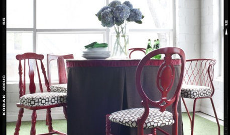
DECORATING GUIDESDIY Project: Sit Pretty with Mismatched Chairs
Create a one-of-a-kind dining set from a collection of cast-offs
Full Story
DECORATING GUIDESTop 10 Interior Stylist Secrets Revealed
Give your home's interiors magazine-ready polish with these tips to finesse the finishing design touches
Full Story
HOUZZ TOURSMy Houzz: A Grand Overhaul for a Growing Family
A suburban home's top-to-bottom remodel creates plenty of room for entertaining and for little ones
Full Story
DINING ROOMSHow to Seat Your Dinner Guests in Comfort
Instead of reaching for pillows and footstools when you dine, settle in with dining tables and chairs that fit the room and body
Full Story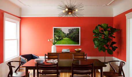
ROOM OF THE DAYRoom of the Day: Bright Red Dining Room Glows in Fog City
Mist can put a damper on the mood in San Francisco, but this lively room fires up the energy
Full Story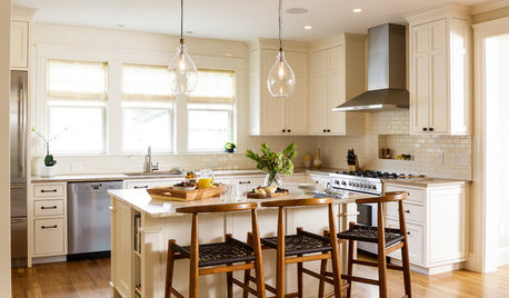
KITCHEN OF THE WEEKKitchen of the Week: A Better Design for Modern Living in Rhode Island
On the bottom level of a 2-story addition, a warm and open kitchen shares space with a breakfast room, family room and home office
Full Story


magnaverde