


A Collected Layered Home
User
11 years ago


Sort by:Oldest
Comments (25)
Related Stories
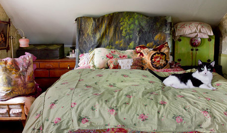
REMODELING GUIDESMy Houzz: Layers of Patina and an Artist’s Touch in a New York Colonial
Antiques and loads of found treasures mix with collections and art in a very personal home and studio
Full Story
HOUZZ TOURSMy Houzz: Travel, Art and Creative Layering Mix in Vancouver
Personality reigns in this eclectic Canadian waterfront home, thanks to the owners' artistic approach
Full Story
HOUZZ TOURSMy Houzz: Peeling Back Layers in a 1908 Home
Hidden fireplaces, buried hardwood and covered beadboard resurface thanks to a Mississippi couple's DIY efforts
Full Story
DECORATING GUIDESHouzz Tour: Layered Look Adds a Fresh Sense of Style
Midcentury art, pottery and a mix of furnishings bring a hip edge to a traditional Los Angeles home
Full Story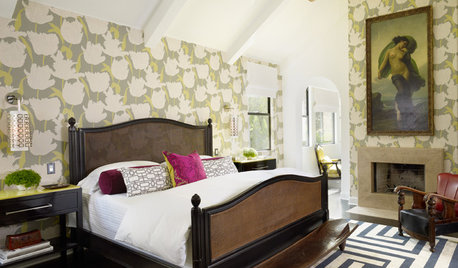
DECORATING GUIDES15 Rooms Bursting With Bravely Layered Patterns
With patterns mixed to bold effect, these rooms show that to the fearless sometimes go the style spoils
Full Story
PLANTING IDEASDesigning With Conifers: Layers of Texture for Your Garden
Sharp and prickly or fine like ferns, richly textured conifers bring unexpected interest to the landscape
Full Story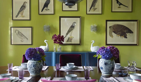
ACCESSORIESCollective Wisdom: Display Ideas for Collections of All Kinds
Show your interests without exposing clutter by going for artful arrangements with a unified feel
Full Story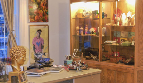
HOUZZ TOURSMy Houzz: Vancouver Artist's Curious, Collected Home
Family memorabilia and intriguing collections tell a lively story in a Canadian artist's one-bedroom home
Full Story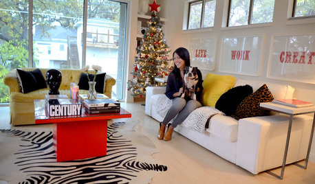
COLORMy Houzz: Colorfully Collected in Austin
Designer Esther LaVonne fills her home with bold color and one-of-a-kind accents
Full Story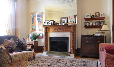
HOUZZ TOURSMy Houzz: Collective Panache for an 1890s Home
Meaningful collages mix with globally gathered mementos in a mom and son’s engaging Montreal house
Full Story
Janice742
Bumblebeez SC Zone 7
Related Professionals
Aspen Hill Interior Designers & Decorators · Belle Glade Interior Designers & Decorators · Little Egg Harbor Twp Interior Designers & Decorators · Bridgeport Furniture & Accessories · Midland Furniture & Accessories · Redmond Furniture & Accessories · Scottsdale Furniture & Accessories · Holliston Furniture & Accessories · Palmetto Bay Furniture & Accessories · Clive Furniture & Accessories · Green Bay Lighting · Miami Lighting · Shorewood Lighting · Rochester Hills Window Treatments · Taylor Window TreatmentsFun2BHere
grlwprls
pps7
flymom65
DLM2000-GW
palimpsest
Boopadaboo
Annie Deighnaugh
patty_cakes
madtown_2006_gw
Boopadaboo
Diane Smith at Walter E. Smithe Furniture
UserOriginal Author
peegee
patricianat
deegw
kitchendetective
texanjana
bronwynsmom
crl_
melsouth
rosie
justsaying