


Neutral paint color
aunteemom
13 years ago
Sort by:Oldest
Comments (23)
Related Stories
COLORHow to Give Neutral Paint Colors a Subtle Jolt
Don’t compete with your neutral hues — complement them!
Full Story
COLORMore Top Paint Picks for 2014: New Greens, Blues and Neutrals
Valspar’s new colors aim to lift spirits and express creativity. Here’s how to use 9 of them in lively ways
Full Story
COLORBest Ways to Use the Neutral Green Color of 2015
Benjamin Moore’s Color of the Year is soft and natural
Full Story
NEUTRAL COLORSDare to Choose a More Colorful Neutral
Understanding Shades of Hue Helps You Go Beyond Gray, White and Beige
Full Story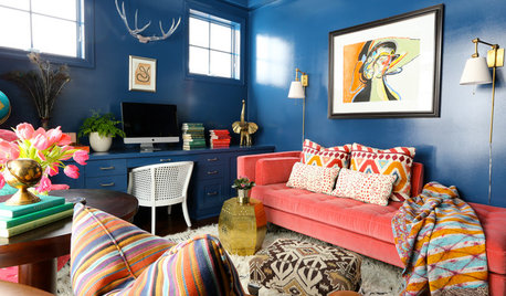
DECORATING GUIDESMove Over, Neutral Sofa — Here Comes Color
Sometimes it makes sense to ignore the conventional wisdom about furniture and make a bold, colorful statement
Full Story
HOUZZ TOURSMy Houzz: Neutral and Natural Elegance in Texas
Creamy hues, plush furnishings and vintage touches create a serene setting for a stylist and her family
Full Story
NEUTRAL COLORSHow to Do Neutrals With Attitude
Add a little edge to a neutral palette with pattern, texture, contrast — and a dash of color
Full Story
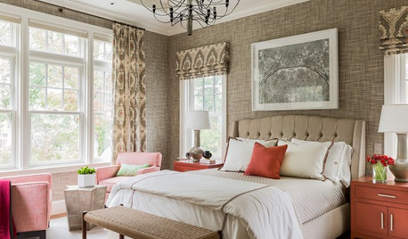
NEUTRAL COLORS8 Great Color Palettes: Surprising Bedroom Neutrals
Peaceful plum, relaxing black and many shades of gray show an unpredictably neutral nature in the bedroom
Full Story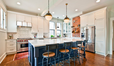
KITCHEN DESIGNKitchen Combo to Try: Neutral Cabinets, Different-Colored Island
Avoid a too-sterile look and establish a focal point with a contrasting island hue
Full Story


dawnp
yayagal
Related Professionals
Garden City Interior Designers & Decorators · Rosaryville Interior Designers & Decorators · Austin Furniture & Accessories · Dallas Furniture & Accessories · Fort Wayne Furniture & Accessories · Memphis Furniture & Accessories · Miami Furniture & Accessories · Midland Furniture & Accessories · Tulsa Furniture & Accessories · Pleasant Grove Furniture & Accessories · Tucker Furniture & Accessories · Wakefield Furniture & Accessories · Rockledge Window Treatments · Rockville Window Treatments · Grosse Ile Window Treatmentsjenes
Lori A. Sawaya
jessicaml
dianalo
jessicaml
sue36
natal
B H
ttodd
catkin
chocolatebunny
Sueb20
Saypoint zone 6 CT
mpwdmom
loribee
sis2two
lolauren
crazyone
User
loribee
lolauren