


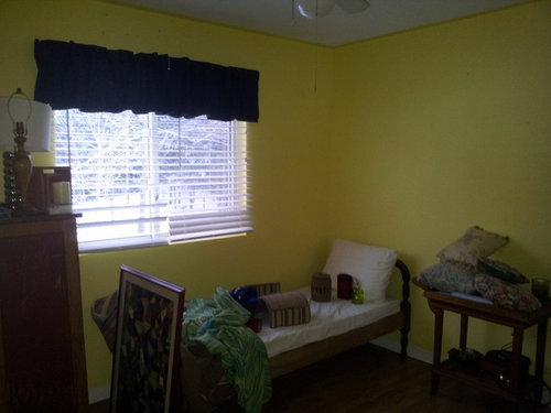
I've Got The Yell-ows!
Baroo2u
10 years ago
Featured Answer
Sort by:Oldest
Comments (18)

lazy_gardens
10 years ago
Annie Deighnaugh
10 years agoRelated Professionals
Clinton Township Interior Designers & Decorators · Indianapolis Furniture & Accessories · Paramus Furniture & Accessories · Silver Spring Furniture & Accessories · Simpsonville Furniture & Accessories · Spartanburg Furniture & Accessories · Detroit Furniture & Accessories · Hoffman Estates Furniture & Accessories · Rancho Santa Margarita Furniture & Accessories · Van Nuys Furniture & Accessories · Jacinto City Furniture & Accessories · Central Falls Custom Artists · Danville Custom Artists · Phoenix Window Treatments · Rolling Meadows Window Treatments
ineffablespace
10 years agohostanista
10 years agohostanista
10 years agoBaroo2u
10 years agoBaroo2u
10 years agoBaroo2u
10 years agobbstx
10 years agoBaroo2u
10 years ago
outsideplaying_gw
10 years agolascatx
10 years agoBaroo2u
10 years agolascatx
10 years agobbstx
10 years agoBaroo2u
10 years agobbstx
10 years ago


Related Stories
DECORATING GUIDESThe Dumbest Decorating Decisions I’ve Ever Made
Caution: Do not try these at home
Full Story
DIY PROJECTS12 Signs You've Caught the DIY Bug
Been making inventive things from scratch? Repurposing salvaged pieces creatively? It may be more serious than you think
Full Story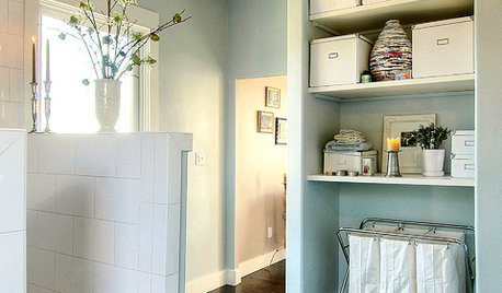
LAUNDRY ROOMSMake a Clean Break With Laundry Chaos
Bins and bags, sorters and other storage — we've got several loads' worth of ways to keep your laundry neat
Full Story
KITCHEN DESIGNThe 4 Things Home Buyers Really Want in Kitchen Cabinetry
For the biggest return on your kitchen investment, you've got to know these key ingredients for cabinetry with wide appeal
Full Story
BEDROOMSHow to Choose the Perfect Bed Pillow — and Sleep Better
Wake up saying 'Ahhhh' instead of 'Ow' with a pillow that provides all the support and comfort you need
Full Story
LIFEThe Polite House: How Can I Tell a Construction Crew to Pipe Down?
If workers around your home are doing things that bother you, there’s a diplomatic way to approach them
Full Story
LIFEThe Polite House: How Can I Kindly Get Party Guests to Use Coasters?
Here’s how to handle the age-old entertaining conundrum to protect your furniture — and friendships
Full Story
LIFEHouzz Call: Show Us Your Nutty Home Fixes
If you've masterminded a solution — silly or ingenious — to a home issue, we want to know
Full Story
LIFETell Us: Do You Know How to Live With Your Parents?
If you've tried multigenerational living under one roof, we'd love to hear the details
Full Story


lascatx