


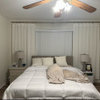
All about Wythe Blue / the properties of color
jockewing
14 years ago
Sort by:Oldest
Comments (12)
Related Stories
GREEN BUILDINGWhat's LEED All About, Anyway?
If you're looking for a sustainable, energy-efficient home, look into LEED certification. Learn about the program and its rating system here
Full Story
GARDENING GUIDESNew Ways to Think About All That Mulch in the Garden
Before you go making a mountain out of a mulch hill, learn the facts about what your plants and soil really want
Full Story
FUN HOUZZHouzz Call: Tell Us About Your Dream House
Let your home fantasy loose — the sky's the limit, and we want to hear all about it
Full Story
WORKING WITH PROSWhat to Know About Concept Design to Get the Landscape You Want
Learn how landscape architects approach the first phase of design — and how to offer feedback for a better result
Full Story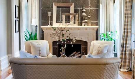
FUN HOUZZGuessing Game: What Might Our Living Rooms Say About Us?
Take a shot on your own or go straight to just-for-fun speculations about whose homes these could be
Full Story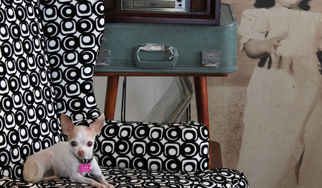
PETSWhat Chihuahuas Can Teach Us About Interior Design
Who knew these tiny dogs could be such a huge fount of design tips? Houzzers did
Full Story
WORKING WITH PROS10 Things Decorators Want You to Know About What They Do
They do more than pick pretty colors. Here's what decorators can do for you — and how you can help them
Full Story
GARDENING GUIDESTree Care: Common Tree Diseases and What to Do About Them
Learn to recognize trees that may be affected by diseases or pests so you can quickly take action
Full Story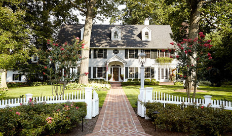
DECORATING GUIDESHouzz Tour: Much to Like About This Traditional Beauty
New elements mix well with old in a New Jersey family’s elegant and comfortable colonial revival home
Full Story
PETSSo You're Thinking About Getting a Dog
Prepare yourself for the realities of training, cost and the impact that lovable pooch might have on your house
Full Story


ttodd
jockewingOriginal Author
Related Professionals
Struthers Interior Designers & Decorators · Boston Furniture & Accessories · Charleston Furniture & Accessories · Des Moines Furniture & Accessories · Frisco Furniture & Accessories · San Francisco Furniture & Accessories · Fort Carson Furniture & Accessories · Irmo Furniture & Accessories · Ives Estates Furniture & Accessories · North Hollywood Furniture & Accessories · Wellesley Furniture & Accessories · Decatur Custom Artists · Ocean Springs Custom Artists · Diamond Bar Lighting · San Jose Window TreatmentsLori A. Sawaya
yayagal
wellspring
jockewingOriginal Author
Lori A. Sawaya
jockewingOriginal Author
Lori A. Sawaya
wellspring
jockewingOriginal Author
gsciencechick