


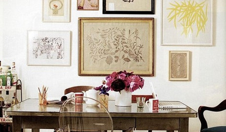
Eclectic or Jumbled
mtnrdredux_gw
10 years ago
Sort by:Oldest
Comments (124)
Related Stories
DECORATING GUIDESSo Your Style Is: Eclectic
This playful, personal home design style shakes up conventions and bridges the gap between other looks. Here's how to master the mix
Full Story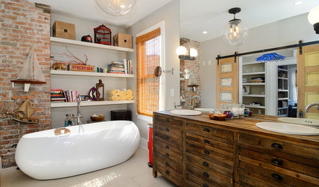
BATHROOM WORKBOOKBathroom Workbook: 6 Elements of Eclectic Style
Express your unique self by mixing styles, eras and more, for a bathroom that’s full of personality
Full Story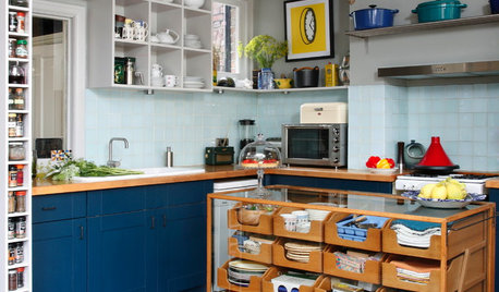
DECORATING GUIDESHow to Bring Order to Your Delightfully Eclectic Room
You've picked up your furniture and finds over the years — here's how to tie it all together
Full Story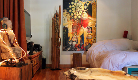
HOUZZ TOURSMy Houzz: Urban Goes Exotic in a Montreal Artist's Home
Found treasures from around the world mix with reinvented furnishings and natural artifacts in this amazingly creative space
Full Story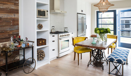
KITCHEN DESIGNKitchen of the Week: One Man's Vintage-Modern Mash-Up
Eclectic style meets Scandinavian modern in a Los Angeles bungalow kitchen designed for entertaining
Full Story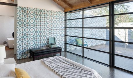
DECORATING GUIDESA Dozen Ways to Work In Patterned Tile
Use colorful and eclectic tile motifs to add interest to flooring, walls and fireplaces
Full Story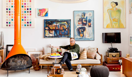
SMALL HOMESMy Houzz: Walls of Art and Glass in a Brooklyn Loft
Eclectic collections, vintage furniture and favorite artworks personalize this 1,000-square-foot open-plan loft
Full Story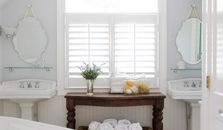
BEFORE AND AFTERS8 Bathroom Updates Have Ideas for Every Style
All white, classic vintage and brightly eclectic are just some of the new looks sported by the transformed bathrooms you'll find here
Full Story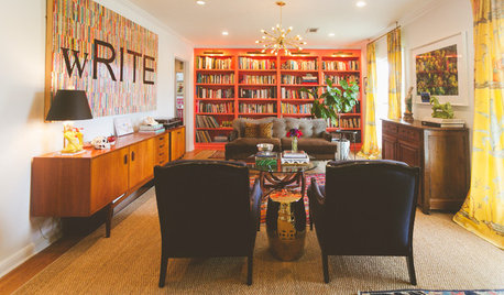
HOUZZ TOURSMy Houzz: Austin Family Breathes New Life Into an Old Bungalow
Homeowners brighten up their 1948 fixer-upper with new floors, marble countertops and so much more
Full Story
DECORATING GUIDES10 Fresh-Brewed Ideas to Steal From Your Local Café
Bring elements of your favorite coffee shop into your home and make it a place you’ll want to relax in for hours
Full StorySponsored
Franklin County's Preferred Architectural Firm | Best of Houzz Winner
More Discussions


lizzie_grow
eandhl
Related Professionals
Barstow Interior Designers & Decorators · Nashville Interior Designers & Decorators · North Myrtle Beach Furniture & Accessories · Racine Furniture & Accessories · Glenvar Heights Furniture & Accessories · Hawthorne Furniture & Accessories · Lake Arrowhead Furniture & Accessories · Murray Furniture & Accessories · Arcadia Lighting · Florida City Lighting · Palm Springs Lighting · Wells Branch Lighting · Colorado Springs Window Treatments · Riverside Window Treatments · Taylor Window Treatmentsoutsideplaying_gw
funkyart
patricianat
golddust
mlweaving_Marji
Debbie Downer
mtnrdredux_gwOriginal Author
massagerocks
mtnrdredux_gwOriginal Author
geokid
cooperbailey
User
Holly- Kay
mtnrdredux_gwOriginal Author
nutsaboutplants
luckygal
geokid
User
golddust
mtnrdredux_gwOriginal Author
nutsaboutplants
mtnrdredux_gwOriginal Author
Debbie Downer
mtnrdredux_gwOriginal Author
Jules
User
geokid
suero
mtnrdredux_gwOriginal Author
geokid
mtnrdredux_gwOriginal Author
Jules
sweet_tea_
mtnrdredux_gwOriginal Author
patty_cakes
peony4
patricianat
mtnrdredux_gwOriginal Author
bpath
nosoccermom
mtnrdredux_gwOriginal Author
kitchentime
dutty
mtnrdredux_gwOriginal Author
this_old_1969_ranch
User
mtnrdredux_gwOriginal Author
User