


Checkerboard floor for a vintage kitchen?
I'm still waffling over what kind of flooring to put in my vintage/cottage style kitchen. Everything else is finished--I just ordered a new DW to replaced the one that broke down during the second load of dishes being done in the newly remodeled kitchen. :[
The current flooring is sheet vinyl--still in good shape after 17+ years, but discontinued by the mfr. I need to fill in where a wall was taken down, and where a base cabinet was removed, and I'd like to use the same flooring for both the kitchen, and an adjacent room. Or, maybe two adjacent rooms--the dining area, and a play room/family dining room in a new addition.
I can't add height in the kitchen, so the flooring needs to be vinyl sheet, or vinyl tile. Tile would be easier to DIY, less expensive, and add to the vintage look. If I don't use the vinyl flooring in the dining area and/or playroom, I'll use hardwood in those rooms. Marmoleum or linoleum is out of my budget.
I love the look of checkerboard, but would three rooms of such a bold pattern be too much? It seems that most rooms with checkerboard floors have very simple color schemes, and my kitchen has some color going on with painted cabinets and vintage ceramics.
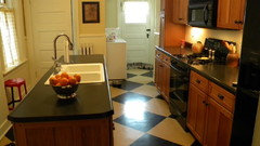
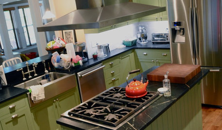
This is the kitchen with current flooring:
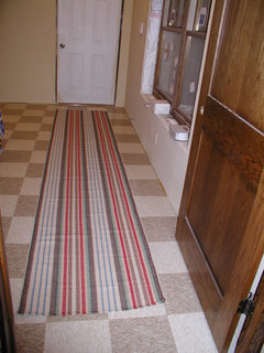
The dining area (in process of completing). The freestanding cabinets are being relocated:
The playroom/extended family dining area, from the kitchen:
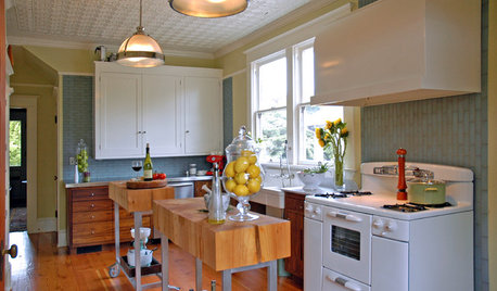
A couple of 'busy' kitchen inspiration pics:
{{gwi:1578482}}
Colors of vinyl composite tile (VCT) I'm considering:
{{gwi:1578484}}
Some very primitive mock-ups that I did in 'paint' program:
The 'wood look' isn't in the running, because I'm replacing the hardwood floor in the LR, and the two materials would meet in a doorway.

After I did the above mock-ups, I realized the squares aren't in proportion to the floor plan. This one is more proportionate:
And, finally, just for fun :)
I'm leaning toward the charcoal/fortress white combo, or maybe the little green apple/fortress white, although pumpkin or cantaloupe would definitely be an attention grabber. Anyone still reading, and have an opinion? Thanks!
Here is a link that might be useful: Checkerboard floor inspiration pics
Comments (49)

sis2two
12 years agolast modified: 9 years agoI like the little green apple and the antique white combination. Personally I think the multicolored tiles in your last photo is just too much and detracts from the rest of your kitchen. I love everything you have done in there. It is so my style!
westiegirl
12 years agolast modified: 9 years agoMy husband and I just laid VCT in our new construction laundry room. The house/room isn't yet complete, but this is the best picture I have of it.
I use a lot of quilts and other color in my decorating, so I wanted something subdued, but still vintage looking. We ended up picking two colors of beige tiles that Menards (in the midwest) had in stock by Armstrong. The tiles were less than $1 per square foot and were very easy to lay down. I troweled the adhesive on with a fine tooth trowel and my husband made any necessary cuts with a sharp utility knife.The manufacturer recommends waxing the tiles afterwards, which we did. Three coats went on very easy, just like mopping a floor.
My only caution for you if you decide to use VCT is to make sure your subfloor is perfectly clean and free of any bumps, divets or imperfections. Over time, the tiles will show these.
I love your kitchen and anything you choose will look great! You obviously have a great eye for picking out things that work well together.
Related Professionals
Cusseta Interior Designers & Decorators · Wareham Interior Designers & Decorators · Atlanta Furniture & Accessories · Miami Furniture & Accessories · Wilmington Furniture & Accessories · Wilmington Furniture & Accessories · Fountainebleau Furniture & Accessories · Pleasant Grove Furniture & Accessories · San Diego Furniture & Accessories · Urbandale Furniture & Accessories · South Bend Lighting · Aurora Window Treatments · Berkley Window Treatments · Mesa Window Treatments · Woodridge Window Treatmentsflwrs_n_co
12 years agolast modified: 9 years agoI think the black and white combination set on point like your first inspiration pic would look charming. However, I do think it might be too much in all 3 rooms. Wood floor would be nicer in the dining room. As for the play room, it would depend on how the flooring bumps up to other rooms as to whether wood or tile would be better.
I know setting the tile on point (rather than parallel with the cabs) is probably harder to do, but I think the effect would be worth the extra effort. I'm so happy for you that you're on the tail-end of your reno. You've done a remarkable job!!
HomeMaker
12 years agoI have hardwood throughout my 90 year old house, but the kitchen was a terrible 70's patterned sheet vinyl.
I used composite tile on the diagonal.
This is an old photo taken just as we were finishing the kitchen about 8 years ago. Pardon the mess.

bmorepanic
12 years agolast modified: 9 years agoI'm not a black and white fan, so keep that in mind.
Antique white and cantaloupe - I'd try holding the color values in the tiles a little bit less than the values you've selected for the cabinets and not too far from each other - little bit more neutral but still complimentary to your stuff.
Fortress white and multicolor is a lighter valued floor - another giant step towards a neutral.
Completely agree with flwers about layout in the pointy format. The other layout that might work is solid color around edge, decor strip and then diamonds inside.
Oh- I figured out why I feel that way! Your kitchen is lovely and all about the found and restored objects. But that does make it visually rich. I be afraid that if the floor is too strong, it will push the composition over the edge into busy.

mama goose_gw zn6OH
Original Author12 years agolast modified: 9 years agosis2two, thank you! I agree about the crazy colors--that design was just for fun--because my eyes were starting to cross with all the checks.
westiegirl, thank you for the picture and for the advice--your laundry room floor looks great. The colors that I posted are also in the Armstrong brand. It's reassuring to know that you DIY'd--did you seal the tile before waxing? Thank you for the lovely compliments!
flwrs_n_co, we'd put off flooring the addition because I had the idea that I wanted to use the same flooring in both rooms. the kitchen floor has always been 3/4" higher than the dining area, and also higher than the addition. If I use vinyl in either of those rooms, I'll need to add another layer of subfloor. Thank you!
homemaker, I love your floor. There are a couple of layers of linoleum, and one of particle board under our vinyl. We have hardwood in the LR and DR, but the floors need to be replaced. Thank you for the picture (what mess? :).
bmorepanic, thank you for the thoughtful response. I've been having the same reservations--thinking that I have a lot of visual clutter up high--glass cabinets, open shelf displays, and a bold floor might be too distracting.
Since flwrs, homemaker and bmore suggested tiles laid on the diagonal, I did another clumsy mock-up, using the charcoal:

I'd been considering a diagonal pattern, just didn't know how to lay it out in the 'paint' program.
westiegirl
12 years agolast modified: 9 years agoMama goose, we didn't seal the tile first. The "wax" we used was a very thin, almost water like consistency. Because we were dealing with a smaller area, my husband put it on with a sponge, on his hands and knees. Our space is approximately 12 feet by 7 feet and it took him about 30 minutes.
Out of all of our projects on this house, this was definitely one of the easiest and quickest. I can imagine if you wanted to lay it on the diagonal, you would want to make sure you had several reference lines on the floor first, and be prepared for more cuts. The trickest part was trying to make sure the corners stayed tight and lined up as you were making your way through the room and I think if you were working on the diagonal, it would be even harder.
However, you have me completely impressed with all of the diy skills you have shown so far and I am sure you could handle it!
honorbiltkit
12 years agolast modified: 9 years agomama goose -- I think the black and white diagonal would work especially well if you use it for several contiguous spaces but would also be perfect in your kitchen alone.
In her posting in the recycled kitchen thread of earlier this month, newdawn1895 included several photos of her kitchen and dining room with diagonal black and white floors. They look great. With a variety of materials, they can be classic or funky or anything in between.
Can't wait to see what you do. Cheers. hbk

GreenDesigns
12 years agolast modified: 9 years agoYou have so much color in so many of your items that I think that too much color and pattern in the floor would be too much. I'm thinking either a low contrast plain checkerboard like the two whites, or like the fortress white and buttercream. I jazzed it just slightly with a small band of the apple green and the perimeter also in butter cream. I think this would give you the pattern you're looking for, and just a bit of the color without being too much of both.

Or, go the other direction and do two low contrast darker colors.
Chocolate & Purple Brown
Midrange Neutral with Smoky Brown and Earthstone Greige
Or, the other alternative that I really think would work is doing just a single more intense color. There's a color called pomegranite that's a deep but not bright red, and that could work great as just a bright colored backdrop to everything else you have going on. It's not as "winey" as it appears in this chip.
I noticed that you don't have any blues, so I'm not sure that you'd care for this suggestion, but Blue Dreams is gorgeous as a single color floor. One of the prettiest budget kitchens I ever did used it for the floor and she painted her cabinets white, used white laminate counters, and then she colormatched her ceiling paint to the Blue Dreams.
Of the colors that you have, the Pumpkin Orange also looks good as a single color, but might have you feeling like you were at Home Depot everyday.

Arapaho-Rd
12 years agolast modified: 9 years agoI have black/white matte finish tile for my kitchen floor and it's a nightmare to keep clean. One of my worst mistakes.
eastfallsglass
12 years agolast modified: 9 years agoHere's a shot of our recently finished 'vintage' kitchen - floor is marmoleum black and white checkerboard, 9" tiles.
There's more pics and info about this kitchen in the original gardenweb thread, linked below.
Here is a link that might be useful: Finally finished! kitchen thread
User
12 years agolast modified: 9 years agoThe Curried Caramel and Cinnamon Brown is closest in color value to the floor you have now, but I think I agree that something too contrasty is just too busy for your unfitted look. I did like the little hint of the Apple Green deco strip, but you already have a lot of green and yellow in the space and I don't think you need to repeat that in the floor.
I'm really kinda liking the Smoky Brown and Earthstone Greige, although I don't think I'd call them mid tone. They are on the dark side, but that's not a bad thing! Dark colors ground a room and make it look more spacious. Using two dark colors close in value together give you visual interest without shouting at you. And to jazz it a bit, I'd do a dark red or black deco strip.
mama goose_gw zn6OH
Original Author12 years agolast modified: 9 years agowestiegirl, thank you for all the encouragement! I also have some help--my father worked in construction in the 1950-60's, when the old 'asphalt' tiles were used. The house we lived in had them in every room, probably another reason I'm drawn to that style. I posted once on another thread, that he removed several tiles and replaced them with a contrasting color, to make us a hopscotch pattern. He's available to supervise, and can also cut the tiles for me.
honorbltkit, I remember newdawn's pics on your thread. I also noticed that she continued the pattern into the dining area. Thank you!
GreenDesigns, thank for for all the examples. I really like the 'rug' design, and the colors you've used. I almost included the pomegranate red in my color samples, but wimped out. The room has no window--light and views are borrowed from the adjacent rooms, so I'd like to stay with at least 50% lighter colors (even with the charcoal rather than stark black), if I decide on the checkerboard. You know, I love the idea of solid pumpkin orange, but I'm afraid that I won't love in a year or two. LOL, my kids' school colors were orange and black--a few years ago I could have scored some major points by using those colors for a kitchen floor!
arapaho, thank you--for that reason I'm planning on the chip, or speckle pattern tiles, hoping that will help disguise the dirt! That's one thing I've loved about our current flooring--it's so busy that very little debris shows.
eastfallsglass, I love everything about your kitchen, even the before pictures. The variegated black tile softens the contrast--I like that much better than matte black. BTW, I have a similar door/window set-up in the dining area--I'm saving the pic of your trim for future reference. Thank you!
hollysprings, I like the idea of dark gray-brown tones. IRL there is a lot of warm gray in the black marble--I was considering repeating that in the flooring, hence the charcoal gray, but I'm not sure of having a solid dark floor, for the lighting issue I mentioned above. I'm afraid that a dark floor would pull all the light from the room, but more spacious is an idea I like. Armstrong sells a tile that is 24"x 2", available in solid black, so an accent strip would be easy.
I keep thinking that if I use a neutral, or gray/off-white, that leaves options open if ever I decide to repaint the cabinets, but in reality I've repainted only this once, in 17 years, and I'm changing the flooring, too, so I should use the colors that look best with the current color scheme.
The 'fortress white' is an oatmealey color with a hint of olive--I bought a couple of tiles as samples to bring home. It looks really good with the green cabinets, and also the FP tile in the new addition. Would it look OK to have all three rooms done in that color, with some kind of deco outline in the kitchen, as hollysprings suggested? Or would it end up looking too institutional and blah (like we're all sitting around waiting for our afternoon meds?)
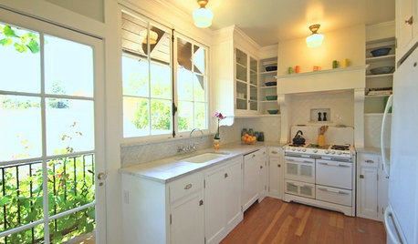
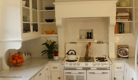
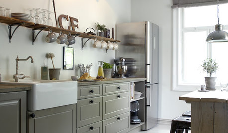
Here's a pic from my inspiration album (from an old GW thread--sorry I don't remember the name, but I LOVE the kitchen):
{{gwi:1578531}}Arapaho-Rd
12 years agolast modified: 9 years agoI agree - the chip design will help tremedously. My mistake was a matte finish on a very plain tile - no pattern. I absolutely love the look - my floor is set on the diagonal. I think whatever you choose will look great!
francypants
12 years agolast modified: 9 years agoI think that checkerboard would look fabulous in your kitchen but have to agree with suero on the diagonal looking way too busy. This comes from someone who loves diagonally placed tile, hardwood and just about anything.

Carol love_the_yard (Zone 9A Jacksonville, FL)
12 years agolast modified: 9 years agoHere's a vote for a neutral solid color. In my opinion, anything else is just too much. I love your room and your colors, but there is a LOT going on in there already.
shelayne
12 years agolast modified: 9 years agoOoooh, I love the first one GreenDesigns posted with the apple green and butter cream. Because it would tie-in with the colors already in your kitchen, it wouldn't be as distracting. I would like to see it on a mock-up, but I think it would be really nice.
I love the checkerboard look, and of course I love your kitchen. :^)
birdgardner
12 years agolast modified: 9 years agoI have a aqua-grey-blue/off-white checkerboard, with chips or speckles, colors very much like those in the picture that mamagoose posted. I used the vinyl tiles because they're in hospitals, schools, supermarkets and hold up well there.
Mistake. Oh, what a mistake. I can not keep a polish on them, and they are very hard to keep clean without a polish. The only way to completely get the stains of normal use out of the little pores is to use Soft-Scrub with bleach cleanser. Then I rinse, dry, rinse, dry, rinse, dry and try to get the polish on them - they stay a bit cleaner for a couple months and the polish is gone. So I settle for having them unpolished and never quite unstained. Now that there is snow on the ground, the kids aren't tracking in dirt from outside - heaven help me in mud season.
The supermarkets, schools and hospitals have industrial buffer machines. I don't. They use some system of stripper and finish chemicals - I don't even know what they are.
If anyone here knows how to solve this problem for home use, please let me know!
I will never use vinyl tiles again. The checkerboard look I still like, but I'd do it in ceramic. I'd put up with the floor being a bit higher than the adjacent rooms - I'd use a threshhold.
Did I mention that some mysterious gouges have showed up in my floor? And Nobody knows how it happened...

live_wire_oak
12 years agolast modified: 9 years agoNoooooo! Not a solid white nursing home floor!
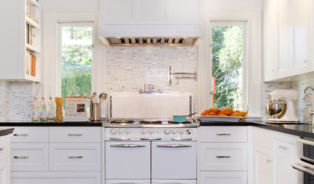
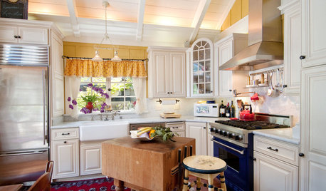
I LOVE the yellow and the green. It reminds me of the yellow and green kitchen in Six Feet Under that I just adored! I can't find any pics of the floor, but here's one with the vintage range and cabinets.
{{gwi:1578534}}
But, for your kitchen, think I like the white and the yellow the best if you want light. Low contrast and light. Ad in the deco strip of green and I think you have a winner.Carol love_the_yard (Zone 9A Jacksonville, FL)
12 years agolast modified: 9 years agoI definitely did NOT say "solid white". But a solid neutral - YES.
mnzinnia
12 years agolast modified: 9 years agoI would stay away from the black and white--too much contrast, does not blend with your pretty kitchen.
The mock up of the buttercream/white with the green edging is very, very nice and has a custom look that elevates it from the standard. The green/buttercream (not on diagonal) is also very attractive and appropriate. you could do a green border to it as well. A last possibility, especially if you want to camo footprints and spills would be a mottled mid color grey or dk tan with green or a cream trim (to keep it looking custom, not instutional). Those will allow you more flexibility in decorating down the road.
The light colors will easily show stuff. My sister put blue and white vct in her vintage kitchen and loved the look but found it hard to keep the "you could eat off the floor" look my grandmother's identical floor had. The fact that she was a working woman with 2 dogs, and a husband didn't help! But if you are ok with extra upkeep ( and don't have a houseful of critters) the lighter colors are lovely.
I would go on line and look at vct tiles available from a variety of companies or go to a flooring company that services commercial accounts to see the much wider assortment than you will find a a big box or small residential flooring store. You might find something you love. Prices will still be very reasonable.
suziqzer
12 years agolast modified: 9 years agoI really like the way the green/buttercream looks as well not on the diagonal, but would personally go for the more traditional black or gray with a white or light gray.
How long do you plan on staying in that home?
My concerns with the green color is that green is a color that doesn't age well and the popular colors of green change faster than other colors. The green I had in my wedding is no longer a popular shade, and I'm not that old :) You may love the color, but potential future buyers may not go for it as you do and might see it as a big project. Cabinets are relatively easy to paint, but flooring can be a bigger project.
mary_lu_gw
12 years agolast modified: 9 years agomama goose, this is something I have been considering for my kitchen as well. Here are a couple pictures I have saved for inspiration.


I agree that from the photoshopping above, the diagonal would look much busier. But love the idea of a checker board for your floor.
debo_2006
12 years agolast modified: 9 years agoWe had a b/w checkerboard floor from my foyer, hall, kitchen, laundry room and power room. It was a lot of area. I HATED THAT FLOOR!!!! It came with the home when we moved in and we kept it for 16 years before remodeling a few years ago.
We received many compliments. They're pretty to look at...when they belongs to someone else, but a PITA to clean and keep that way.
One of my happiest days was when we got rid of it....but that's just my opinion from experience. Sorry to be a Debi Downer.

Oakley
12 years agolast modified: 9 years agoHere's mine. It's a deep rusty/red, color is "Caboose" by Crosville Tile. The other is a cream color. They're porcelain and easy to clean, and they don't stain. I didn't do the diagonal though, it would drive me nuts.
I also have braided rugs in front of the sink and stove, which aren't in the picture.
Kitchen:

Utility room. The picture makes the red look brown.
busybee3
12 years agolast modified: 9 years agoi would go with a checkerboard pattern of some type... i like the green and antique white or fortress white- i think the buttercream is too yellow...
i also think a muted checkerboard such as the chocolate brown combo that greendesigns posted might look nice-and the 2 tones would probably prevent the room from feeling too closed in...
i definitely would not use solid...unless it was a strong or deep color-- a light toned neutral would definitely feel too 'institutional' for me!! (cuckoo's nest?!)
gsciencechick
12 years agolast modified: 9 years agoI love the green, too, although B&W always makes my heart go pitter patter. Oakleyoak, I love your floor color, too!
Oh, someday I will have a checkerboard floor when this one needs to go. I know the major complaint is that the B&W never look clean on either color. Pam who runs RetroRenovation has a professional come and buff her floors a couple times per year.
I saw this blog on people who used marble and granite tiles in their kitchen. Maybe I would consider that.
Here is a link that might be useful: Marble & granite tiles
Jane_the_Renovator
12 years agolast modified: 9 years agoI put a black-and-white VCT floor in our vintage kitchen. Never again. Looks great, BUT
* the individual tiles get loose
* PITA to keep clean. We have to sweep and mop 2x week minimum
If I did it again I would do a solid "marbled" type floor with a border, or do checkerboard sheet vinyl.
Also, you can get VCT floors sealed. That's how the industrial settings keep their floors clean. Call your VCT dealer--they should have the name of a company that does it.
mama goose_gw zn6OH
Original Author12 years agolast modified: 9 years agoHey, you guys were supposed to solve all my problems--at least, all my kitchen floor problems! LOL, all of your responses are bouncing around in my head (with the other voices already in there), and I still can't decide. To add to my confusion, I found some even cooler colors on the Armstrong website, 'Kickin Kiwi' and 'Screamin Pumpkin', to name a couple. Then my sister said that she thought a solid dark orange would look nice, because the hardwood that we've had in the other rooms has an orange-y tone, and I have touches of orange in all the common rooms.
I found another GW thread with a VCT checkerboard floor/border
Also want to give credit to mjsmama for the pics of the green/white floor, above.
arapaho, thank you!
suero, thank you for the mock-ups using the Armstrong colors--that combo is still one of my favorites.
fancypants, thank you!
love_the_yard, thank you--do you have a favorite solid neutral color in mind?
shelayne, thank you, as always, :). One good thing about the flooring dilemma is that I've learned to use the 'paint' program (kinda) for mock-ups.
birdgardner, thank you for honest advice on your experience. I've read several threads that mention the same problems with the maintenance issue. I plan to seal the tile initially, but I can't see myself waxing, stripping and buffing on a regular basis. After reading your post I called my mother to ask if the VAT tiles in our old house drove her crazy. Her answer was "Yes and no." The tiles were dark and showed every speck of dirt, but she didn't wax often, only damp-mopped (on her hands and knees)!!
BTW, Nobody is a frequent visitor here, too...live_wire_oak, LOL, that's exactly what I was thinking! Thank you for the pic--I love the look of the kitchen. It seems that green/white/yellow is the front-runner.
mnzinnia, I like the idea of the gray green and cream, because of the large amount of gray in the counter. Thank you for the info on our sister's flooring. We have a lot going on around here--three generations in one house, no inside critters, but lots of mud this time of year.
suziqzer, thank you. I plan to stay here indefinitely, maybe all of my days. I was recently widowed, but so far I'm managing to keep the house and yard in shape. One of my daughters has divorced and returned home with her young son, and the other daughter wants to "live here forever" when she finishes college. The house is nicely arranged so that it can be divided into several smaller living areas, if necessary, and we have a large area for parking. I realize my kitchen style is not for everyone, especially younger buyers, so if ever I need to sell, I have no doubt that the kitchen will be gutted and replaced, as soon as the ink is dry on the contract. :(
mary_lu, that first pic makes my heart skip a beat! I wish I has the courage to do that pattern, LOL. Love the third picture--that's exactly the feeling that I wanted in my kitchen, but with my smooth-top convection oven :). Thank you!
debi_2006, thank you for another honest opinion!
oakleyok, thank you for the pictures. I think your kitchen floor was one that started me on this path--I love it! You already know that I love all of your collections :).
busybee, LOL 'cuckoo's nest'! I'm still thinking about that dark solid orange that my sister suggested!
gsciencechick, thank you! I hope you get a B/W checkerboard floor some day. It will look wonderful with the fridge :).
jane_the_renovator, thank you--sheet vinyl is still an alternative--just wish there were more vintage styles available.
Thank you all for taking the time to help me with this decision. All your advice and encouragement is appreciated!
westiegirl
12 years agolast modified: 9 years agoAs far as the maintenance, I have only had my floor installed since August 2011. However, during that time, we have had a great deal of construction continuing in the house and all foot traffic goes through this room. I routinely have men stomping around in muddy work boots and a five year old dropping muddy and wet everything! We also live on 10 acers that has not yet had grass seed applied. It doesn't make a difference where you step, you hit mud or clay. All I have done is wait for the mud to dry, then vaccuum. I very occassionally mop with vinegar and water(not often, because I know it is going to make me mad when it is dirty again in 30 minutes). The floor still looks great in my opinion.
The wax my husband put on is for commercial applications. He has promised to take care of any stripping and reapplying needs in the future. He used to work at a University doing maintenance and tells me that it is not difficult, nor will it need to be done often for our residential situation.
My beige/tan colors do not show every speck of dust (and we have a lot in the house right now)! I think the various flecks of colors in the tiles help a lot. Mine are definitely not a solid color.
Good luck with your decision, I'm sure your stunning kitchen will look great with whatever you choose!
suero
12 years agolast modified: 9 years agoI have a VCT floor in my exercise room and my laundry room. Dropping a weight (15 lbs?) in the floor in the exercise room did cause a dent, but the pattern is such that the dent isn't noticeable unless you get on your hands and knees to scrub the floor, which I do, but rarely. Vacuuming and damp mopping keeps it sufficiently clean.
Oakley
12 years agolast modified: 9 years agoMy apologies, I didn't know you were talking about vinyl! Okay, I had a vintage vinyl pattern in the kitchen before the remodel. I was SO sad to see it go, but it had to because it wouldn't fit the new kitchen.
It was by Armstrong (the best, IMO) and it had a white background with small dark green triangles. As vintage as you can get. Vinyl IS vintage.
I was so pleased I put the same thing in the bathroom but used a light pink diamond.
Don't do the vinyl tiles. Do sheet vinyl.
I also wouldn't do orange. You'd be stuck with that color. I'd rather be stuck with red, white, green or pale yellow floors which makes it easier to accessorize the kitchen.
mnzinnia
12 years agolast modified: 9 years agoBirdgardener,
Two suggestions. 1. Go to a store that carries commercial floor care products and ask what products they recommend to seal and polish your floor. You will first have to strip it (ask) and it will take some work to put the products on but they will be hard wearing. Don't use the mop'n'glow junk.
Second, many homemakers in the '50's-'60's (pre wall to wall carpet days) had a home type floor polisher machine. I have one I bought at a church rummage sale and have seen others n thrift stores. They are simple, solid machines that make it easy to buff your floor. I think I paid $4 for mine that is identical to the one my mom used in the 50"s.
Hope that helps.catperson
12 years agolast modified: 9 years agoI used VCT in my small kitchen, but to keep it from looking so "busy", put 4 tiles together to make one large one, and put them on the diagonal. I can't remember the exact colors I used, but they are similar to buttercream and black chip. Actually I got the idea from an old DIY kitchen show where the guy did his mom's kitchen, and I used the same colors that he used. I used these in my kitchen, pantry, and butler's pantry. I will try to attach a couple of pictures.
[IMG]http://i487.photobucket.com/albums/rr234/catperson/Our%201898%20House/HouseInteriors040.jpg[/IMG]
catperson
12 years agolast modified: 9 years agoSorry picture didn't come through. I'm trying, but seem unable to do this. Can anyone help?
mama goose_gw zn6OH
Original Author12 years agolast modified: 9 years agocatperson, I tried to insert, but it wouldn't work for me either. Your kitchen is beautiful, and the floor is perfect for the space. I love the style of your woodwork and doors. Thank you!
forboystoo, thank you for trying. :)
Here is a link that might be useful:
mama goose_gw zn6OH
Original Author12 years agolast modified: 9 years agowestiegirl and suero, thank you for the maintenance info--I was starting to think the worst, and it's good to know that I won't have to spend all my time cleaning. Not that I don't love cleaning. :P
oakley, no problem. I'm very happy with the vinyl and would use it again--just wish I could find a pattern (in the budget line) that looks vintage. It seems that most patterns are stone/slate lookalikes.
catperson
12 years agolast modified: 9 years agomama_goose, thanks for posting my picture!! I have a better view without a glare on the floor. Would you be able to post it for me? Thanks so much!!
mama goose_gw zn6OH
Original Author12 years agolast modified: 9 years agoI'm still not seeing a picture in preview, and when I click on the link in preview, it doesn't work, either. Don't know if it's my computer??
Tried this link, but it's not working either. I highlighted and opened your link, and was able to view the picture.
I like the way you centered the large squares between the counter and island, and used muted colors to add to the cozy feel of the kitchen. Thank you, catperson.
Here is a link that might be useful:
cathleen_ni_houlihan
12 years agolast modified: 9 years agoMy kitchen has painted white cabinets, periwinkle blue paint, and checkerboard tiles of charcoal grey and black. I think on your samples, it would be closest to charcoal and black chip. Black and white would be way too much for me, but I love the checkerboard with lower contrast.
I agree that it would be better to keep the hardwood in the other rooms.
User
12 years agolast modified: 9 years agoI'm late to the party, but I cast my vote for the charcoal/cream or black/white checkerboard combo in a straight pattern (not on the diagonal). That is a classic look that is great with the green cabinets but will weather any kind of color change in the kitchen.
Second choice would be the green/cream combination, but that may be limiting in a way that the black is not.
Oakleyoak, your kitchen is perfection!
catperson
12 years agolast modified: 9 years agomama_goose, can you help me with this one? Thank you so much!!
[IMG]http://i487.photobucket.com/albums/rr234/catperson/Our%201898%20House/HouseInteriors042.jpg[/IMG]
mama goose_gw zn6OH
Original Author12 years agolast modified: 9 years agoI couldn't get this one to work in the text, but I see it in preview in the bottom link.
catperson, do you have your kitchen pictures posted? I checked the FKB--didn't see it there. I'd love to see more pictures. :)
Here is a link that might be useful: {{gwi:1578478}}
catperson
12 years agolast modified: 9 years agoThanks again, mama_goose!! No I don't have my kitchen pictures posted, because obviously I don't know how to do it. How embarrassing!
The tiles that look yellow really aren't. They are more of a tan. This is an 1898 house, and I know the kitchen isn't period, but there was nothing there when we bought the house. The rest of the house is of the period and was pretty intact when we bought it.
Thanks again for your help with the pictures, mama_goose!!!!!
mary_lu_gw
12 years agolast modified: 9 years agoJust wondering....have you made a decision yet? So wishing we were at a point to put our floor in. Lots of great ideas here. Please let us know what you decide and, of course, pictures are always appreciated!
mama goose_gw zn6OH
Original Author12 years agolast modified: 9 years agomary_lu, thank you for remembering me :). I still haven't made a decision, although I found an ad for a Restore a few hours' drive from here, that has many different colors of VCT for a bargain price. I'm planning a trip soon, if only to see the colors in person.
In the meantime I'm doing small tasks, here and there, on the guest room (above the new addition) and the dining room. Today, one of my daughters is helping me move a pie safe (or two) from the DR to my bedroom. When I get some pics of those areas, I'll start another thread.
Thanks, everyone, for all the advice and good thoughts!


suero