Shop Products
Houzz Logo Print
makeithome_gw

Help, I am stuck, and I don't know what to do

makeithome
13 years ago

For the past couple days, I have been feeling stumped as to where to go from here with my dining room. I feel like my curtains are causing some kind of mental block. Don't get me wrong... I love them. I think they work really well and the pattern is beautiful. However... I am terrified of mixing patterns. And styles. Right now, the dining room has a good base to launch from. But it's very traditional so far. I am young and I want a house that feels classy, but young and fresh too- very modern traditional, with a little funkiness... and sparkle.

Trying to find the right accessories to go with what I have has my head spinning.

First, we need a rug. The room is lacking a certain warmth that I know a rug will bring. I also want to rug to protect the floors from spills and scratches. I showed DH the sea grass rug that I thought would look good and he said it was a no go. I showed him a few rugs with a lot of beige (aka safe), and he hated them too. He wants COLOR. I asked him about what accent color he sees... his answer is lime green. My answer would be robin's egg blue. Uh oh.

Second, I know we need something on the walls. We cut out a piece of cardboard the size of that mirror we wanted from Pier 1... and I just think it's too big. It dominates the wall. I want something that adds sparkle, but that is balanced with everything else in the room. I also really want color on the walls. The room is very neutral right now, and I want something with energy.

Sorry, I realize that was a whole jumble of thoughts... but I am trying to make sense of everything going on in my head, lol.

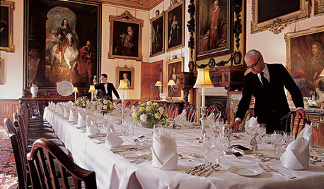
SO to refresh your memory, here is my dining room as of right now:

and here is a close up of the curtain fabric:

Now, I was looking at art all afternoon (today was my last day off before going back to work... boo) and I found two paintings that I love, both by the same artist, that really capture the color and the energy and the feeling of what I am going for:

So, using those paintings as a basic guide, I went and found some 8' x 10' rugs that I like that have color just like what DH is looking for:

Here's the thing... I have absolutely no concept of whether any of those rugs work with the curtains. I like them all, but I can't see them jiving with the paisley pattern of my dear curtains.

What have I done? Have I laid a foundation that will prevent me from having that young, fun vibe? Can you really mix sparkle, color, patterns traditional and modern all together like I had hoped? Why have I suddenly lost all sense of vision here?

If you have any thoughts or suggestions or anything... I'd love to hear it. I need to get some outside perspective for sure :)

Thanks in advance!

Comments (38)

  • nicole__
    13 years ago
    last modified: 9 years ago

    I love what you've done so far! Q: Do you have room for a server or sideboard? If you buy a narrow one you'd have room for off loading dishes and displaying pretty objects. I also think a drum lamp shade affixed to your chandy would grab some WOW effect!

    Rug #3 or #4 is gorgeous, but do you want to add aqua blue to the room and NOT pick up the color in the wall art? Rug #4 is the only blue that the wall art mimics.....it's probably the best choice for THAT reason.....either picture is gorgeous, but the birds are calmer...more serene. The pears print adds "red".

  • alicate
    13 years ago
    last modified: 9 years ago

    I love your art! Who is the artist?

  • rmkitchen
    13 years ago
    last modified: 9 years ago

    Well I think you did a splendid job of describing how you envision your DR! But I also totally understand feeling overwhelmed and lost.

    Okay, so I can see your paisley curtains going with any of the rugs. I don't think that'll be a problem. To my (42 year-old) eye, the first two rugs have the most zing!, the most energy, youthful flair. The final three rugs feel more traditional. The striped (second) rug feels casual to me, how do you feel about that?

    In your curtains is there any sage / (light) olive green or robin's egg blue? I think either of those colors would be beautiful in your room (as the wall color), and would be a good background for art / mirror. I also think either of those colors would be really pretty with a sparkly chandelier. And you could go WILD, young, fresh, bling, with lighting. I love nicole's idea of the chandelier wrapped in a drum shade -- have you seen those?

    How big is the mirror you like and on which wall were you envisioning it? Where were you thinking of placing the artwork? I happen to love big artwork, esp. in a place like a DR where you'll (hopefully) be sitting for long, fun, conversation-filled stretches of time. I think the big artwork gives not just personality but also something which won't bore or distract the people at the table.

    In our DR we have one wall which we had mirrored, the whole wall. On another long wall we have a large (>3'x3') painting. You can see I'm biased.

    I think your DR is on its way to being modern elegant with a kick -- I think your rug and art could give the kick.

    Great start!

  • lavender_lass
    13 years ago
    last modified: 9 years ago

    I like the fourth rug (for style) but I think your DH is right...you need some bright green...if not lime, at least leaf green :)

    Pick up the green in the art and put it in as an accent, in the rug. This will really tie the art and curtains in with the rug.

    If you're looking for sparkle, what about more crystal in your chandelier? Chandeliers can be very affordable, depending on where you shop...even second hand stores. Don't forget the Internet, too. It will give you great ideas...maybe you can even add some sparkle to your existing chandelier...can't really tell from the photo.

  • Shannon01
    13 years ago
    last modified: 9 years ago

    I like the 3rd rug with the curtains. I like the Amoung Friends picture.

    I just did my livingroom and had such a hard time mixing things, especially patterns. What I think works is different sizes, I think they say to use 3. So the rug would be the large pattern, the picture the med, and the curtains the small. The dark birds reflect the dark wood and specks of dark in the curtain.

    I agree that I too love the pear pic but it has too much red. I like the first and last rugs but wonder if first is too pale and the last is too traditional and dark like the furniture.

    I second, or third, the need for a new light. Be sure to look beyond what you find. Look for style you like, you can always paint it.

    You have such a good thing started. Don't be afraid. We made three trips to get our lamps for the livingroom, almost two for the rug and were petrified when the sofas came in and were curved waaaay more than we thought they would be. If you purchase on a credit card you can return and exchange without tying up all your cash.

    Keep us posted, I really want to see the end results of this room. I love it.

  • gsciencechick
    13 years ago
    last modified: 9 years ago

    I like the "Among Friends" print and the first rug with the "bursts". I think that brings a touch of fun to the room. I agree, look into a new light fixture. Maybe bring in some green accents (like a table runner or a platter or items for the corner cabinet) to pick up from the print.

  • busybee3
    13 years ago
    last modified: 9 years ago

    so far, i think it looks great! your curtains are very neutral...looks like alot will go with them! i like rugs 3 and 5 best... and will complement the dark wood/light seat cushions the best.
    my concern about the art is the size...i like the friends pic, but think it might look small. i would rec buying the pier1 mirror, bring it home and try it and just return if you don't like it... size is something that's really hard to envision sometimes and things you think might look huge don't in the whole scheme of the room.

  • laxsupermom
    13 years ago
    last modified: 9 years ago

    I'm in love with "The Pear Tree" I like 3 & 5. 5 might be better at hiding stains. More pattern=better stain hiding.

  • gracie01 zone5 SW of Chicago
    13 years ago
    last modified: 9 years ago

    I like rug #3. It mimics the paisley curtains. I would get the rug first, then look for art later (or rather, let the art find YOU).

  • susanka
    13 years ago
    last modified: 9 years ago

    I think either of the art pieces would bring the life and sparkle you want into the room. The pears are my favorite. Can you order one or both of them (or pick them up if you found them IRL) and try them out? I think they'd be so important in your room if you like them IRL you'd want to put them up and fit other things around them. I would not get a rug first. It's so easy to return things; I do it all the time. How fun it sounds to make your room more exciting! Best of luck!

  • barb5
    13 years ago
    last modified: 9 years ago

    I can see robin's egg blue as your accent color too. Is your DH amenable to that, or does he insist on the green?

    If the blue is a go, I like rug number 1. The others are fairly traditional and will ramp up the "formal" aspect of the room. I think your curtains are neutral enough, and the paisley pattern small enough to not compete with the rug. Of course, I would do a "try at home with option to return" with the rug.

    And then I would go with "Among Friends" print and some robin's egg blue accessories for your china cabinet, either in it or on top of it.

  • WalnutCreek Zone 7b/8a
    13 years ago
    last modified: 9 years ago

    I love the art work; however, it does not "go with" your curtains at all; neither do any of the rugs pictured. The curtains appear to be trimmed in a smoky gray color, such as BM Coastline paint. There also appears to be some light blue in the drapery. My recommendation is to try to pull a color from the fabric of the curtains which you love and use that color to paint the walls. Then look for a rug and art work.

    If you want to change directions and go with the artwork, you need to consider changing your draperies.

    This may sound harsh, but mistakes can be very costly, and you and your husband want to end up loving the dining room. My 2 cents worth.

  • dianalo
    13 years ago
    last modified: 9 years ago

    I think you both want something young and fresh so make sure your choices hit for both of you.
    I also like the pears better in your situation. The birds theme is very popular right now and the pears give you something more unique.

    Try the following:http://www.google.com/products/catalog?q=blue+and+green+rug&oe=utf-8&rls=org.mozilla:en-US:official&client=firefox-a&um=1&ie=UTF-8&cid=9026188029875410279&ei=6G0jTazUN4WglAe4sYXcDA&sa=X&oi=product_catalog_result&ct=image&resnum=7&ved=0CEkQ8gIwBg#

    {{gwi:1577531}}

    http://www.amazon.com/Exploded-Floral-Rug-Blue-Green/dp/B002VNJDBQ

    {{gwi:1577532}}

    Walmart would not let me copy their pic, so you will have to cut and paste.
    http://www.walmart.com/ip/Chandra-Rugs-Rowe-Green-Blue-Contemporary-Rug/14628814?sourceid=1500000000000003260370&ci_src=14110944&ci_sku=14628814

  • beekeeperswife
    13 years ago
    last modified: 9 years ago

    I'm sorry, but I really don't see any of those rugs looking "young & fresh". Maybe the stripe, but it doesn't work with the curtains.

    I just received my online version of cb2's spring catalog. There are quite a few rugs that are much younger than your choices above. Also they have some really great prints in this catalog.

    Even a solid lime green shag rug would look really great in your space. I'm not making any specific suggestions, but you will know it when you see the right thing.

    Take a look at the catalog, and

    Here is a link that might be useful: cb2 catalog

  • kiffgirl
    13 years ago
    last modified: 9 years ago

    Don't get hung up on buying art to "go" with or "match" your decor. Buy art you love, art that makes you smile when you look at it. Art that speaks to you will bring you so much more joy than some piece bought just to match your decor. You want your rooms to always be a reflection of what you love.

    Both of your paintings would be lovely. I'm partial to the pears. It is warmer and happier to me, and a bit more contemporary with it's color palette. It would bring an edginess and some warmth to the space.

  • Sueb20
    13 years ago
    last modified: 9 years ago

    With your drapes, I like rug #3. I also think you shouldn't worry about matching your artwork with your curtains. You don't want to look like a furniture showroom with everything matchy-matchy. I like the "Among Friends" print but I wonder where you'll put it? If you're placing it on one big open wall, it's going to be too small.

    I'd pick up the blue from the rug and get a big funky bowl or vase in that color for the table, and maybe add some blues and beiges/browns in your corner cabinet. Looking closely, I can see you have some white dishes in there, but I'd love to see some more colorful items displayed.

  • susanka
    13 years ago
    last modified: 9 years ago

    makeithome, I chickened out on saying it earlier, but none of the rugs you show look young or vibrant to me either. #1 has kind of a retro feel to me, and the others might be very nice, but just not fresh or any of the other adjectives you said you're looking for.

  • hilltop_gw
    13 years ago
    last modified: 9 years ago

    Love your choices of dining set, drapery fabric and artwork. FYI my daughter ordered rug #1, the Soho Burst rug in beige from Overstock for her apartment and it really shed. It's a thick, contemporary rug and we both loved it, but the wool shedding is a pain. She only owned it for a short while and then moved cross country. She didn't have a vacuum and no longer has the rug so maybe it gets better over time.

  • kjmama
    13 years ago
    last modified: 9 years ago

    Your room is pretty. I am not sure I'd put anything too trendy on the floor. �I'd also put the lime �green in ways that were easy to change, art, center pieces, placemats, pillows... �I do like the lime green idea to freshen it up. � �
    I personally am not a big fan of mass art. What about mirrors, dishes, letters, antique pieces, a quilt wall hanging.... Of course mass art has it's place, but don't rush it just to finish a room. Make it something you love. Visit local galleries, young artists, antique shops... �Just some thoughts.�

  • suero
    13 years ago
    last modified: 9 years ago

    With your rugs and the pear picture:

  • makeithome
    Original Author
    13 years ago
    last modified: 9 years ago

    Hi everyone,

    Thanks so much for the feedback so far. I really appreciate all your comments.

    Suero, thank you so much for photoshopping!!! It's hard for me to envision these things and you helped so much!

    Based on the photoshopped pics and your feedback, I am thinking the following:
    - the right rug is not here ... yet
    - the right art is not here ... yet
    - Both lime green and robins egg blue could definitely work in this room
    - A solid rug might work best, but in a bright color
    - some bright accessories in the cabinets should be a great addition
    - the mirror might not look as big in the room as the big piece of cardboard that we hung on the wall.

    When I have more time I will respond more individually. Thank you so much!!!!

  • palimpsest
    13 years ago
    last modified: 9 years ago

    I mirror does not really represent a "solid" object like cardboard does, because the mirror reflects the room. So, it is not really represented well by cardboard. You may have to prop up the actual mirror to know for sure, but within reason, the bigger the better.

  • krycek1984
    13 years ago
    last modified: 9 years ago

    Well, I'm 26 and we just bought a house last year, so I kind of know where you're coming from.

    I would lose the curtains, honestly. The direction you want to go with the rugs and art you have shown us doesn't match with the curtains, IMHO.

    The art is absolutely splendid. I would buy that art in a second if I could. Love the rugs too.

    I have a parlor that I can get away with being formal and stuffy in...the rest of the house I suppose is more what you are talking about, slightly traditional but still young and fresh and alive.

    If you get rid of the curtains and follow your intuition, I think you'll have an easier time.

    THe artwork really is beautiful.

    I would avoid rugs with frills or persian rug types of designs if you are looking to not get too formal/traditional.

  • WalnutCreek Zone 7b/8a
    13 years ago
    last modified: 9 years ago

    I agree that items completing a room do not have to be matchy-matchy. In fact there is only one matchy-matchy in my entire house, and that is the bed, dresser, and nightstands in the master bedroom (which I purchased over 30 years ago when everyone bought matchy matchy). However, the mixture in a room as a whole does need to be harmonious and pleasing to the eye.

  • demeron
    13 years ago
    last modified: 9 years ago

    I love the colors you're using. Have you looked at any Dash and Albert rugs? Lots of color possibilities.

    My 2c is to consider painting your wonderful corner cabinet-- maybe a different color in the interior, line it with some cool paper, or even paint the exterior a darker punchier color.

  • makeithome
    Original Author
    13 years ago
    last modified: 9 years ago

    demeron - I looked at Dash and Albert (I had never heard of them until you mentioned them) and I must say, their rugs are super cute. However, for the size we need, they were a little on the pricey side for us. And most of the rugs I loved, hubby wouldn't like because now he has told me he doesn't like stripes.

    So I went onto Amazon last night and looked at over 1500 rugs in about an hour (thank God for the internet)and I picked out 6 that I thought were nice.

    Hubby shot them all down. Now he is telling me that he doesn't want flowers, and that he really wants the rug to have a border around the edge of it. I'm starting to think that original rug #5 is looking better and better for that.
    I'm still not convince, though, that THAT rug is the right rug for that space.

    Meanwhile, I agree that painting the inside of the cabs a fun color will be nice... but I want to find a rug first before I try to decide on a color to paint in there. I did paint the inside the color of the walls (they were white before) to help the dishes stand out, but a bright color would add even more dimension and fun.

    I'll keep looking and keep everyone updated on if I find anything.

    Thanks for the support, guys!

  • suero
    13 years ago
    last modified: 9 years ago

    This rug is a lot bolder, but I think it works:

    Here is a link that might be useful: 9 x 12 Agra ABC Carpet

  • jlbh
    13 years ago
    last modified: 9 years ago

    I am a long time lurker mainly because I usually have nothing viable to offer (probably don't now either!) but I do have the valances that match your curtains in my kitchen and my walls are painted a similar color. Your curtains looked really washed out in the pictures due to lighting so I think that is throwing off how some of your choices would look. I think you should keep the rug a neutral color without a pattern (although the one that dianalo posted with the flowers would look awesome) then pick an accent color and fill your cabinet with dishes in that color, add art work with the color you choose with dark brown frame(s). I think the art work you chose would look really good, especially the birds but the pear tree would give you more color options. I would paint the back of the cabinet in the darkest brown found in your curtains or paint the outside the dark brown and leave the inside as is. Either way would look really good with lime green dishes and or blue. A big clear glass bowl/vase in those colors on your table would look awesome. You could even paint some chunky candle sticks blue or green. I don't know what is on the otherside of your window but a long narrow row of say 5 colorful, funky plates would look kinda cool hung there. I couldn't decide if I wanted lime green or red in my kitchen for an accent color. I went with lime and loved it but I had a red mixer and kept wondering what that would look like so I bought some cheapy red things and switched it out to red. I think I will put the lime back in in the spring/summer and the red in the fall/winter. Well for being a lurker, I sure did get wordy here. I don't know if I helped or not but good luck, you have a great start.

  • makeithome
    Original Author
    13 years ago
    last modified: 9 years ago

    nwdrip- Thanks for chiming in! I am thankful for any advice and I appreciate you commenting on my thread. I think painting the back of the cabs dark brown would be really cool with some colorful dishes.

    Suero- I never would have picked a rug like that, but you are right, it works. My only thing is that I am, in general, trying to avoid red. I had red accents all over my last apartment, and I want to go for a different feel. However, I get to see what a teal looks like, and how patterns interact with my curtains, so thank you!!!

    I have continued to look at other rugs. Hubby has been almost no help. He is very picky on what he wants, but he won't help me look. I have browsed through approximately 4000 rugs by now, and every suggestion I have had, he has shot down. :(

    Here are some of my favorites right now. Please tell me what you guys think:

    A

    B

    C

    D

    E

    F

    G

    Hubby wants a border around the edge, doesn't want flowers, only wants a hint of color, doesn't want stripes, doesn't want beige.

    Please note that most of *my* faves at least have one of those things.

    This one that I posted earlier appears to still be hubby's favorite:

    But he's not sold on it.

  • AHomeWest
    13 years ago
    last modified: 9 years ago

    How about something more graphic/simple like a quatrefoil design? It's simple, yet gives a mix of two colors (subtle, if you want,) as well as a bit of elegance. To me, this type of design is both feminine AND masculine. I'm sure you could find one with a border somewhere...

    Here is a link that might be useful: Quatrefoil Design Rug

  • suero
    13 years ago
    last modified: 9 years ago

    Here's Rug A:

    But if you don't go with the ABC rug, hubby's favorite is mine, too.

    In any case, the best way to tell is to get the rug in the room, so whatever you buy, make sure you can return it.

  • jiggreen
    13 years ago
    last modified: 9 years ago

    Suero, how do you do that???? Photoshop? or another (hopefully not so pricey!) program ?

  • suero
    13 years ago
    last modified: 9 years ago

    Magic, sheer magic!

    I used Fireworks. Any software that allows you to manipulate bits and use layers will do.

    First I copied the table and chairs and set the copy on a layer. Then I copied the rug to its own layer and used a distort tool to give it the right perspective and size. Then I placed the rug layer between the original picture layer and the copied table and chair layer.

    Or should a magician not reveal how the trick is done?

  • yayagal
    13 years ago
    last modified: 9 years ago

    I have a code for $50.00 off at Home Decorators. The number is1946108A
    The site has tons of rugs and everything else. I purchased a rug there and I'm very very pleased with it. Good luck!

  • loribee
    13 years ago
    last modified: 9 years ago

    Ditto Nwdrip! That being said, I'd go with a muted rug- say B, E or F.

  • suero
    13 years ago
    last modified: 9 years ago

    I've played around with your rug choices, and here's how they look next to your drapery sample (the ones not here are the ones I've posted previously):

    G makes the table and chairs pop. E is the most muted and relaxed, followed closely by B. C is my least favorite. The central color is what's holding me back. F surprised me in fitting in much better than I thought, but it is beige.

  • vicbowling
    13 years ago
    last modified: 9 years ago

    Have you thought about doing something with the seat covers? that would make a nice subtle change and might tie everything together. I think the problem that I have with what you're doing so far is that you're doing a whole bunch of safe choices but none of them are really going together so it's looking bland and choatic at the same time. Don't get me wrong, I really love everything that you've chosen but nothing seems to punch and be the focal point of the room. I'm only saying this because you said that you wanted a modern and youthful but sophisticated feel to the room but with a mixture of paisley, you're actually creating the opposite.

    With the curtains you have have you tried to match at least one bold contrast color to extend to the rest of the room? A nice chocolate purple might be nice for the accent wall and compliment your dark dining table and you could use an aqua to ease it together. I would probably choose stark white to be the accent and use it very strategically and minimally.

    Here is a link that might be useful: daycare furniture

  • makeithome
    Original Author
    13 years ago
    last modified: 9 years ago

    Suero - You have been amazing. Thank you so much! According to your comparison, I am totally digging G. I think it has a great mix of color, pattern and its fresh and contemporary. The only problem... it doesn't have a border, lol. I'll see if I can convince the hubby.