Pittsfield Buff, Powell Buff or Monroe Bisque?
I am trying to decide between these three colors for my family room walls. The drapes are in this fabric, and I have a chocolate brown leather sectional.
I want to go get some samples, but they don't have all of these colors in the little pots. So, I may have to get quarts, and hate to buy three!
In the samples, I see in the Pittsfield Buff some slight green tones, Powell Buff more orange and in the Monroe a more taupey color. I want a warm light gold. Believeable Buff is close to what I want, but maybe a tad darker - which brings me to these three.
Here's the fabric, if you're familiar with these three colors, what do you think? They're all very similar but I see undertones in each. I like Susan02's Pittsfield Buff rooms, but also like Powell Buff - but haven't seen any photos of it in a room.
Any advice, or should I just buy the three quarts!?
Comments (98)
susans02
16 years agolast modified: 9 years agoSorry for the late follow-up - IMO the Pittsfield Buff doesn't have any green undertone at all - to me Dunmore Cream does. It definitely looks diff. during certain times of the day/depending on how much light I get. The pics I posted above are pretty acurate of each room - it's a nice soft warm color to me. The hall trim is just molding on drywall. Nothing special! I've used Wilimngton Tan - it's a great color too - def. deeper and more gold. Shelburne can look more grey from my experience. It's looking lovely -
Gardenchick1 - your house is SOO pretty!
msrose
16 years agolast modified: 9 years agoAndrea - BM paints come in quart sizes also, so you don't have to get a gallon of Wilmington Tan.
Laurie
Related Professionals
Liberty Township Interior Designers & Decorators · Denver Furniture & Accessories · Memphis Furniture & Accessories · Nashville Furniture & Accessories · Port Charlotte Furniture & Accessories · Rockville Furniture & Accessories · San Diego Furniture & Accessories · Newton Furniture & Accessories · Annandale Furniture & Accessories · Chino Hills Furniture & Accessories · Maplewood Furniture & Accessories · Wellesley Furniture & Accessories · San Francisco Lighting · Richardson Window Treatments · Oakland Window TreatmentsCaroleOH
Original Author16 years agolast modified: 9 years agoJohnatemp - thanks for the photos! WT looks so different in photos don't you think? It looks gold in your vanity shot and taupey brown in the tub shot - I cannot really get an accurate photo in my kitchen since it faces north and in winter OH has very little natural light (that wasn't a vent - well maybe!)
Anyways, it looks nice with your travertine. Do you find it to be a huge contrast? I think it will go nicely in the kitchen - I really like it with the window treatments and my countertops and cabinets. I also like it with the wood trim in there. And yes, I did make the chair cushions. I learned to sew back in junior high - back in the olden days when we all made alot of our own clothes. Especially, our homecoming and prom dresses. Now, I never sew my clothes, but do sew alot of pillows, valances etc. I didn't do the panels in the FR because that amount of fabric is just really too much to handle and keep the grain straight etc.
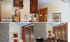
I am so perplexed though on what to do in my FR now!! Here's some photos of the colors I have samples of. I did consider, Squirrel, the WT at 50%, but was worried it would be too yellow. More yellow than what I have to choose from right now with Pittsfield and Powell Buff. The 100% WT is I think too dark - so I'm not going there. The Pittsfield and Powell Buff are the right shade, but are truely a yellowish gold and I'm wondering if that will work on such a large area. The current color is Kilim Beige - a light taupey color, but it has a goldish tone to it when it's looked at on the walls. Should I just stick with that?!! What do you all think?
Here's one more with the Wilmington Tan against the backsplash
Here's some general shots of the room to get some perspective!
looking into the kitchen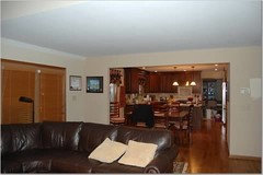
high FR wall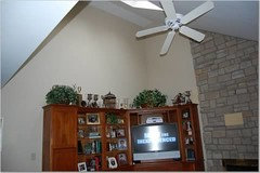
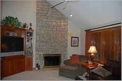
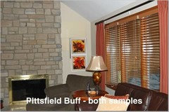
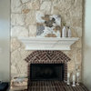
Here's one with Pittsfield Buff and the fireplace - WT on the stone itself
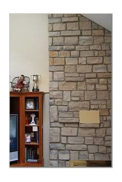

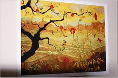
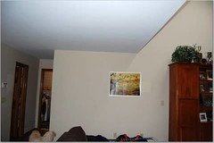
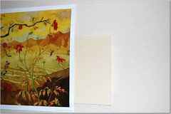
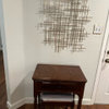
I also fell in love with this picture and think it needs a golder/warmer background to look nice. You can see how much cooler the paint looks against this print. I thought the paprika red in the print would look nice with the chair I have on order (it will go where the green chair is now) and the drapes. I ordered this poster for $9 to see if I like it, but Ballards has a glicee print of it that's much larger and more $$ - just didn't want to order it if I didn't like it - what do you think about using it on this wall? It's not the best shot of the wall since I wanted to show the entire length, but I ordered a ORB metal & wood console table to go along this wall and I was thinking about hanging this print above it with a lamp or something...The sample is Pittsfield Buff
abmatt
16 years agolast modified: 9 years agoHello,
This is the first time I've posted to this forum. I spend a lot of time on the kitchen forum and post only ocassionally there.
Reading your question about the paint colors brought me back to the Age of Torture that was my paint decision phase. Finally I paid a paint color consultant about $75 an hour to look at the house, probe my thoughts about what we were trying to accomplish and I am very happy with how my colors work together. He works only with BM paints, which I already liked anyway.
The best $$ ever spent.
Monroe bisque has a presence in our house but not in an area of main focus. It provides a nice neutral transition and I have to agree that it can play the role of "just there," though that's not necessarily a bad thing. I think of it as "sell your house" tan. A color I never would have been able to ID on my own.
We used it on our kitchen ceiling against Timothy Straw walls and in the rear pantry/mud room and in our small upstairs landing. It is also on one one side of the inner stairwell, the other side is Huntington Beige which I just love. It looks great on old plaster walls.
Well a lot of talk and little of it pertained directly to your question, if at all, but I kind of miss the Age of Torture in a sick way!
Consider the color consultant in your area. I live in Jax, FL so I cannot advise on where you can find one, but mine also works in a paint and decorating store and the consulting job is his own. He's known locally as the "color guru."
Good luck. I may start hanging out here as my focus shifts from the almost completed kitchen to refreshing the living room and den.
Anne
Kathleen McGuire
16 years agolast modified: 9 years agoAmity's Pony Tail is at Lowes, by Olympic Paint. It is also at Pittsburgh Paints. They are sister company's, both owned by PPG Industries. I have seen it in person and it is a very nice color, although I'm not sure hopw much different than WT. Maybe a tad less yellow. Another great color at Olypic Paints is Golden Ecru 316-4 and Applesauce Cake 316-5. Pony Tail is 315-4. Here are a few shots of Golden Ecru from a parade of homes I went to:
ladyamity
16 years agolast modified: 9 years agoFirst of all, I want to say Thank you all so much for posting pictures. What a great way for me to get inspiration.
I'm sure everyone seeing these beautiful rooms will benefit too!Caroleoh,
Weird, huh?
Yes, the PonyTail was originally going to be the wall color in the entry way.
With the Cottage White from Ho-De as trim, the two made a great contrast.
The PonyTail looks pretty dark in that first pic with the white door as contrast, no?No way did I think it would be light enough as Trim work, but just as an experiment, to see how much the PonyTail color reflected what was surrounding it, I painted one window trim and fell in love with the PonyTail as Trim color.
So much so that PonyTail is now (will be when we are done) the new trim color throughout the house.
In the dark gold/Medieval room the PonyTail Trim around the windows actually looks like the lightest, creamiest beige possible, no undertones.
Originally we saw the color on a Pittsburgh Paint card.
We ended up buying a big 5 gal. bucket at Lowes.
Olympic Paint card #C15-3ladyamity
16 years agolast modified: 9 years agokmcg85,
You must've snuck in while I was doing my hunt-n-peck.
Thank you for giving such great info about Pony Tail---so much better than I could have explained it.No Taupey tones ---- no lavender or pinkish undertones.
Just enough of a soft golden hue or soft, very light tan, depending on the room/light/surroundings.Those pics are gorgeous! The second pic with the darker ceiling with wood is drool-worthy.
squirrelheaven
16 years agolast modified: 9 years agoIf the PB is to the left of the fp, it looks too pale yellow to me from here. I'd look at some with more brown as well; a little more earthy for the stone.
The photo of the WT with your tile looks nice, imo, as the tile looks much less gray/taupe. It's really tough to gauge the real life tones of things in photos as they're just not at all accurate. It does look very golden in johnatemp's night shot, depending on the lighting. And, if that's your tile coloring in her daylight bath -- it's gorgeous! lol
Kathleen McGuire
16 years agolast modified: 9 years agoAmity, you are right with the color numbers. The ones I posted are the Pittsburgh numbers, however the names are identical in both lines. So, if at Lowes anyone, look up the names at the Olympic display. Sorry!
What Squirrel said about going more brown, earthier, is my thought also. There seems to be too much yellow. SW has Camelback which is a nice caramel color. Sorry, if i've already mentioned it, but I think at least in your kitchen it would look great with you fabric! Nothing wrong with continuing that in the FR if it works with the stone too!squirrelheaven
16 years agolast modified: 9 years agoI see green in the Camel Back. ??
I'd get a sample pot of 1069 Twilight Gold for the kitchen (a bit lighter than the Brunswick) and if you like it, try 1068 Squire Hill Buff in the fr which is one swatch lighter than the Twilight.
Another $12 is nothing in the bigger scheme of things, imo.
And that's what I tinkk!
(I do hope you'll be trying a larger sample 'board' before final commitment to your selection :)
Kathleen McGuire
16 years agolast modified: 9 years agoNo green in Camelback. It is almost identical to my Tobacco Road. Warm, brown/gold, not so much yellow.
andreaintx
16 years agolast modified: 9 years agoCarole,
Have you made your decision? I got the WT per suggestion and I'm not sure. I also got the Powell Buff and you're right, it looks very similar to PB. Our house colors are very similar (NVG granite and cream travertine bs) so I'm anxious to hear what you decided. I'm waiting for everything to dry and then I'll post some pics.
CaroleOH
Original Author16 years agolast modified: 9 years agoHi Andreaintx,
I'm going to do the Wilmington Tan in the kitchen. I really like it - and I don't have very much wall space, so I think the gold will be more of a punch of color that will perk up the room. I have Nomadic Desert in there now, and it's blah with the woodwork.
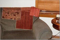
My FR is another story! WT is too dark for in there and I have too much wallspace and not alot of light, so I don't want to have a cave like feeling. But, I feel like the Pittsfield and Powell Buff are a tad on the yellow side and when you add in my Paprika colored chair - it might look too much like halloween candy. Here's my chair fabric by the way. The paisley I was thinking about for pillows, but it was too expensive for how much I liked it!
So, I'm going to go look at some samples at Lowes for the Ecru, Ponytail and I forget the other colors. Also, want to look at Laura Ashley Sand colors to see if I like those. How are you feeling about the Pittsfield Buff and Wilmington Tan? Can't wait to see your photos!andreaintx
16 years agolast modified: 9 years agoCarole,
Not sure about the Wilmington Tan or Powell Buff. Here are the three including Pittsfield Buff and the granite, tile and WT fabric
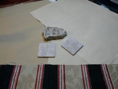
I have a lot that I have to bring together so we need to make sure that one color will work with three rooms and fit with the rest of the downstairs.Here is a link that might be useful: Downstairs
CaroleOH
Original Author16 years agolast modified: 9 years agoNot to make your freak out or anything, but I don't see alot of gold in your fabric, tile or granite. Maybe it's the photos because I know my photos don't look a great deal like real life - and I'm only posting a few of the gazillions I've taken trying to get the flash right.
What color is your woodwork? It looks white to me in the photos. What color is the carpet? Your furniture is brown, and with the white trim, I think the Kilim Beige strip of colors would work well for you. Nomadic Desert is a tad darker than Kilim Beige and goes with the New Venetian granite very well. What color are the kitchen cabinets? White or light tan? You had two photos. If you've got alot of white and your accent is red/burgandy, I'd go more taupe than the golds. Kilim Beige is my very favorite color. Nomadic Desert is a shade darker. Your LR fireplace tile is more on the taupe side, your dark hardwood floors are more mahogany to me than warm gold/brown so I really think the Kilim or Nomadic would work. The sample card isn't true to the actual colors, so you'll just have to trust me on the actual colors. Kilim Beige is very similar to the Pittsfield Buff in tone, it's just not as yellow. If you want something a tad darker the Nomadic would work well with the white woodwork. I just don't like it in my stained woodwork kitchen!
Page back through all my picture posts. The color in the FR is Kilim Beige and the color in the kitchen is Nomadic Desert. You can see how similar the Pittsfield is to the Kilim, just not as yellow/gold. If I didn't have the stained woodwork and paprika orange and gold colors going on, I'd be very happy with my colors!!
Go get two more samples of SW Kilim Beige and SW Nomadic Desert. Then you can compare the yellow gold to the warm taupe and see what looks best.
andreaintx
16 years agolast modified: 9 years agoMy woodwork is white. The kitchen tile is brown so the taupe colors didn't look good in the kitchen when we tried them out before. The floors are Brazillian Cherry and they have become a deep red which we love. The cabinets are going to be painted Oatmeal and will have a brown glaze for antiquing. All of the lights are hardware in the kitchen will be a variation of coppery bronze. The LR hardware and lights will have to be changed later, husband not in a hurry. The blinds are also white and were replaced two years ago. The foyer is Navajo White and the kitchen/nook/living room needs to look okay with that too since the walls connect. My accents are more of the jewel colors, esp. red and black. See why it is so hard for me to pick out the perfect color.
CaroleOH
Original Author16 years agolast modified: 9 years agoI promise you the Nomadic Desert will look great in your FR/kitchen/living areas or the Kilim Beige if you want something lighter. Do you have a SW paint store near you? If you look at the paint strip - it has all of the colors in your palate - it's the bottom deepest colors are a true brown. The only odd thing is the colors are much warmer on the wall than they look on the strip.
I will never ask you to do another thing as long as I live - get the two paint samples. :-)
I'm back to looking at the boring Monroe Bisque sample. I swear I'm going to make a decision tommorrow. I've gotten absolutely nothing done in the last 24 hours other than paint sample boards, drive to paint stores to buy sample paint, position them throughout the FR kitchen and take too many pictures to count - then I stare at the pictures, then I stare at the wall samples, then I move them and repeat. I think Abmatt's comment about this being the "Age of Torture" was spot on. If I wasn't going to pay someone to paint the FR I wouldn't be so worried - I can always repaint. I'm just too cheap to "pay" someone to keep repainting!! I wonder if I could handle a 14-16' ladder against that one wall...the others are a breeze....hmmm..............
andreaintx
16 years agolast modified: 9 years agoCarole - I hear ya!! We are having someone paint too, I have a two and a half year old, no way I'm painting all that myself. I have a SW store very close. I'll go by after I drop her off at MDO. I want a good color.
BTW back in October when I started this process I didn't get a thing done for two weeks. My husband was like hello clean the house, cook dinner, do something!
polkadots
16 years agolast modified: 9 years agoCarole, what happened to the Powell Buff? Did you not like it in the daylight? It is a warm neutral to me, not really yellow. Just based on what I just repainted, I am not feeling like the Monroe Bisque is right with the Wilmington Tan next to it, too cool. Sorry, I just know the pain I went through! :) But the lighting makes such a difference, so it's really what you think is best in your room. Good luck with the choice.
andreaintx
16 years agolast modified: 9 years agoCarole. I know you mentioned that your painter likes SW paint, what about BM Aura? Has he said anything about that paint? We really like it because the guy at the store said it will hold up to kids very well. My painter isn't a conversationalist. We give him the date, he comes, does his work, takes his money and is on his way, so I can't really get his opinion on the Aura.
CaroleOH
Original Author16 years agolast modified: 9 years agoPainters tend to like to work with certain paint stores - they have accounts with them etc...
I think SW and BM paint is comparable in quality. I like the SW Duration paint for scrubability and it comes in a flat that isn't real shiney. I saw the Aura paint too - it looks nice - about the same qualities as the Duration. The paint store guys will always say their paint in the best!
My painter likes to use ProMar or Superpaint because it is really easy to touch up and the touchups blend into the wall nice.
I think you're safe with either one. The SW store is closer to me and he gets a discount on the paint there, so that's why we go that route.
Polkadots, I reread your post on another thread about the Monroe Bisque and Wilmington Tan - maybe you're right!!
The Powell is more yellow and the Pittsfield has a slight green tint, but I'm going to go out today and look at some others too. My family thinks I'm nuts. They think all the colors look the same. And they do, BUT, when you put a color up on a huge area it takes on a life of its own. I'm amazed at how different a color looks when you just hang it on the wall vs. looking down at it in your hand or on a table.
But, I'm done. I've spent $50 on paint and little rollers and I'm going to make a decision....Maybe I'm back to Pittsfield!
amsunshine
16 years agolast modified: 9 years agoSorry to add something else to the realm of choices, but the Wilmington Tan appears very complimentary to both your kitchen and FR. What if you had it mixed at say, 50% or 75% to make it a little lighter since you don't want it so dark for your FR?
On the other hand, I much prefer Pittsfield Buff to Monroe Bisque for your room. I agree with polkadots the MB may be too cool, esp. if you don't get much natural light there. I think the Powell Buff has a tad too much pink/red in it and I'd be afraid it might clash with the reds and paprika tones you mention for your room.
polkadots
16 years agolast modified: 9 years agoCarole, I feel your pain. When I was doing this my husband thought they all looked the same. I told him I must be "sensitive" to color! LOL If Pittsfield was your first choice originally, maybe you should go back to that. It seems like I've done that a lot - ended up with one of the first things I picked, but not before the agony of trying lots of others.
oceanna
16 years agolast modified: 9 years agoCarole, I thought I recognized them! I love that site and have long drooled over it and have shared it many times here. How was the pattern? Was it clear and easy to follow? You did a great job!
johnatemp
16 years agolast modified: 9 years agoCarol,
It will all be gorgeous when it is done!!Did you try the Shelbourne buff next to your fireplace? I have also used SB & agree with SUsan about having gray undertones....kinda like your stonework(which is gorgeous) What is the color lighter from SB?
I like your fabric choices. I was thumbing thru PB catalog this AM and thought of you when I saw these pillows....they appear to be kinda rusty and sagey.
{{gwi:1574436}}Smiles:)
andreaintx
16 years agolast modified: 9 years agoThe Nomadic Desert and Kilim Beige are very pretty colors but they don't tie everything together like the Pittsfield Buff. Thank you for those suggestions, I'm glad I looked at them. I'm going to do the Pittsfield Buff in the Aura paint. I have to talk to my painter through his wife and there are special tools and techniques in painting with the Aura per the manager of the paint store so I am really hoping it all looks okay.
Did you find some other colors?
Shelbourne Buff is a pretty color. It did have too much gray for what I needed.
CaroleOH
Original Author16 years agolast modified: 9 years agoOK,
Today I went to Lowe's and purused their paint samples - nothing jumped out at me that I hadn't already seen at BM and SW - plus I was a bit underwhelmed to start with a totally new color option at this late in the game. So, I went to SW and bought two more paint samples - 50% Wilmington Tan and 25% Wilmington Tan due to several suggestions on this post and because I really liked this color so thought it might work in the FR at a lesser strength.
The 50% was still too dark for the FR and the 25% WT is very similar to the Pittsfield Buff and Powell Buff. So at this juncture, I'm going to go out on a limb and say:
Kitchen - Wilmington Tan 100% strength. I like the extra richness of the color - the 50% was a tad lighter, but you lost the color depth.
FR - Pittsfield Buff. No real great reason other than I think it looks great in the pictures posters were generous to share, it was very similar to the other colors but wasn't quite as peachy. The 25% WT was close too, but I hate to have a really custom paint color in case I want to repaint one wall etc. I figured I'd have a better chance at getting a match on the color down the road a year or so if I asked for Pittsfield Buff vs. 25% of Wilmington Tan!! Also, Andreaintx decided to go with Pittsfield Buff and I figured she's done as much or more due diligence on this paint color and if SHE's chosen it - what other reasons do I need?
So, I'm painting a huge poster board - one side WT and the other Pitts for the final, final, final review. After that, I'm out of poster boards, paint rollers and patience. The painters come next week, so I'll live with the two poster boards for a few more days. Once they're dry - it takes awhile to dry on one side so I can paint the other, I'll post the larger samples for final reviews!
Thanks so much to everyone for their comments, and patience with my photo postings!
Carole.
squirrelheaven
16 years agolast modified: 9 years agoLooking forward to seeing! I was thinking last night, looking at the very gold WT above your kitchen door -- it may just be that area due to the light and what's more at room level would be more beige. It's such a beautiful color and looks fine in your latter tile shot and in johnatemp's bathroom with similar tile.
Home stretch!
CaroleOH
Original Author16 years agolast modified: 9 years agoOK, I almost hesitate to post these because they're just not 100% true to what it looks like. The colors are not quite this yellow - the flash just does wild things with these pictures, and it's not bright enough to take the photo without the flash. I think it doesn't help matters that the background color is such a taupey color - it really makes the samples stand out. I think overall everything will be ok, I hope. I'm so tired of looking at paint colors! I put these prints sortof up to see against the paint color. I'm not sure I'm going to keep them, but I do like them - just don't know if it's too much of the orangey/paprika!
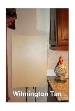

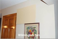
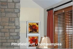
One more thing! GO BUCKS!!! Please cheer for the Buckeyes tonight as the underdogs at the Sugar Bowl vs.LSU. OH-IO!!andreaintx
16 years agolast modified: 9 years agoCarole,
Thanks, your rooms are going to look so awesome.
I was singing in the minivan after deciding that Pittsfield Buff was the right color. It has been a long time making sure I got the right color. My husband was ready to be done after the powell buff posterboard hit our dog on the head while he was sleeping. Poor BJ, I think it has left a mental scar with him. I don't think BJ or I want to see painted posterboard for a while. :)
Please post pics of your rooms when you are done.
Kathleen McGuire
16 years agolast modified: 9 years agoLooking forward to seeing BOTH your spaces! Oh, and Carole I'm in the Buckeye State as well.(Columbus) Guess it will be a late night!
polkadots
16 years agolast modified: 9 years agoCarole, sounds like you are happy and comforatble with your choices - HOORAY! I hope the painting goes well - can't wait to see the results.
squirrelheaven
16 years agolast modified: 9 years agoHow many times can a person be the 999,999 visitor on Image Shack!
Trying to pull some of the yellow out. Is this closer?
deborahnj
16 years agolast modified: 9 years agoCaroleoh, I just saw your note about the Buckeyes and had to chuckle because I just had a "Duh" moment. I thought your ID was Carol-Leoh and then realized it is Carol OH. Duh!!
Today everyone at work showed their fan support and wore OSU paraphanalia. Needless to say not much work was done today and my DH is knee deep in the game.
I think you have chosen some wonderful colors for your home. Thanks for your help today.
brutuses
16 years agolast modified: 9 years agoAll of downtown N.O. was in a non-work mode today for 2 reasons, the excitement of the game and the fact that no one could maneuver through the streets to get to their offices. I'm not into football, but enjoy watching others get so excited and having a good time.
The afternoon news was nothing but news about the partying and excitement of the game. People were standing outside one of the best sandwich shops (Mother's) for over an hour, waiting to get in. Glad it was nice weather today and not too hot or too cold.
While I'm in here talking to y'all, DH is talking to himself watching the game. Or maybe it's the cats he's talking to. I know LSU intercepted one ball, that's all I've been able to decifer. I wish both teams well.
I hope all the visitors, win or lose, go home with good memories of our city. We sure do love having them come to visit. I've lived here all my life so Mardi Gras, etc. is no big deal to me. I stay as far away from Mardi Gras as I can. As children we loved it, but after 30 or so years, it gets tiring for some, me being in that some. However, I know some people who come to visit really, really love it and that makes me happy. The best time for us is to watch the excitement of the people who are here for the first time.
deborahnj
16 years agolast modified: 9 years agoBrutuses, your DH is not the only one talking to myself. Ditto for my DH. I've been at this computer uninterrupted since the game started.
I agree I hope folks come home from NO with good memories of the city. I was there years ago and loved it.
mpwdmom
16 years agolast modified: 9 years agoI vote for Pittsfield. I fell in love w/ it the first time I saw susans02's room.
I actually have samples sheets of all three behind a photo in my hall. The MB looks too pink toned to me. Powell looks nice but again, I'm loving Pittsfield. : )
Susanmpwdmom
16 years agolast modified: 9 years ago(OT, sorry can't resist)
Brutuses, that game started very scary for us LSU folks. But now I just have one thing to say: GEAUX TIGERS! ; )
Susan
CaroleOH
Original Author16 years agolast modified: 9 years agoNo LSU posters on my thread!!! Just kidding. I live in Columbus, and both my hubby and I went to OSU. My son will be playing golf for them next fall, so we're big fans.
Quite a sad day - they just couldn't get it together when they needed to and too many penalties!
Anyways, back to more important things! Squirrel, thanks for adjusting those photos. They do look more true - except the colors are a tad darker especially the WT. I just couldn't figure out how to take the picture with my built in flash so that the color was accurate. I think the WT will be fine in the kitchen. The current nomadic desert does go better with the backsplash, but I don't like it with my window treatments or woodwork, so it's a tossup. I should have chosen a warmer backsplash, but it's too late now. :-)
Hopefully the painters are coming next week, so I'll post the finished rooms! I'm going to go with the Pittsfield in the FR - everyone seems to like that color that's posted, and while it's yellower than what I have now, I think once it's all painted the same color it will look great.
brutuses
16 years agolast modified: 9 years agoSusan, too bad the Saints don't play like the Tigers!
Carol, nice to meet you. The Bucks did a fine job. I think the hometown teams always have a slight advantage in any game. I was glad to hear a Columbus fan on the news today say the fans of LSU are intense, but polite. I was gald to hear that because I know they can get rialed and excited over their team. HA!
Unfortunately with football there can't be a tie so there always has to be a loser. Columbus is a great team and they surely have nothing to feel bad about.
snickysnacker
16 years agolast modified: 9 years agoCarol, I've been reading this thread with interest. Did you ever get the rooms painted? Would love to see pix.
:)parma42
16 years agolast modified: 9 years agoMe too. As one who has all her walls splotched up with samples of a few of the choices and a painter who keeps calling.....
msrose
16 years agolast modified: 9 years agoI recently asked her the same thing and she posted some updated pictures. Here's the link.
Laurie
Here is a link that might be useful: Carol's picture
leahwalker
16 years agolast modified: 9 years agoThis is way too weird. I've been mulling over 3 color choices for my great room. I thought I had decided on one of the three - Dunmore Cream, so I came here to search for pictures and found this thread. You'll never guess what my other two choices were. Pittsfield Buff and Monroe Bisque! I showed my husband this thread and he thought it was me joking with him. :)
My room has very similar colors to yours. My sofas are a darker/distressy leather look, it looks like we have the same wood blinds. My drapes are solid, but the same overall ruddy/rust orange color. My fireplace is tile, but it's a grayish, creamish, reddish color. The wood in my room is oak.
I'm pretty much decided on Dunmore Cream. The green undertones go well with the oak/blinds and rustic pine furniture, and it's a beautiful contrast against the rust/red colors. The more I look at Monroe the more it's too taupey, and the more I look at Pittsfield (which I LOVE), the more it's too middle of-the-road-neutral. I will probably repaint DH's bathroom with it - I painted it Applesauce Cake and hate it.
Anyway, I'm not sure Dunmore will give you the neutral light gold you're looking for, but I think it would be a great backdrop for the family of reds you have in your room.
My bedroom is Raffia Basket by Sherwin Williams. It's a retired color but they can still mix it, and I know there are tons of pics of it around. Have you looked into that color? It's a great neutral gold without being gold.
Benjamin Moore's Vellum is another neutral gold that I'm currently loving, but it's a richer color than Raffia Basket.
mpwdmom
16 years agolast modified: 9 years agoTell your husband there's way more than one thread on this color-family! Do a search and you'll find a handful. I've been going back and forth for months on the color for our master bedroom, but I'm tired of thinking. I may have to just flip a coin and paint.
Actually my decision is postponed until our new comforter from The Company Store arrives...at which time all the samples come out again to be compared next to the comforter. I know, I need to get a life. ; )
Susan
leahwalker
16 years agolast modified: 9 years agoI bought a quart of Powell Buff lastnight and painted squares all over the place (with all my sampling I HAVE to paint, or my walls will start a new trend -- CALICO!). I don't know. When I saw it in the can I thought I would love it. On the sample squares it seems to read very... "butter". Not really what I'm looking for. In others' pics it looks really buttery to me too. So back to the drawing board I guess. :(
With what I've paid in sample quarts (none of the colors I've looked at come in the little jars), I could have paid the painter bill in a few rooms!
christinak55
16 years agolast modified: 9 years agoSusan02 your rooms are beautiful. What paint(color and brand) did you use for the white trim? Did you choose semigloss or enamel?
Thankstinam61
16 years agolast modified: 9 years agoCarole - do you know the name of the fabric used for your Pate Meadow valances? The fabric with the black background? Thanks so much - your valances are just beautiful!
tina
kristyt
15 years agolast modified: 9 years agoI don't know if my last message posted so I am going to try this again.
I am newly engaged and my finace' wants to paint the interior of the house. It really needs a woman's touch and I deperately need help.
QUESTION: Is Pittsfield Buff and Monroe Bisque available at Lowes or Home Depot?
If anyone has any further suggestions for me I can email pictures.
I love everything Susans02 posted!!!
Sincerely,
Kristy



polkadots