


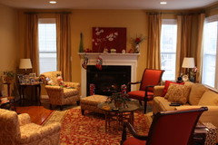
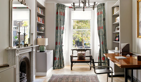
Should drapery panels be the same color as walls?
jamaraz
13 years ago
Featured Answer
Sort by:Oldest
Comments (19)

suero
13 years agoUser
13 years agoRelated Professionals
Mansfield Interior Designers & Decorators · Ridgefield Interior Designers & Decorators · Wareham Interior Designers & Decorators · Aliso Viejo Furniture & Accessories · Moraga Furniture & Accessories · Tamalpais-Homestead Valley Furniture & Accessories · Decatur Custom Artists · Egypt Lake-Leto Lighting · Miami Lighting · Sarasota Lighting · Ferndale Window Treatments · Mesa Window Treatments · Mount Pleasant Window Treatments · Orange County Window Treatments · Riverhead Window Treatmentsigloochic
13 years ago
graywings123
13 years agojamaraz
13 years agoUser
13 years ago
lisa_mocha
13 years agoppas
13 years agojerseygirl_1
13 years agojamaraz
13 years agojimandanne_mi
13 years agohoyamom
13 years agoregina_phalange
13 years agojamaraz
13 years agofranksmom_2010
13 years agocompumom
13 years agoartbyorion
13 years agoerinsean
13 years ago

Related Stories
DECORATING GUIDESDesigner Details: Banded Drapery Panels
Bands of Color Add Custom Appeal to Your Window Treatments
Full Story
REMODELING GUIDESTongue and Groove Wall Paneling Joins the Comeback Club
Try this smooth architectural move to give your walls a streamlined appearance that conveys quality
Full Story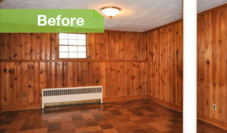
PAINTINGKnotty to Nice: Painted Wood Paneling Lightens a Room's Look
Children ran from the scary dark walls in this spare room, but white paint and new flooring put fears and style travesties to rest
Full Story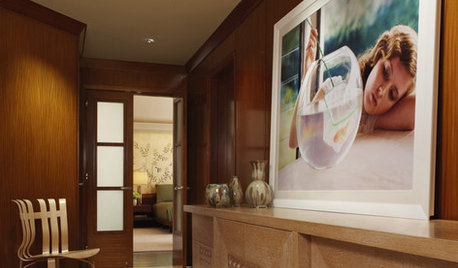
Fresh Ways With Wood Paneling
Crisp, white surfaces and accessories brighten up the dark wood wall
Full Story
How to Update Cozy Wood Paneling
See how to give fresh life to once-retro woodsy wall coverings
Full Story
DECORATING GUIDES22 Divine Draperies That Indulge and Delight
Yards of luscious fabrics, luxuriously swagged and layered, create drapes that gratify the senses
Full Story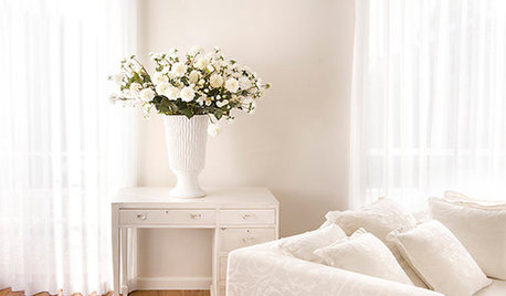
WINDOW TREATMENTSDrapery Diary: Stationary Styles
These window treatments are designed for looks instead of function
Full Story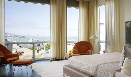
DECORATING GUIDESPick the Right Drapery Top for Your Room's Style
From rod pockets to goblet pleats, the headings of your curtains speak volumes about your attention to detail
Full Story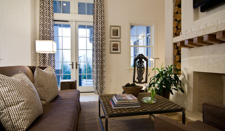
WINDOW TREATMENTSThe Case for Stationary Draperies
Curtains that open and close are great in some situations, but stationary draperies can give you a better view (and save money too)
Full StoryMore Discussions


User