


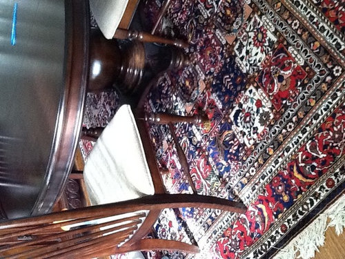
Paint color with this Oriental rug
honeybasil
11 years ago
Featured Answer
Comments (21)

honeybasil
11 years agohoneybasil
11 years agoRelated Professionals
Queens Interior Designers & Decorators · Sweetwater Interior Designers & Decorators · Tahoe City Interior Designers & Decorators · Dallas Furniture & Accessories · Shakopee Furniture & Accessories · Moraga Furniture & Accessories · Northbrook Furniture & Accessories · Northridge Furniture & Accessories · Immokalee Custom Artists · Arcadia Lighting · Green Bay Lighting · Clinton Window Treatments · Littleton Window Treatments · Rockledge Window Treatments · La Jolla Window Treatmentsyayagal
11 years agoVertise
11 years agoteacats
11 years agohoneybasil
11 years agohoneybasil
11 years agobronwynsmom
11 years agohoneybasil
11 years agogeokid
11 years agopps7
11 years agoJamie
11 years ago
Annie Deighnaugh
11 years agogeokid
11 years agohoneybasil
11 years agoJanice742
11 years agohoneybasil
11 years agoJanice742
11 years agofarmchic
11 years ago PRO
PROLori A. Sawaya
11 years ago


Related Stories
DECORATING GUIDES8 Secrets to Pairing Patterns With an Oriental Rug
Plaids, florals, stripes — a good Oriental rug can stand up to almost any other pattern. These tips can help you master the effect
Full Story
MODERN HOMESHouzz Tour: A Cubist Confection Oriented Toward Nature
Dramatic yet understated, a West Vancouver house defers to its woodland and ocean setting
Full Story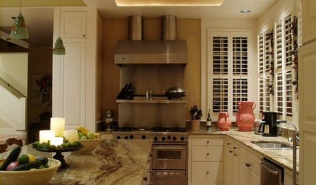
MORE ROOMSOriental Rugs Beyond the Living Room
Traditional Rugs Create a Classic Look in Unexpected Places
Full Story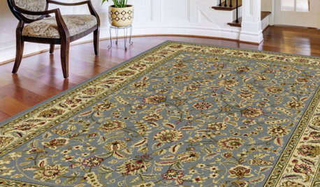
SHOP HOUZZShop Houzz: Save up to 30% on Oriental Rugs
From floral motifs to traditional patterns, save on oriental rugs through August 30, 2015
Full Story0
RUGSMake a Statement With a Bold, Artistic Rug
A rug with a strong image or pattern paints a picture on your floor while boosting your room’s style
Full Story
SHOP HOUZZShop Houzz: Unexpected Places to Use an Oriental Carpet
Add a timeless and sophisticated touch to any part of the home with a traditional carpet
Full Story
ART8 Ways Vermeer’s Work Can Make Its Mark in Your Home
Go Dutch with stained glass, Oriental rugs, checkered floors and delft tile
Full Story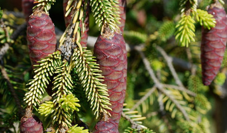
GARDENING GUIDESGreat Design Plant: Skylands Oriental Spruce, a Favorite Conifer
Brighten up a drab corner of your garden with Picea orientalis ‘Skylands’, a smaller spruce that a bird family might just call home
Full Story
DESIGN DICTIONARYOriented Strand Board
This inexpensive alternative to plywood can serve as a strong substrate material or provide an interesting finish style of its own
Full Story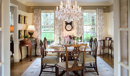
FLOORSTasteful Ideas for Traditional Dining Room Floors
Practical meets polished with these rug, tile and paint designs that have your traditional dining room floor covered
Full StoryMore Discussions


Lyban zone 4