


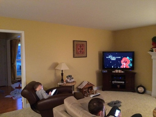
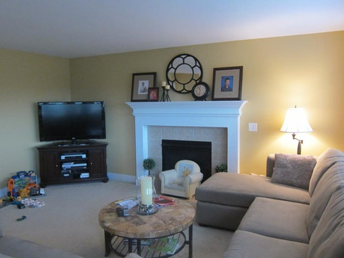
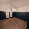
I was so distracted thinking about paint colors...
court1000
10 years ago


Sort by:Oldest
Comments (32)
Related Stories
PETSSo You're Thinking About Getting a Dog
Prepare yourself for the realities of training, cost and the impact that lovable pooch might have on your house
Full Story
COLORYou Said It: ‘Adding Color Is About So Much More Than Shock’ and More
Highlights from the week include color advice, Houzzers helping Houzzers and architecture students building community housing
Full Story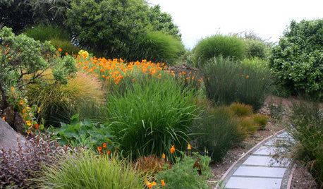
GARDENING GUIDESNew Ways to Think About All That Mulch in the Garden
Before you go making a mountain out of a mulch hill, learn the facts about what your plants and soil really want
Full Story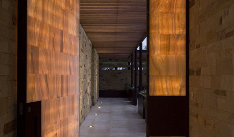
ARCHITECTUREDesign Workshop: Thinking Differently About Doors
Go beyond utilitarian openings to use doors as art, space definers and experience enhancers
Full Story
DECORATING GUIDESNo Neutral Ground? Why the Color Camps Are So Opinionated
Can't we all just get along when it comes to color versus neutrals?
Full Story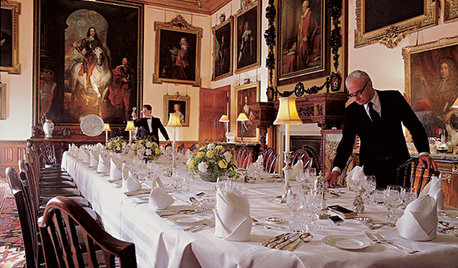
FUN HOUZZEverything I Need to Know About Decorating I Learned from Downton Abbey
Mind your manors with these 10 decorating tips from the PBS series, returning on January 5
Full Story
COLORHave You Heard the Hues? 15 Colors You May Not Know About
Name-drop these shades at holiday parties — or better, try one on your walls — and expand your palette possibilities
Full Story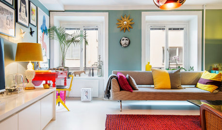
COLORBye-Bye, Minimalist White — The New Nordic Style Is All About Color
The Scandinavian color palette is moving away from pale, cool shades with hot new hues on walls and floors
Full Story
EXTERIORSHelp! What Color Should I Paint My House Exterior?
Real homeowners get real help in choosing paint palettes. Bonus: 3 tips for everyone on picking exterior colors
Full Story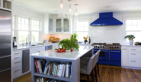
KITCHEN DESIGNSo Over Stainless in the Kitchen? 14 Reasons to Give In to Color
Colorful kitchen appliances are popular again, and now you've got more choices than ever. Which would you choose?
Full Story

court1000Original Author
Oakley
Related Professionals
Clinton Township Interior Designers & Decorators · Bend Furniture & Accessories · Madison Furniture & Accessories · Norwalk Furniture & Accessories · St. Louis Furniture & Accessories · Wilmington Furniture & Accessories · Woodbury Furniture & Accessories · Tucker Furniture & Accessories · Diamond Bar Lighting · Kendall Lighting · San Francisco Lighting · Aurora Window Treatments · Colorado Springs Window Treatments · Gadsden Window Treatments · Walnut Creek Window Treatmentscourt1000Original Author
Sueb20
Annie Deighnaugh
court1000Original Author
springroz
Bunny
chispa
sarahandbray
juliekcmo
kellienoelle
nosoccermom
indygo
court1000Original Author
court1000Original Author
nosoccermom
chispa
noellabelle
patricianat
sis2two
carolt924
nhb22
WendyB 5A/MA
susanilz5
Holly- Kay
sweet_tea_
cms_az
court1000Original Author
chispa
annkh_nd
WendyB 5A/MA