


MBA Tile layout ideas?
mtnrdredux_gw
10 years ago
Sort by:Oldest
Comments (11)
Related Stories
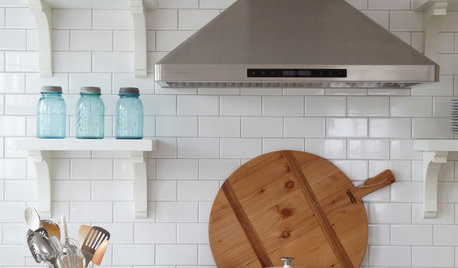
TILEHow to Choose the Right Tile Layout
Brick, stacked, mosaic and more — get to know the most popular tile layouts and see which one is best for your room
Full Story
KITCHEN DESIGNKitchen Layouts: A Vote for the Good Old Galley
Less popular now, the galley kitchen is still a great layout for cooking
Full Story
MODERN ARCHITECTUREThe Case for the Midcentury Modern Kitchen Layout
Before blowing out walls and moving cabinets, consider enhancing the original footprint for style and savings
Full Story
HOUZZ TOURSHouzz Tour: A New Layout Opens an Art-Filled Ranch House
Extensive renovations give a closed-off Texas home pleasing flow, higher ceilings and new sources of natural light
Full Story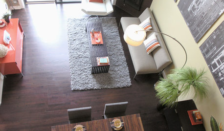
DECORATING GUIDESHow to Plan a Living Room Layout
Pathways too small? TV too big? With this pro arrangement advice, you can create a living room to enjoy happily ever after
Full Story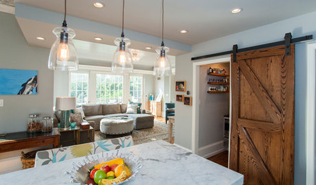
KITCHEN DESIGNKitchen of the Week: Barn Wood and a Better Layout in an 1800s Georgian
A detailed renovation creates a rustic and warm Pennsylvania kitchen with personality and great flow
Full Story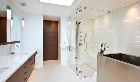
BATHROOM DESIGNRoom of the Day: New Layout, More Light Let Master Bathroom Breathe
A clever rearrangement, a new skylight and some borrowed space make all the difference in this room
Full Story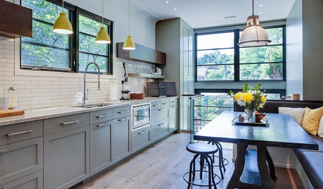
KITCHEN DESIGNKitchen of the Week: More Light, Better Layout for a Canadian Victorian
Stripped to the studs, this Toronto kitchen is now brighter and more functional, with a gorgeous wide-open view
Full StoryHOUZZ TOURSHouzz Tour: Pros Solve a Head-Scratching Layout in Boulder
A haphazardly planned and built 1905 Colorado home gets a major overhaul to gain more bedrooms, bathrooms and a chef's dream kitchen
Full Story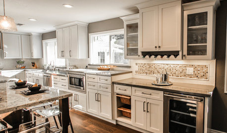
KITCHEN OF THE WEEKKitchen of the Week: More Storage and a Better Layout
A California couple create a user-friendly and stylish kitchen that works for their always-on-the-go family
Full Story


joaniepoanie
mtnrdredux_gwOriginal Author
Related Professionals
Brooklyn Furniture & Accessories · Carlsbad Furniture & Accessories · Rome Furniture & Accessories · St. Louis Furniture & Accessories · Thousand Oaks Furniture & Accessories · Richfield Furniture & Accessories · Silver Spring Furniture & Accessories · Lake Magdalene Furniture & Accessories · North Bellmore Furniture & Accessories · Chapel Hill Custom Artists · Summerville Custom Artists · Jefferson Valley-Yorktown Lighting · Palm Springs Lighting · Scottdale Lighting · Dallas Window Treatmentsjmc01
suero
ineffablespace
Annie Deighnaugh
joaniepoanie
mtnrdredux_gwOriginal Author
Lyban zone 4
mtnrdredux_gwOriginal Author
suero