Shop Products
Houzz Logo Print
itltrot_gw

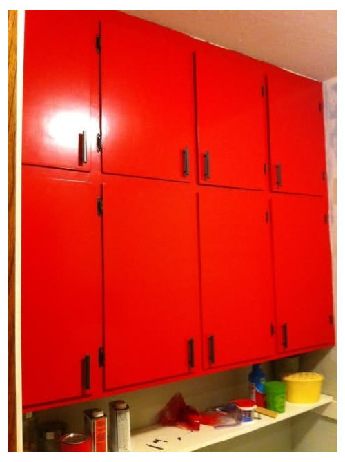
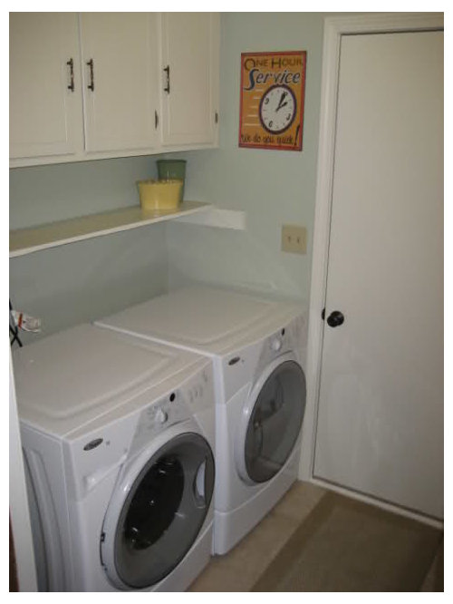
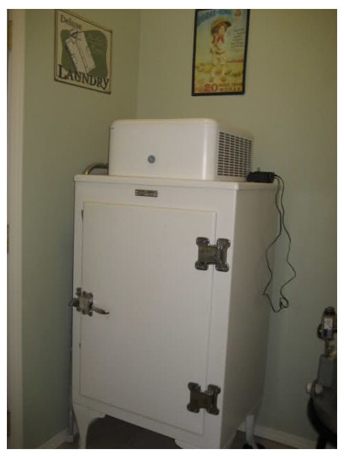
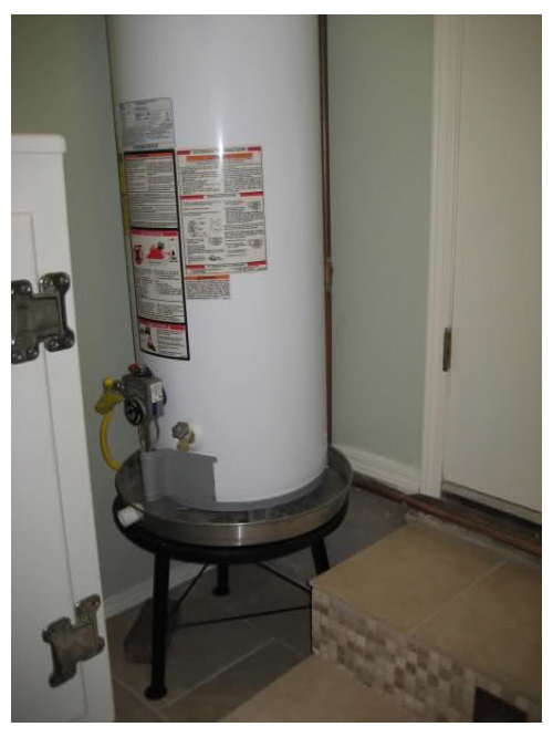
Mid Project Panic and Second Thoughts.....

itltrot
12 years ago

I'm in the middle of redoing my laundry room. My heart sings for red, especially red appliances. However, my check book says no way so I painted my cabinets red. The red is very bold and bright and shiny. Maybe to shiny.

I thought I had a plan for wall paint and a little mosaic backsplash but now I'm scared it's to much. I need some direction on where to go with wall color. The green walls make me think Christmas and the blue makes me think Americana theme. Neither are the looks I am going for.

It is a tiny 5'5" x 8' room with zero natural light. The tile floors are beige toned and the wood work is SW Dover White. Cabinets are SW Safety Red.

And here are the pictures. Excuse the cell phone quality.

Red Cabinets minus crown.

Laundry room with previous SW Liveable Green


Proposed tile and paint color but mixed down 50%

Laundry rug

Other details

Flooring

I thought about just going white but there is already so much white with appliances. Maybe creamy white or beige? I'd appreciate any suggestions or comments. Thanks!

Comments (25)

  • teacats
    12 years ago

    I do vote for fresh clean white tile mixed with a thin line of coppery-glassy tile to work with the accents in the floor tile.

    Yep -- a basic fresh white paint too. Easy to touch up in the future ....

    Your room will look fresh and bright with LOTS of color from the rug, accents and cabinets!

  • andreadeg
    12 years ago

    You might try a glaze on top of the red cabinet paint to deepen the color and tone it down a bit.

    For wall color...how about yellow?

  • springroz
    12 years ago

    Maybe you need to antique the cabinets? I LOVE the fabric, but i don't know how those cute blue ovals are going to fit in. Not that they won't, I just can't picture it!

    Sorry I can't be more help.....

  • itltrot
    Original Author
    12 years ago

    Teacats, I've been thinking a lot of white tile or as odd as it sounds using pennies to tie in the copper. I wanted something with a little sparkle.

    andrea & spring, I'll look into options for glazing or antiquing. I really wanted a semi-gloss look but the red was only available prepackaged gloss.

  • ttodd
    12 years ago

    I think white walls or walls that have a whisper of blue to them would look lovely! The rug, cabinets and light will make your room sing!

  • deeinohio
    12 years ago

    I was going to suggest the same as ttodd: something white with a whisper of blue.

    BTW, would you share your source for the seagrass laundry basket? I love that one and need a new one.
    Dee

  • teacats
    12 years ago

    Ah! That kind of backsplash (pennies!) was featured in a posting at the blog Cote de Texas -- a wonderful guest house in Texas .... great fun idea! :)

    Just adding my two cents ....... LOL! :)

  • itltrot
    Original Author
    12 years ago

    ttodd and dee, I'll look into whispery blues.

    The basket is from Pier1, the water hyacinth version. But I'm not sure I can recommend it. I put it in my trunk and when I got home I picked it up by the handle and a very large chunk of material broke off. Of course I live an hour from the store and they were out when I called to tell them mine broke. I haven't decided if I'll get a replacement or refund.

    I'll check out the post on Cote de Texas.

    Two cents...haha. :)

  • LuAnn_in_PA
    12 years ago

    I know I guy here in PA that did a whole family room wall with pennies back in the 70s...

    and it STILL looks good!

  • deeinohio
    12 years ago

    Thanks for the info - that's not good, but it sure is purty!
    Dee

  • Carol_from_ny
    12 years ago

    I like the red cabinets. What's not working for me are the cabinet pulls. They are too angular. You need something with some bling and some curve to it.
    The rug is wonderful. I'd pull a yellow off it and do the walls in that. Since you seem to like antiques for a backsplash I'd go with tiles in the original Fiestaware color line. Red, yellow, colbalt blue, turquoise, a bit of cream.

  • les917
    12 years ago

    See the turquoise color in the rug, at the center of those two flowers? That is your wall color. The two are stunning together.

    Then I would do white tile. It will be crisp and fresh with the turquoise and red. Plus, if you decide down the line to change the cabinet or wall colors, you aren't locked in by the tile.

  • User
    12 years ago

    I adore red, so red cabinets sound great to me. However, on my screen your color is not a true red, it has more of an orangey/coral cast. It does not look like the red in the rug at all. Have you thought about trying a few other shades of red ?

  • lilybug46
    12 years ago

    Entirely agree with the suggestion of the tourquoise wall colour with the red cabinetry. It will look gorgeous!
    I'm trying to work that exact colour scheme into my new old home somewhere-possibly laundry room too.

  • itltrot
    Original Author
    12 years ago

    Let me first state the colors in the rug are slightly different in real life.

    les, the turquoise is the original color I planned on using. When the rug arrived the color was not as light as in the picture. If you have a SW paint deck it matches closest to SW 6769 Maxi Teal. That color is way to dark to put in that room which is smaller than most walk in closest and has NO windows and NO natural light. But I agree wholeheartedly those colors look great together.

    Here are a couple inspirations pics of the red and turquoise/aqua.

    kswl, the red in that picture is very skewed. It is a true red and doesn't lean orange or burgundy. The picture was taken with a camera phone and flash at 10pm at night so there was no way to get a true picture of the color. There are actually a couple shade of red in the rug and this does work well with one of the reds despite the pictures.

    I'll try to take some more accurate pictures with my grown up camera. Cell cameras are just so handy at times.

    But here are a couple more pictures of the red again with the cell camera. Maybe these will be more helpful.

  • always1stepbehind
    12 years ago

    I didn't read all the replies, but I did see the suggestion of a glaze. My first thought was to go over it with stain to tone it down...I've never worked with glaze but I have done stain over painted furniture.

  • yayagal
    12 years ago

    I would still use a turquoise color but make it lighter. You don't have to have the exact tone of a color. I agree with Les that white tiles would bring it all together. I love all your ideas so far, keep on going and show us the results.

  • desertsteph
    12 years ago

    find that turquoise on the paint strip then go a few shades lighter.

    if you don't like the gloss of the cabinets how about putting a satin clear coat on it?

    I think the cabinet handles are fine but if you want to lighten it up, how about these?

    Here is a link that might be useful: cabinet pulls

  • itltrot
    Original Author
    12 years ago

    I guess I don't understand tone and shade like I thought I did. It confuses me to think I can take a color and make it lighter but it'll still be the same color.

    Anyways, I'm headed to the paint store at lunch to pick up a couple sample pots of paint for the laundry room and the guest room. I've got a coupon that expires this weekend so I'd like to get the paint chosen.

    I'll be back with pictures tonight of the sample colors.

    steph, thanks for the ides of the satin clear coat. That might be a possibility. I'd rather do that than glaze it.

    Those are fun handles. I'll keep them in mind if I decide to change mine later on. For now, they aren't a big concern. The paint is driving me nuts!

  • lizzie_grow
    12 years ago

    I was going to suggest a teal/turquoise, too. I love your cabinets & rug! I also like the idea of a "whisper" blue with teal and red accessories...kinda like your inspiration photo. My only concern is if that goes with the flooring. I suppose you could do a neutral with some oomph to it to tie in the flooring and then use red, turquoise, and yellow accessories and tie in the rug that way.

    Please post when you finish it!!

  • itltrot
    Original Author
    12 years ago

    The paint saga continues. The red is such a strong color it reflects off the white samples making them pink/purple. The light teal is baby blue against the red. The deep turquoise overwhelms the space fighting with the red. Beige looks brown.

    DH thinks grey but grey is not a cheerful color to me so I don't want a color like that in an already small space that I don't enjoy being in. I'm looking towards a yellow. I need to get a couple colors picked out and head to the store.

    Wish me luck. I'll try to make a post later with the color samples. My Internet isn't working this morning so I'm posting this from my phone.

  • lizzie_grow
    12 years ago

    What about wyeth (sp) blue (BM)? Or RH silver sage or sea green? They're more subdued, but still have enough depth to work off the beautiful cabinets.

  • itltrot
    Original Author
    12 years ago

    Got the internet now... Here are the 2 blues I picked up yesterday and a couple beige I had on hand.

    The pictures are without flash and with the actual lighting in the room. I thought I was more representative of the space that way. The door and trim is SW Dover White for reference.

    First blue is SW Tame Teal

    Second blue is SW Aquarium which is 2 colors lighter than the blue in the rug.

    First beige is SW Nantucket Dune

    Second beige is SW Practical Beige

    That's all for now.

  • cindyloo123
    12 years ago

    Whoa. I think the room is way too small to use any kind of strong color on the walls with those cabinets.

    I'd keep the walls neutral myself. White, beige, or grey. Even a light yellow would be too much I think. Use the colors in the rug to accent.

  • lizzie_grow
    12 years ago

    Out of those, I like the Tame Teal. If you are looking at SW paints, and interested in a yellow, look at Jersey Cream. We used it on the exterior of our house with Dover White trim. Really a pleasant yellow & yellows are hard...I know from personal experience!! Keep at it!