


accent wall color and other decorating dilemnas!
WendyB 5A/MA
10 years ago
Sort by:Oldest
Comments (12)
Related Stories
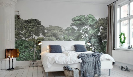
DECORATING GUIDES13 Stylish Ways to Accent a Bedroom Wall
From tried-and-true favorites to the latest textures, these creative ideas can strengthen your bedroom’s design
Full StoryDECORATING GUIDESThe Case for the Anti-Accent Wall
Go ahead, paint everything the same color (even the trim)
Full Story
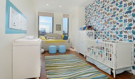
KIDS’ SPACES12 Dreamy Accent Walls for Baby’s Room
Subtly sophisticated to full-on fantasyland, these painted and papered walls give a child an imaginative start
Full Story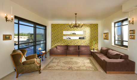
WALL TREATMENTSGetting the Accent Wall Right
Celebrate a Glorious Color or Material Without Overpowering Your Space
Full Story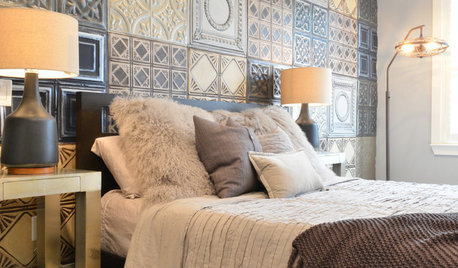
WALL TREATMENTSIdea of the Day: Tin Tiles Create a Striking Accent Wall
A bachelor's bedroom has the industrial style he loves but also is warm and comfortable
Full Story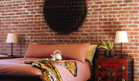
MORE ROOMSOne-of-a-Kind Decor for Above the Bed
That Headboard Wall: It's the Perfect Spot for an Accent All Your Own
Full Story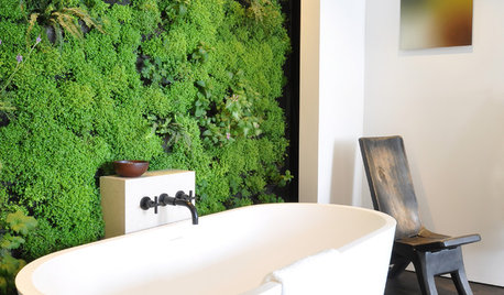
HOUSEPLANTSBaby Tears Mimics Moss for a Green Accent Indoors
This adaptable spreader thrives in water or soil, making it a terrific addition to containers and living walls
Full Story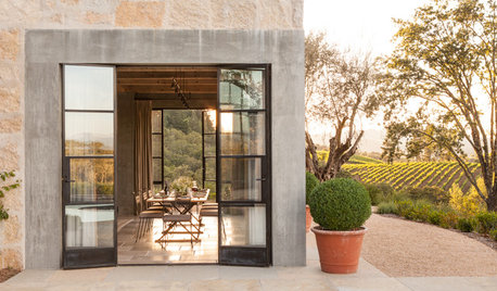
RUSTIC STYLEHouzz Tour: A California Country Home With a French Accent
A new house mixes modern touches with the timeless beauty of stone walls, rustic doors, old olive trees — and vineyards all around
Full Story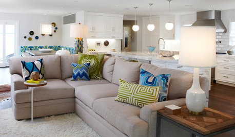
DECORATING GUIDESHow to Get Your Accent Pillows Right
Weekend Project: Pull your living room together with the perfect combination of decorative pillows
Full StorySponsored
Leading Interior Designers in Columbus, Ohio & Ponte Vedra, Florida
More Discussions


Annie Deighnaugh
amykath
Related Professionals
Barstow Interior Designers & Decorators · Bloomingdale Interior Designers & Decorators · Clinton Township Interior Designers & Decorators · Fort Smith Interior Designers & Decorators · Struthers Interior Designers & Decorators · Van Wert Interior Designers & Decorators · Athens Furniture & Accessories · Augusta Furniture & Accessories · Chaska Furniture & Accessories · Culver City Furniture & Accessories · Decatur Custom Artists · La Jolla Lighting · Pearland Lighting · Channahon Lighting · Colorado Springs Window TreatmentsWendyB 5A/MAOriginal Author
WendyB 5A/MAOriginal Author
junco East Georgia zone 8a
WendyB 5A/MAOriginal Author
Olychick
teacats
patty_cakes
junco East Georgia zone 8a
WendyB 5A/MAOriginal Author
patty_cakes