


Has anyone used Farrow & Ball Powder Blue?
Sueb20
16 years ago
Related Stories
COLOR4 Cool Paint Colors Touted for 2014 — and How to Use Them
Muted but complex, these hues from Farrow & Ball can stand on their own or play supporting roles
Full Story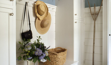
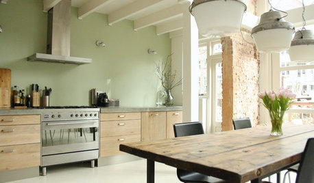
MUDROOMSThe Cure for Houzz Envy: Mudroom Touches Anyone Can Do
Make a utilitarian mudroom snazzier and better organized with these cheap and easy ideas
Full Story
DECORATING GUIDESColor Guide: How to Use Light Blue
Whether you call it powder, sky or baby blue, this ultratraditional color lends fresh-faced appeal
Full Story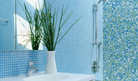
COLORBathed in Color: When to Use Blue in the Bath
Look skyward or to the waters in nature for a soothing, spa-like bathroom
Full Story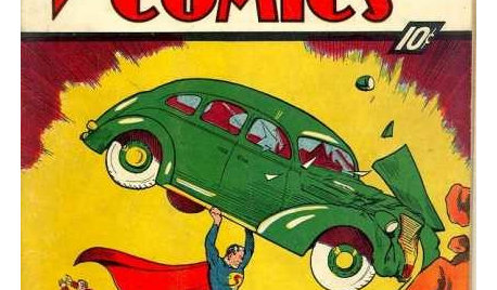
REMODELING GUIDESOne Guy Found a $175,000 Comic in His Wall. What Has Your Home Hidden?
Have you found a treasure, large or small, when remodeling your house? We want to see it!
Full Story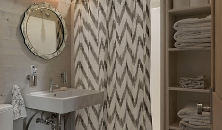
BATHROOM DESIGNThe Cure for Houzz Envy: Bathroom Touches Anyone Can Do
Take your bath from blah to ‘ahhhh’ with just a few easy and inexpensive moves
Full Story
COLORBest Uses for the Boho Blue Color of 2015
PPG Pittsburgh Paints’ Color of the Year is a bold bohemian blue best used in small doses
Full Story
COLOR10 Reasons to Use Sky Blue
This versatile color can look fresh or timeless, beachy or polished. Check out ways to use sky blue indoors and out
Full Story
BLUEColor Guide: How to Use Navy Blue
Solid, steadfast navy blue can ground a room, but it still knows how to have a good time
Full Story
COLORBest Uses for the Saturated Blue Color of 2015
Kelly-Moore’s selection is a classic shade of blue worthy of chunky accents around the home
Full StoryMore Discussions


rococogurl
lisamaria
Related Professionals
La Habra Interior Designers & Decorators · Long Beach Furniture & Accessories · Paramus Furniture & Accessories · Topeka Furniture & Accessories · Tucson Furniture & Accessories · Wilmington Furniture & Accessories · Carson City Furniture & Accessories · Hilton Head Island Furniture & Accessories · Hoboken Furniture & Accessories · Sudbury Furniture & Accessories · Chapel Hill Custom Artists · Florida City Lighting · Venice Lighting · Huntington Beach Window Treatments · New Baltimore Window Treatmentsjudithn
rococogurl