Shop Products
Houzz Logo Print
inspiredisabel

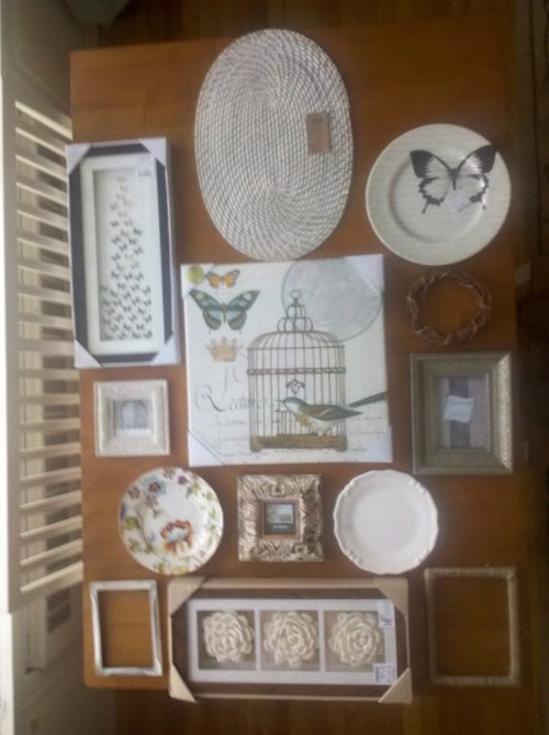
Does this wall arrangement look ok?

inspiredisabel
13 years ago

I have a small wall section above a radiator on my 2nd floor and I want to hang this arrangement above it. The wall is about 6 inches bigger on each side than this table I have everything pictured on. I have fiddled with it and I think it looks good now - do you have any suggestions? Does something not look right, or uneven?

Thanks!

Comments (35)

  • Carol_from_ny
    13 years ago

    I think every thing looks squeezed into too tight a configuration. There's way too many pieces for the amount of space even given you have six inches more all around on the wall space. I'd loose the oval mat, the round wreath and the two plates on the bottom.

  • inspiredisabel
    Original Author
    13 years ago

    Thanks for the comments Carol!

    I just wanted to post an inspiration photo...

    I like this look where it is a full arrangement and my radiator below would "act" as this console table does.

  • User
    13 years ago

    Love the inspiration picture, the colors look great.

    What I dont like about your arrangement are the round objects, I would stick to rectangular and square ones.

  • inspiredisabel
    Original Author
    13 years ago

    roseabbey - thanks! do you suggest rectangular and square only because the overall arrangement would look better?

  • busybee3
    13 years ago

    i agree about the round objects, with the exception of the butterfly plate...i would work that into your arrangement.
    you could probably work out the arrangement with all the plates, but definitely remove the wreath and placemat...

  • bettymnz4
    13 years ago

    In the inspiration wall, the perimeter objects form a rectangle or square; try rearranging your items so there are no "gaps" along the perimeter (two examples on your arrangement are to top "line" and the second to the bottom row).

    I would also put the large, GORGEOUS bird print along the bottom edge (similar to how the inspiration photo has their largest piece). The oval mat looks "off" to me; try it horizontally. Is the one plate too white?

    Various shapes in this type of arrangement can be visually stunning when the scale and color tones complement the other items.

  • inspiredisabel
    Original Author
    13 years ago

    hmm.. ok rearranged a bit and edited... not sure about it. I just bought all this stuff yesterday but playing with it will tell me what I am lacking.

    Thanks for the replies - they are so helpful!

  • User
    13 years ago

    I like what you have done in your last photo except the top row. I would loose the plate look for something else. Move the middle one down a bit.

  • Boopadaboo
    13 years ago

    I like the first one better. :) Only thing that looked off was the whit oval item. Can you put the collage frame where that was?

  • Ideefixe
    13 years ago

    In the inspiration photo, the objects vary not only in shade, but also in texture. Everything on your wall looks new. I think that incorporating something faded, chipped (artistically, not damaged), worn or a little bit tarnished would make the arrangement more interesting.

  • busybee3
    13 years ago

    try putting the butterfly plate more towards the middle, the frame at top right to top left, the flower triage vertically, and move the middle frame so that it's top doesn't jut too far above the other pieces...??? not sure i like the 2 open frames...maybe just one???(or one within the other?? or something small(like a big key, or a plaque, or a butterfly cutout) within each...?)(lets see what something like that looks like-i have trouble visualizing...)

  • les917
    13 years ago

    I like the last arrangement much better, but I would move the big art print up to where the horizontal three framed piece is in the middle, after removing that piece (three cabbage roses, perhaps?) and eliminating it. That frame shape and size is too similar to the black and white butterfly one, which I think you should keep as it works well with the butterfly plate in black and white.

    Now you will have open space below the print you moved up, and I would bring back the plate with the colorful printed design. Then I would look for something textural, along the ideas of your little wreath, but with more substance. Not necessarily round, but just natural in feel and more textural.

  • TxMarti
    13 years ago

    I like your second arrangement better of the two. In fact if you left off the top three items, I think it works really well.

    But if you want it bigger, there's something about the top row that doesn't work for me. I like the birdcage picture in the corner and the tall butterfly picture on the other corner. I'm not crazy about the collage picture because it seems like a collage within a collage. I wonder if you used your three plates and the little wreath in a square in the top left corner and the three rose picture over the two small square pictures in the top right, if it would look more cohesive.

  • msrose
    13 years ago

    I'm not crazy about the oval thing that looks similar to a placemat, but I really like the round plates mixed in. The last arrangement looks better than the 1st because it's less cramped, but it still has an empty space up at the top. Maybe you could add in the other two plates somewhere and help eliminate that space.

    Laurie

  • prairiegirlz5
    13 years ago

    I agree with marti that that second arrangement minus the top row looks better than the first one. BUT Remember to line up the edges. When you're placing the objects on the wall, the bottom edges should all line up. Your eye takes in all the details once they are organized within a recognizable shape, otherwise it looks "off".

    I think the roses work because they are mounted within squares, mounted within a rectangle. That works with all of the ivory frames and the rectangular butterfly print.

    I do like the plates, esp. love the butterfly and poppy plates. The wreath shape is too organic. I think it needs to be more uniformly round to work with the other plates.

    The oval mat and collage frame don't work for me; but I would like to see the plates and possibly a rounder, twiggier wreath (suggestive of a bird's nest?) worked into the mix. I would like to keep the silvery frame as well, but I don't think the mat color works with the composition. Maybe put an old sepia photo or mirror inside instead, and turn it the other way? Really nice pieces, did you find them all at the same place? Lucky girl.

  • inspiredisabel
    Original Author
    13 years ago

    thanks so much for all the comments! My head was spinning reading through all the changes to try, lol : P

    ok - so I made a couple of things to fill up the previously blank frames, still a couple more to go.

    any better?!

  • allison0704
    13 years ago

    I like a mix of pictures and items on a wall. I just finished one for DD2 last week - pictures and how I did it below. Hope it helps you get yours just right!

    Here is a link that might be useful: informal picture wall

  • kjmama
    13 years ago

    It just keeps getting better:)

  • juddgirl2
    13 years ago

    I like the last arrangement. The outside perimeter and spacing between items are more even.

    Love the inspiration photo. It's giving me ideas for the space under the table in my foyer.

  • prairiegirlz5
    13 years ago

    I really loved the empty frames, more interesting to my eyes.

    Try moving the wrapped frame from the bottom right to the top right. And stacking the two short white frames on the top left? Frame the white plate on , say, a burlap mat and try that in the lower right corner. Stay with it, it looks stunning so far.

  • cyn427 (z. 7, N. VA)
    13 years ago

    That looks much better! Still, I would try the white oval frame at the top right, with the two small squares next to each other and the round butterfly plate where the oval frame is now or I might actually leave off the entire top row...or maybe not-lol.

    Anyway, you are absolutely getting there and if you stop now, it will look fine.

  • IdaClaire
    13 years ago

    Isn't it funny how different eyes just see things ... differently? I don't care for the open frames at all; then again, I've never been a fan of that look - just hanging an empty frame to fill in space. I do think you're on the right track with your last arrangement, but if it were me, I'd sure look for something to fill those empty frames with. Vintage botanicals would be nice.

  • inspiredisabel
    Original Author
    13 years ago

    ha ha thanks for the help!

    last one for the night with... empty spot for??? Gives me something to look for tomorrow!

  • inspiredisabel
    Original Author
    13 years ago

    thanks aunt jen!

    I like the open frames but I do also like them filled. If I start of with them empty and I happen upon the right print then I know I have a spot for it! ; )

  • TxMarti
    13 years ago

    inspiredisabel, I think you've got it with this last picture! You don't have an antique item to put in that spot do you?

  • prairiegirlz5
    13 years ago

    I actually like the last composition, the one before this one, best. I had to copy them and place them side-by-side to see why. I think the oval & wrapped frames should stay empty, and the butterfly plate needs to stay at the top of the composition. The wreath might look good in place of the small white frame on the top right. I don't like the pair of them on either side. Love the effect!

    Oh, I wanted to tell you that I saved the exact same inspiration photo.

  • User
    13 years ago

    I just did a side by side of the last two and can't decide which I like better, lol. Both look good to me.

  • ctlane
    13 years ago

    I really like the very last one, you just need to find something to fill that one spot.

  • bettymnz4
    13 years ago

    Yesssssssssssssssssss to the last arrangment. (When you find something for the lower right frame, the item should be light in color imho.

  • busybee3
    13 years ago

    i like the very last one best too...i would try to find maybe a 3-d object to put in the empty space and would also try to find something to put within the empty frame on the bottom right....not a print...a small, interesting plate, a letter or word, or i keep thinking some 3-d butterfly cutout of some type. it's neat to see the wall coming together!

  • inspiredisabel
    Original Author
    13 years ago

    I really am liking the last 2 also!

    martia8 - I don't have anything immediate that I can think of... will need to trek down to our barn but there is about 2 feet of snow blocking my way! I think finding something sorta flat-ish might be an issue.

    prairiegirlz- I definitely like the oval one empty and probably the twine wrapped one too. The twine one was just a thin ugly frame I painted so I just wrapped it - I love the texture of it!

    shesharee - ctlane - betty - thanks for your input! : )

    busybee - fantastic idea with a word or letter! I only have a small aluminum w to fit but it looked way too chunky. I will keep looking! Thanks!

  • Olychick
    13 years ago

    It looks great and I'm sure you'll find the perfect thing for your last spot. Have you thought of a 3d bird sculpture, since you have some in your china cabinet? I was thinking a small shelf, but even like how they've displayed this one on a block of wood (perhaps a bit too rustic for your look). this one is from Etsy

  • prairiegirlz5
    13 years ago

    A letter would look great; I think a lower-case "b" would go with the bird and butterfly theme!

  • prairiegirlz5
    13 years ago

    Meant to add, great job wrapping the frame! I can't wait to see the wall when everything is hung.

  • inspiredisabel
    Original Author
    13 years ago

    olychick - oh my gosh that little carved bird is super cute! thanks for sharing... I just might look it up. love Etsy btw!

    prairie - thanks about the frame! : )