


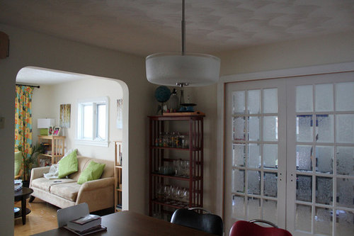
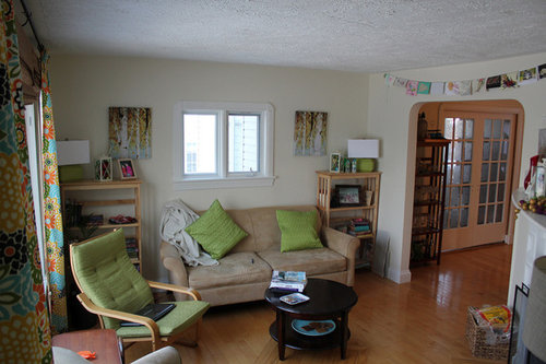
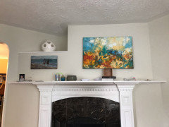
Something between BM Edgecomb and Titanium...
robo (z6a)
10 years ago
Featured Answer
Sort by:Oldest
Comments (30)

robo (z6a)
10 years ago
patiencenotmyvirtue
10 years agoRelated Professionals
Rosaryville Interior Designers & Decorators · Augusta Furniture & Accessories · Chicago Furniture & Accessories · Dallas Furniture & Accessories · Memphis Furniture & Accessories · Miami Furniture & Accessories · Nashville Furniture & Accessories · West Palm Beach Furniture & Accessories · Hilton Head Island Furniture & Accessories · San Diego Furniture & Accessories · Lake Magdalene Furniture & Accessories · York Lighting · East Setauket Window Treatments · Rockledge Window Treatments · Tennessee Window Treatmentsrobo (z6a)
10 years agopatiencenotmyvirtue
10 years agorobo (z6a)
10 years agorobo (z6a)
10 years agosjhockeyfan325
10 years agorobo (z6a)
10 years agochispa
10 years agopeony4
10 years agorobo (z6a)
10 years ago
Annie Deighnaugh
10 years agorobo (z6a)
10 years ago
done_again_2
10 years agoAnnie Deighnaugh
10 years agorobo (z6a)
10 years agorobo (z6a)
10 years agocrl_
10 years agodaisychain01
10 years agorobo (z6a)
10 years ago
Kathy Stuart
5 years agoEmmaNJ
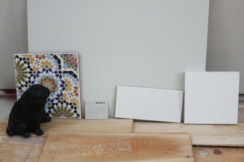
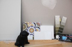
4 years agorobo (z6a)
4 years agorobo (z6a)
4 years agorobo (z6a)
4 years agorobo (z6a)
4 years agorobo (z6a)
4 years agorobo (z6a)
4 years ago
Related Stories

WHITEHow to Pick the Right White Paint
White is white, right? Not quite. See 8 white paint picks for 8 very different effects
Full Story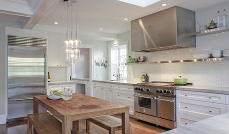
KITCHEN DESIGNCooking With Color: When to Use White in the Kitchen
Make sure your snowy walls, cabinets and counters don't feel cold while you're riding white's popularity peak
Full Story
TRIMTrim Color Tips: Get Your White Trim Right
Set off wood tones, highlight architectural features, go minimalist ... white trim is anything but standard when you know how to use it
Full Story
GRAYChoosing Paint: How To Pick the Right Gray
Which Version of Today's 'It' Neutral Is For You?
Full Story
DECORATING GUIDESThe Case for In-Between Colors
These mutable hues defy easy description, but their appeal all around the home isn't hard to get
Full Story
DECORATING GUIDESGet the Scoop on Finding the Best Paint for Your Money
Scoring the best deal on paint for your home may have nothing to do with advertised specials
Full Story
MOST POPULAR50 Shades of Gray
Gray is hotter than ever, thanks to a hit novel full of risks and dark secrets. Tell us: Which paint shade possesses you?
Full Story
EXTERIOR COLORExterior Color of the Week: 7 Ways With Warm Gray
See why this hue can be the perfect neutral for any house
Full Story
DECORATING GUIDESColor of the Week: Decorating With Warm Gray
Tired of tan? Getting gloomy from cool gray? Make warm gray your new go-to neutral
Full Story
COLORColor of the Year: Off-White Is On Trend for 2016
See why four paint brands have chosen a shade of white as their hot hue for the new year
Full StoryMore Discussions


chispa