


Paint colors for very open floorplan?
OOTM_Mom
10 years ago
Related Stories

WHITEHow to Pick the Right White Paint
White is white, right? Not quite. See 8 white paint picks for 8 very different effects
Full StoryROOM OF THE DAYRoom of the Day: Right-Scaled Furniture Opens Up a Tight Living Room
Smaller, more proportionally fitting furniture, a cooler paint color and better window treatments help bring life to a limiting layout
Full Story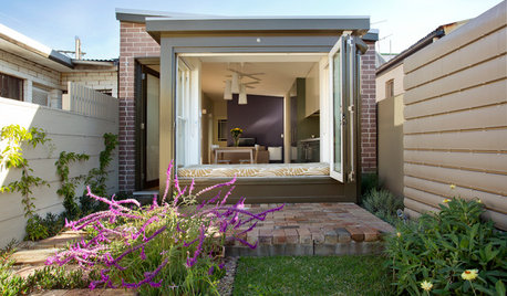
HOUZZ TOURSHouzz Tour: A Victorian Cottage in Sydney Opens Up
Colors, not walls, now define spaces in this once-dreary home — and the new airy garden overlook helps too
Full Story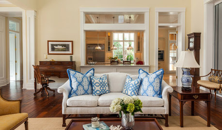
COLORThe Best White and Pastel Colors for Every Kind of Natural Light
Understand how sunlight affects your rooms and get tips on choosing paint colors for each type of exposure
Full Story
CURB APPEAL5 Bright Palettes for Front Doors
Splash bold green, blue, orange or red on your front door, then balance it with a more restrained hue on the rest of the house
Full Story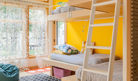
COLORDreaming in Color: 8 Eye-Opening Yellow Bedrooms
Start your day energized and cheerful with bedroom hues that sing of sunshine or golden fields
Full Story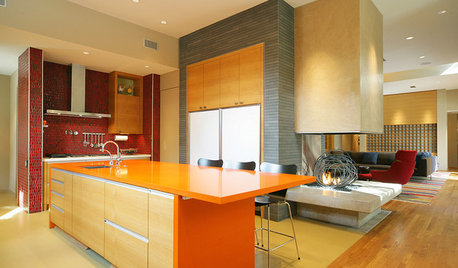
KITCHEN DESIGNPalatable Palettes: 8 Great Kitchen Color Schemes
Warm and appetizing or cool and relaxing? These 8 paint palettes can help you choose the best colors for your kitchen
Full Story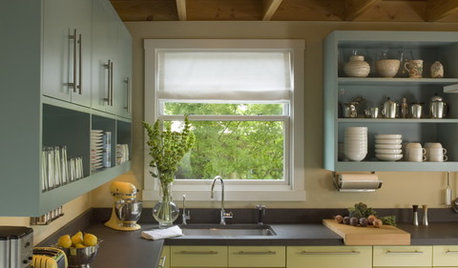
MOST POPULAR8 Great Kitchen Cabinet Color Palettes
Make your kitchen uniquely yours with painted cabinetry. Here's how (and what) to paint them
Full Story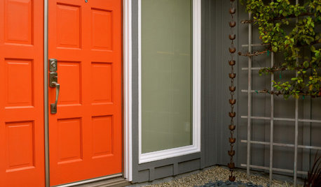
MOST POPULARHow to Choose a Front Door Color
If choosing a door paint isn't an open-and-shut case for you, here's help
Full Story
COLOR4 Hot Color Trends to Consider for 2013
Bring some zing to your rooms for the new year, with high-energy shades that open the eyes and awaken the spirit
Full Story


Annie Deighnaugh
OOTM_MomOriginal Author
Related Professionals
Chambersburg Furniture & Accessories · Dallas Furniture & Accessories · Denver Furniture & Accessories · Memphis Furniture & Accessories · North Myrtle Beach Furniture & Accessories · Rockville Furniture & Accessories · Tampa Furniture & Accessories · Fargo Furniture & Accessories · Discovery Bay Furniture & Accessories · Mundelein Furniture & Accessories · Zionsville Furniture & Accessories · Short Hills Furniture & Accessories · Baldwin Park Lighting · San Francisco Lighting · Bell Window TreatmentsOOTM_MomOriginal Author
OOTM_MomOriginal Author
OOTM_MomOriginal Author
OOTM_MomOriginal Author
OOTM_MomOriginal Author
WendyB 5A/MA
WendyB 5A/MA
OOTM_MomOriginal Author
Annie Deighnaugh
OOTM_MomOriginal Author
Annie Deighnaugh
annzgw
tibbrix
AlyB
Rob F.
Annie Deighnaugh
tibbrix
OOTM_MomOriginal Author
OOTM_MomOriginal Author
OOTM_MomOriginal Author
WendyB 5A/MA
OOTM_MomOriginal Author
OOTM_MomOriginal Author
OOTM_MomOriginal Author
OOTM_MomOriginal Author
WendyB 5A/MA