


Farrow & Ball Paint/Colors
organic_smallhome
16 years ago
Sort by:Oldest
Comments (12)
Related Stories
COLOR4 Cool Paint Colors Touted for 2014 — and How to Use Them
Muted but complex, these hues from Farrow & Ball can stand on their own or play supporting roles
Full Story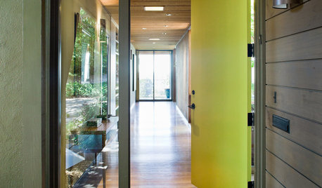
CURB APPEAL5 Bright Palettes for Front Doors
Splash bold green, blue, orange or red on your front door, then balance it with a more restrained hue on the rest of the house
Full Story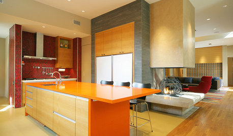
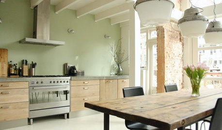
KITCHEN DESIGNPalatable Palettes: 8 Great Kitchen Color Schemes
Warm and appetizing or cool and relaxing? These 8 paint palettes can help you choose the best colors for your kitchen
Full Story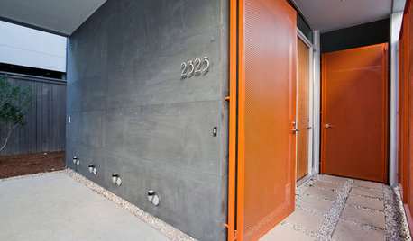
FRONT DOOR COLORSFront and Center Color: When to Paint Your Door Orange
Bring high energy and spirit to your home's entryway with a vibrant shade of orange on the front door
Full Story
COLORColor of the Year: Off-White Is On Trend for 2016
See why four paint brands have chosen a shade of white as their hot hue for the new year
Full Story
COLORThe Best White and Pastel Colors for Every Kind of Natural Light
Understand how sunlight affects your rooms and get tips on choosing paint colors for each type of exposure
Full Story
MOST POPULARThe Right Way to Test Paint Colors
Here are 5 key steps to take to ensure you're happy with your wall paint color
Full Story
COLOR12 Tried-and-True Paint Colors for Your Walls
Discover one pro designer's time-tested favorite paint colors for kitchens, baths, bedrooms and more
Full Story
WHITEHow to Pick the Right White Paint
White is white, right? Not quite. See 8 white paint picks for 8 very different effects
Full Story
COLORHow to Choose a Paint Color
Designers offer tips for examining your closet, memories and daily life to find the right paint colors for your home
Full Story


gwendolynne
amysrq
Related Professionals
Charleston Interior Designers & Decorators · Austin Furniture & Accessories · Greer Furniture & Accessories · Hastings Furniture & Accessories · Portland Furniture & Accessories · Thousand Oaks Furniture & Accessories · Woodstock Furniture & Accessories · New Bedford Custom Artists · Decatur Custom Artists · Deer Park Lighting · South Miami Lighting · Walnut Creek Lighting · Wasco Lighting · Phoenix Window Treatments · Ridgewood Window Treatmentsorganic_smallhomeOriginal Author
moonshadow
organic_smallhomeOriginal Author
patricianat
christa160
uluvbs
uluvbs
Bunny
kimbers324
kitchendetective