


GW change
peegee
10 years ago
Featured Answer
Sort by:Oldest
Comments (58)

mary_lu_gw
10 years agolynninnewmexico
10 years agoRelated Professionals
Wanaque Interior Designers & Decorators · Memphis Furniture & Accessories · Midland Furniture & Accessories · Nashville Furniture & Accessories · Woodstock Furniture & Accessories · Miami Beach Furniture & Accessories · Kingsburg Furniture & Accessories · Arlington Custom Artists · Los Gatos Custom Artists · Pico Rivera Custom Artists · Centreville Lighting · Suitland Lighting · Gadsden Window Treatments · La Vista Window Treatments · Sacramento Window Treatmentsmelsouth
10 years agomdln
10 years ago PRO
PROWhitelacey
10 years ago
justgotabme
10 years agocovingtoncat
10 years agofunnygirl
10 years agoUser
10 years agolyfia
10 years agohilltop_gw
10 years agoHannahBananah
10 years ago
DLM2000-GW
10 years ago
Sueb20
10 years agolyfia
10 years ago
graywings123
10 years agoUser
10 years agoDLM2000-GW
10 years ago
Annie Deighnaugh
10 years ago
tinam61
10 years ago
3katz4me
10 years ago
outsideplaying_gw
10 years agonancybee_2010
10 years ago
chas045
10 years ago
NHBabs z4b-5a NH
10 years agoHannahBananah
10 years agoDLM2000-GW
10 years agosuero
10 years ago
dedtired
10 years agojustgotabme
10 years agolyfia
10 years agoUser
10 years agoDLM2000-GW
10 years ago
deegw
10 years agorunninginplace
10 years ago
Irish2
10 years agograywings123
10 years ago
EricaBraun
10 years ago
romy718
10 years agojustgotabme
10 years ago
4boys2
10 years agomdln
10 years agobbstx
10 years agodedtired
10 years agolizbeth-gardener
10 years agojustgotabme
10 years agomdln
10 years ago
albert_135 39.17°N 119.76°W 4695ft.
10 years ago
msrose
10 years ago


Related Stories
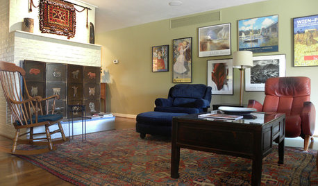
HOUZZ TOURSMy Houzz: Arts and Crafts Inspires a Midcentury Home
Antiques and modern touches combine seamlessly in a personalized remodel for a Dallas couple
Full Story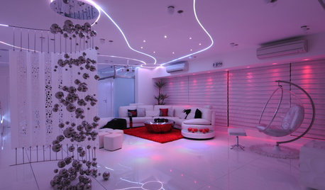
LIGHTINGHouzz Tour: An Indian High-Rise Trips the Light Fantastic
Surreal colored lighting and an ubercontemporary design make an apartment near Mumbai dance with drama
Full Story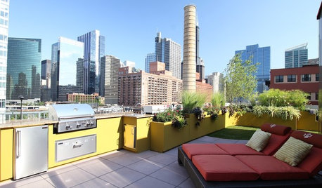
Easy Green: Fire Up an Ecofriendly Barbecue
Lose the paper plates — and the guilt — with these tips for barbecues and outdoor parties that are kinder to the earth
Full Story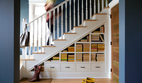
ORGANIZINGPre-Storage Checklist: 10 Questions to Ask Yourself Before You Store
Wait, stop. Do you really need to keep that item you’re about to put into storage?
Full Story
KITCHEN DESIGNHow to Work With a Kitchen Designer
If you're ready to make your dream kitchen a reality, hiring a pro can ease the process. Here are the keys to a successful partnership
Full Story
LIFEHow Do You Make Your Tea and Coffee in the Morning?
A morning cup is a must for many, and preparation comes in many guises. We look at coffee and tea habits across the Houzz community
Full Story
BATHROOM DESIGN9 Surprising Considerations for a Bathroom Remodel
Don't even pick up a paint chip before you take these bathroom remodel aspects into account
Full Story
Replace Your Windows and Save Money — a How-to Guide
Reduce drafts to lower heating bills by swapping out old panes for new, in this DIY project for handy homeowners
Full Story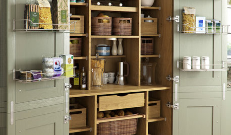
KITCHEN PANTRIES80 Pretty and Practical Kitchen Pantries
This collection of kitchen pantries covers a wide range of sizes, styles and budgets
Full Story
SMALL HOMESHouzz Tour: Color and Personality in 500 Square Feet
This Los Angeles home for 4 has a small footprint, but the family is big on creative solutions and styling
Full StoryMore Discussions

tinam61