


I see we have a new board layout
moonshadow
11 years ago
Related Stories
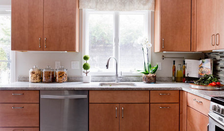
KITCHEN DESIGNHere It Is! See Our Finished Kitchen Sweepstakes Makeover
This lucky New Jersey homeowner got improved storage, upgraded finishes and a better layout to accommodate his family of 6
Full Story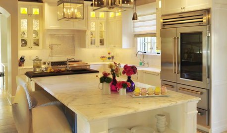
KITCHEN DESIGNSee-Through Refrigerators Dare to Go Bare
Glass-front fridge doors put your food and drinks on display, for better or worse. See the benefits and disadvantages
Full Story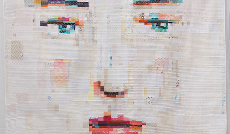
ARTSee Winning Modern Quilts on Display at QuiltCon 2015
Top quilts have been chosen from among hundreds at the international show in Austin through February 22. View them and others here
Full Story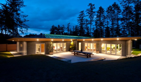
GREEN BUILDINGHouzz Tour: See a Concrete House With a $0 Energy Bill
Passive House principles and universal design elements result in a home that’ll work efficiently for the long haul
Full StoryBEFORE AND AFTERSSee a DIY Powder Room Transformation for $1,100
Determination, DIY skill and a stunning tile feature wall helped make this formerly dark and gloomy powder room feel spacious
Full Story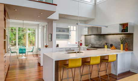
INSIDE HOUZZHouzz Survey: See the Latest Benchmarks on Remodeling Costs and More
The annual Houzz & Home survey reveals what you can expect to pay for a renovation project and how long it may take
Full Story
KITCHEN DESIGNLove to Cook? We Want to See Your Kitchen
Houzz Call: Show us a photo of your great home kitchen and tell us how you’ve made it work for you
Full Story
HOUZZ TV FAVORITESHouzz TV: See How Early Settlers Lived in This Restored Pilgrim House
Passionate restoration and preservation efforts give a 1665 home an honored place in the present
Full Story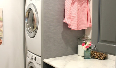
LAUNDRY ROOMSSee an Amazing $400 Laundry Room Remodel for a Family of 8
Budget shopping and DIY spirit create folding space, smart storage and better organization for a couple and their 6 kids
Full Story
INSIDE HOUZZInside Houzz: See the Houzz App’s Latest Features
Update your Houzz app for iPhone®, iPad® and iPod touch® for your new profile page, enhanced searching and easier uploads
Full StorySponsored
Columbus Area's Luxury Design Build Firm | 17x Best of Houzz Winner!
More Discussions


work_in_progress_08
roarah
Related Professionals
Wareham Interior Designers & Decorators · Augusta Furniture & Accessories · Cedar Rapids Furniture & Accessories · Simpsonville Furniture & Accessories · Surprise Furniture & Accessories · West Palm Beach Furniture & Accessories · Duluth Furniture & Accessories · Norwalk Furniture & Accessories · Carpinteria Furniture & Accessories · Springville Custom Artists · Diamond Bar Lighting · Laguna Niguel Lighting · Walnut Creek Lighting · Greensboro Window Treatments · San Rafael Window TreatmentsAnnie Deighnaugh
daisychain01
roarah
camlan
DLM2000-GW
Elraes Miller
moonshadowOriginal Author
Faron79
writersblock (9b/10a)
Bumblebeez SC Zone 7
User
camlan
User
Boopadaboo
mitchdesj
DLM2000-GW
moonshadowOriginal Author
writersblock (9b/10a)
luckygal
lizbeth-gardener
User
roarah
writersblock (9b/10a)
Vertise
terezosa / terriks
Sueb20
Vertise
writersblock (9b/10a)
Oakley
User
4boys2
writersblock (9b/10a)
yborgal
Vertise
yogacat
Vertise
terezosa / terriks
Oakley
User
caminnc
cooperbailey
lynxe
moonshadowOriginal Author
tessaD
beache
theroselvr
dedtired
tuesday_2008