


I think I committed an egregious faux pas
kitchendetective
9 years ago
Featured Answer
Sort by:Oldest
Comments (51)

grainlady_ks
9 years ago
plllog
9 years agoRelated Discussions
Is it a faux pas to...
Comments (8)In my experience, the mix and match approach can work fine, but it does take some trial and error. Carpets can work together even if they are very different if they sort of define different areas in a space, for example, a seating arrangement here, and a traffic pattern there, versus an entrance foyer, etc. In our case, nearly all the carpets are variations of earth tones. For example, an unusual "camel" background color with accents of rose, green and other muted shades in our area rug in front of the sofa blends well with our beige sofa and green chairs and a red chair. But then, not very far away, in our very small entry foyer we have a 4 by 6 rug with a strong navy blue background with patterns in reds, tourqoise and amber. I'm sure you think these two would clash. I thought so too until I tried it. But they "define" separate areas and work together. But you can't just combine colors haphazardly. For instance, the color of the rug you choose for under or in front of the sofa should definitely blend with the color(s)of you upholstered furniture. Otherwise it will look out of place. But then, in a separate area even in the same room, you can have a rug with a different color, texture, or pattern. That's where the mix and match comes in. But you still have to try it to make sure it will work. By the time you're finished you'll probably be tired of lugging carpets back and forth, and wondering if you'll ever get it right. But you'll know when you got it right....See MoreI'm soo over this kitchen! Pls help me commit
Comments (46)The panel, bead to bead is just a tad over 16" wide. Yes stiles? (the space in between the beaded panels) is about 1.5". The (fluted) column width is 4" wide. I only added the fluted columns to island (after working w/ designer) since I had 1 fluted column in a clipped corner. It looked a bit lonely in the kitchen. Three fluted columns looked intentional; one looked like a mistake. Just my non-design opinion. It's kinda like the symmetry thing to me. I have 3 entrances/exits in small kitchen. You see the fluted columns when you enter via 2 of the entrances. My hood is a 36" by modernaire. Height is about 21". 34" off the countertop. We didn't want hood too high that it became ineffective, but did not want DH to bump his head. I notice Trevor Lawson has been on lately; he handles all Internet sales of the hood. I got the hood and exhaust guts thru him....See MoreCrown molding faux pas
Comments (9)Thank you tatts and Flo Mangan for the info on peel and stick. I was wanting to put it on the family room fire place right opposite to the kitchen as a short cut, in grey color so to reflect the marble theme of the kitchen. I get it now, these won't be safe to use. Perhaps real tiles then. A floor guy should be able to do it I suppose, before I get the painters to start their job. Thanks a lot :)...See MoreFamily photos in dining room: a designer’s faux pas or is it ok?
Comments (47)I love family photos. However, (and this is just me) I get a creepy feeling when they are put in such a prominent spot that for a lot of the time I am in a room, the whole family is staring at me! My beloved SO has LARGE family photos of his whole family on a shelving unit right across from our bed in the bedroom, and it is a small room so the edge of the bed is relatively close to the shelving unit. His whole clan is always staring at me, when I go to bed at night, when I'm changing into my jammies or getting dressed in the morning, and when I wake up. I wouldn't want my clan up there, that's for sure, but different strokes for different folks. He likes seeing them all the time and I am just splitting hairs with that creepy feeling. Better than in the bathroom I guess! My dad has a small photo of my deceased mother in a prominent spot in the living room, and that doesn't bother me, so I guess it depends. I have a mirror in my dining room and hate it because I hate looking at myself while eating. I would love a wall of family in a dining room, but maybe not where they were always staring down at me while eating. A montage of smaller photos that one passes by on the way to the table--wonderful. But really, just some random thoughts. As many have said, there is no one right or wrong way if you like it that's all that matters. Also, there are some frames that you can buy that mix photos with design and sometimes sayings, those would look fab in your room. You could fit a little montage on the right side of the doorway. I almost bought a piece at the local big box that was a clock where you could put a photo in every time slot. I also think that "mixing and matching" photo exhibits in one room is probably a no go too. So for example, putting that clock in our bedroom along with the photos on the shelves might bee too much of a good thing....See More
annie1992
9 years agobeachlily z9a
9 years ago
Bumblebeez SC Zone 7
9 years agoteresa_nc7
9 years agocattyles
9 years agoUser
9 years agomdln
9 years ago
dcarch7 d c f l a s h 7 @ y a h o o . c o m
9 years agokitchendetective
9 years ago
Jasdip
9 years ago
graywings123
9 years agolucillle
9 years agomlweaving_Marji
9 years ago
Rusty
9 years ago
ann_t
9 years agograndmamary_ga
9 years agoplllog
9 years agograinlady_ks
9 years agomary_c_gw
9 years agoUser
9 years agokitchendetective
9 years agocj47
9 years agolizbeth-gardener
9 years agoannie1992
9 years agowintercat_gw
9 years agoaprile421
9 years agoaprile421
9 years agojustsaying
9 years agolascatx
9 years ago
sleevendog (5a NY 6aNYC NL CA)
9 years agokitchendetective
9 years agodreamhouse1
9 years agoann_t
9 years agocoolbeansw
9 years agocj47
9 years agodcarch7 d c f l a s h 7 @ y a h o o . c o m
9 years agoplllog
9 years agoaprile421
9 years agokitchendetective
9 years agolascatx
9 years ago
sylviatexas1
9 years agoUser
9 years agomoosemac
9 years agokitchendetective
9 years agomoosemac
9 years agodcarch7 d c f l a s h 7 @ y a h o o . c o m
9 years agomoosemac
9 years ago
Related Stories
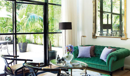
WINDOWSBlack-Framed Windows — Faux Pas or Fabulous?
Find out if black frames would be a great fit for your home — or better to avoid
Full Story
DECORATING GUIDES13 Low-Commitment Ways to Play With Pattern
Go as lively as you want. Easily changed patterns mean how long the look stays is up to you
Full Story
DECORATING GUIDESThe Dumbest Decorating Decisions I’ve Ever Made
Caution: Do not try these at home
Full Story
BUDGET DECORATINGThe Single Easiest Trick for Serial Redecorators
Take the no-sweat approach to no-commitment decorating with this inexpensive, readily available solution
Full Story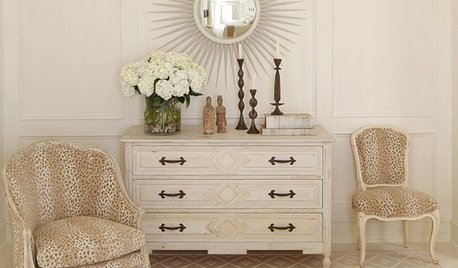
COLOR11 Ways to Spice Up Neutral Palettes
Side with texture and pattern in a neutral room for a look that commits to high sophistication and elegance
Full Story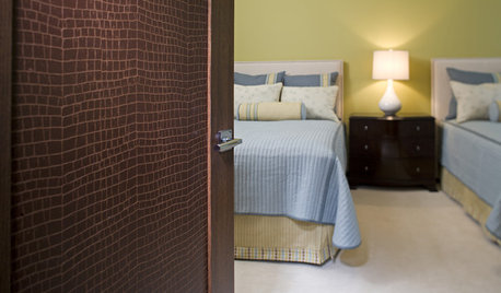
DOORS10 Cleverly Crafty Ways to Refashion a Door
Enter the world of faux croc, nailheads and wallpaper to bring imagination and liveliness to a plain door
Full Story
DECORATING GUIDESBudget Decorating: How to Decorate Smart and Slow
To make the most of your decorating dollar, forgo the disposable stuff, think vintage and free first and give yourself a splurge
Full Story
REMODELING GUIDESAre You Gutsy Enough to Paint Your Floor White?
Sleek and glossy or softened by wear, white floors charm
Full Story
WALL TREATMENTSWild Texture: Crocodile Rocks
Try the look of croc on your upholstery, tiles, walls and even the tub
Full Story
MOST POPULARFirst Things First: How to Prioritize Home Projects
What to do when you’re contemplating home improvements after a move and you don't know where to begin
Full Story

Lars