


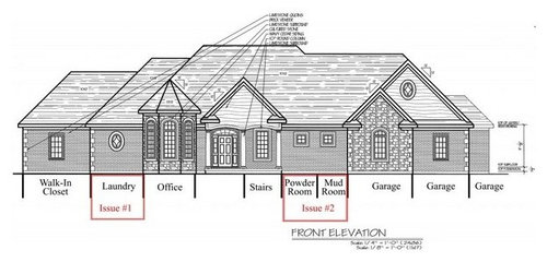
Exterior Look opinions needed and Issues
rcbob
10 years ago
Sort by:Oldest
Comments (6)
Related Stories

DECORATING GUIDESNo Neutral Ground? Why the Color Camps Are So Opinionated
Can't we all just get along when it comes to color versus neutrals?
Full Story
WALL TREATMENTSExpert Opinion: What’s Next for the Feature Wall?
Designers look beyond painted accent walls to wallpaper, layered artwork, paneling and more
Full Story
You Said It: Hot-Button Issues Fired Up the Comments This Week
Dust, window coverings, contemporary designs and more are inspiring lively conversations on Houzz
Full Story
DECORATING GUIDESWhat You Need to Know Before Painting Brick
Sure, painted brick can be a great look. But you need to take some risks into account. Here's how to paint brick like a pro
Full Story
WORKING WITH PROSWorking With Pros: When You Just Need a Little Design Guidance
Save money with a design consultation for the big picture or specific details
Full Story
COLOREvery Room Needs a Little Bit of Black
‘I’ve been 40 years discovering that the queen of all colors was black.’ — Pierre-Auguste Renoir
Full Story
HEALTHY HOMEWhat You Need to Know About Dust and How to Fight It
Breathe easier with these 10 tips for busting mites, dander and other microscopic undesirables
Full Story
TILEWhy Bathroom Floors Need to Move
Want to prevent popped-up tiles and unsightly cracks? Get a grip on the principles of expansion and contraction
Full Story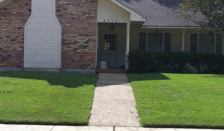


renovator8
sombreuil_mongrel
Related Professionals
Plum Design-Build Firms · Arcata Home Builders · Hillsdale Home Builders · Browns Mills General Contractors · Channelview General Contractors · Gary General Contractors · Hayward General Contractors · Ken Caryl General Contractors · Mentor General Contractors · Nampa General Contractors · National City General Contractors · North Lauderdale General Contractors · Rolling Hills Estates General Contractors · San Marcos General Contractors · Watertown General Contractorslyfia
GreenDesigns
lyfia
rcbobOriginal Author