


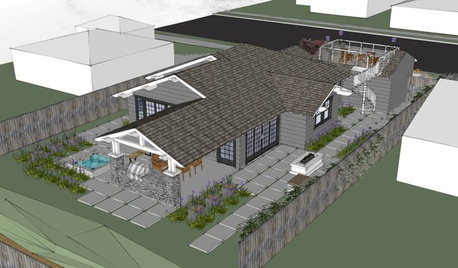
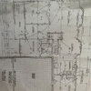
Feedback Needed On Renderings/Plans
building_a_house
11 years ago

Related Stories
WORKING WITH AN ARCHITECTWho Needs 3D Design? 5 Reasons You Do
Whether you're remodeling or building new, 3D renderings can help you save money and get exactly what you want on your home project
Full Story

WORKING WITH PROSWorking With Pros: When You Just Need a Little Design Guidance
Save money with a design consultation for the big picture or specific details
Full Story
MOVING10 Rooms That Show You Don’t Need to Move to Get More Space
Daydreaming about moving or expanding but not sure if it’s practical right now? Consider these alternatives
Full Story
DECORATING GUIDESWhat You Need to Know Before Painting Brick
Sure, painted brick can be a great look. But you need to take some risks into account. Here's how to paint brick like a pro
Full Story
MAN SPACESWhy Men Really Do Need a Cave
Don't dismiss cars, bars and the kegerator — a man space of some kind is important for emotional well-being at home
Full Story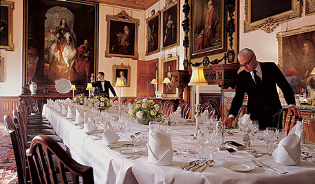
FUN HOUZZEverything I Need to Know About Decorating I Learned from Downton Abbey
Mind your manors with these 10 decorating tips from the PBS series, returning on January 5
Full Story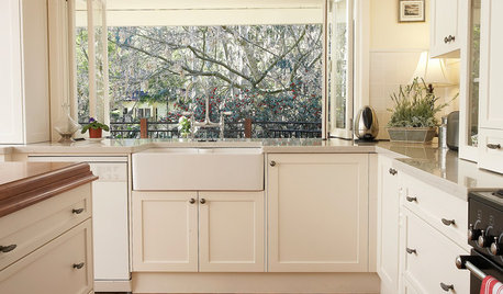
KITCHEN SINKSEverything You Need to Know About Farmhouse Sinks
They’re charming, homey, durable, elegant, functional and nostalgic. Those are just a few of the reasons they’re so popular
Full Story
HOME TECHDoes Your Home Need an Operating System?
New technologies hope to unify the lawless frontier of home-automation products. Would they work for you?
Full Story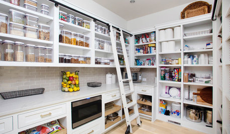
KITCHEN DESIGN9 Questions to Ask When Planning a Kitchen Pantry
Avoid blunders and get the storage space and layout you need by asking these questions before you begin
Full StoryMore Discussions

building_a_houseOriginal Author
_sophiewheeler
Related Professionals
North Chicago Architects & Building Designers · Spring Valley Architects & Building Designers · Riverdale Design-Build Firms · Saint Peters Home Builders · Sarasota Home Builders · Yorkville Home Builders · Hunt Valley Home Builders · Alhambra General Contractors · Avon Lake General Contractors · Cumberland General Contractors · Delhi General Contractors · Parkersburg General Contractors · Selma General Contractors · Syosset General Contractors · Van Buren General Contractorsbuilding_a_houseOriginal Author
building_a_houseOriginal Author
mtnrdredux_gw
building_a_houseOriginal Author
renovator8
livingreen2013
livingreen2013
building_a_houseOriginal Author
gaonmymind
mtnrdredux_gw
building_a_houseOriginal Author
building_a_houseOriginal Author
building_a_houseOriginal Author
building_a_houseOriginal Author
kirkhall
Houseofsticks
building_a_houseOriginal Author
gaonmymind
building_a_houseOriginal Author
lavender_lass
building_a_houseOriginal Author
building_a_houseOriginal Author
Window Accents by Vanessa Downs
building_a_houseOriginal Author
carp123
building_a_houseOriginal Author