


Exterior colors- too bold?
livingreen2013
11 years ago
Related Stories
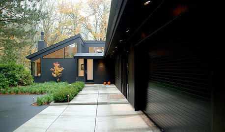
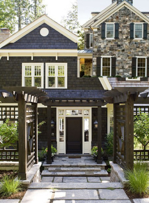
EXTERIOR COLOROn Trend: Bold and Black Exterior House Color
All-black and coal-gray exteriors make a nonconformist statement on homes of any style and size
Full Story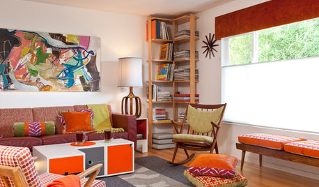
COLORFUL HOMESCase Study: The Fearless Approach to Bold Color
Bland has no place in this San Diego home. See how the designer uses vivid hues with cohesiveness and without overwhelming
Full Story
BOLD COLORBe Bold, Be Brave With Color
Add some fearless color to your home with help from designers who do it well
Full Story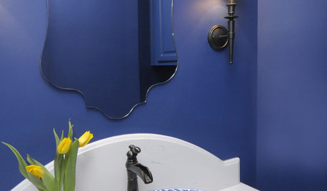
BATHROOM DESIGN8 Bold Paint Colors for Your Powder Room
Turn your powder room into a exclamation point with a bold shot of red, raspberry, hyacinth, rich brown or stormy blue
Full Story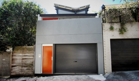
COLORGoing Bold With Just Enough Color
Using color with restraint inside and outside can be far more effective than a less subtle approach
Full Story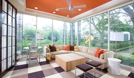
MOST POPULARHeads-Up Hues: 10 Bold Ceiling Colors
Visually raise or lower a ceiling, or just add an eyeful of interest, with paint from splashy to soothing
Full Story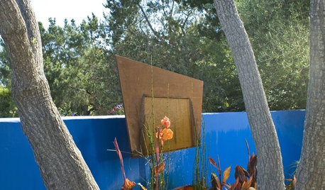
GARDENING GUIDESHow to Go Bold With Summer Garden Color
Get dramatic color in your garden from summer through fall with these tips for plantings, furniture and backdrops
Full Story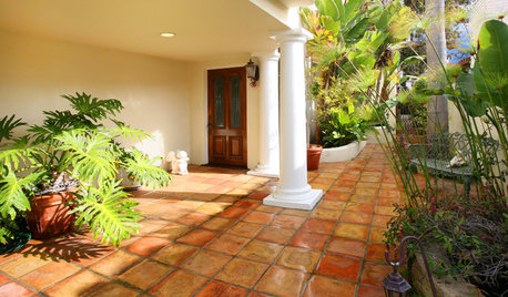
PATIOSLandscape Paving 101: Tiles Bring Bold Color and Pattern
This versatile garden material can blanket an entire patio or liven up the scenery with striking accents
Full Story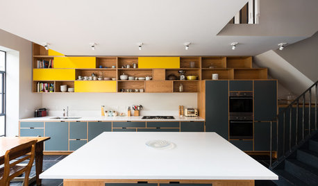
ADDITIONSKitchen of the Week: Cabinets Make a Bold Statement
This one-of-a-kind kitchen in a Victorian house is a testament to what can be achieved with a little bravery
Full Story
EXTERIOR COLOR18 Home Exteriors Gone Wild With Color
Technicolor dreams play out beautifully with these exterior paint jobs, showing that color confidence has its rewards
Full StoryMore Discussions


building_a_house
gaonmymind
Related Professionals
Hutto Home Builders · Midlothian Home Builders · Roseburg Home Builders · Troutdale Home Builders · Burlington General Contractors · Augusta General Contractors · Fort Lee General Contractors · Great Falls General Contractors · Merrimack General Contractors · Natchitoches General Contractors · Redan General Contractors · Rolla General Contractors · Selma General Contractors · Springfield General Contractors · Williston General Contractorslivingreen2013Original Author
User
building_a_house
building_a_house
livingreen2013Original Author
livingreen2013Original Author
Karen.1288
livingreen2013Original Author
User
live_wire_oak
threeapples
livingreen2013Original Author
olivesmom
livingreen2013Original Author
building_a_house
building_a_house
livingreen2013Original Author
livingreen2013Original Author
Karen.1288