


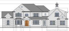
Last push before build, anything wrong with this plan?
Hello,
Just throwing this out there to see if there's anything glaring that we missed. Anyone see anything wrong? Fridge is changing from 36" to 54".
Thanks

Comments (39)
Related Professionals
Five Corners Architects & Building Designers · Lake Morton-Berrydale Home Builders · Clarksburg Home Builders · Lansing Home Builders · Montgomery County Home Builders · New Bern General Contractors · Bloomington General Contractors · Casas Adobes General Contractors · Clarksville General Contractors · Evans General Contractors · Green Bay General Contractors · Hanford General Contractors · Hutchinson General Contractors · Keene General Contractors · Mount Vernon General Contractors
bevangel_i_h8_h0uzz
10 years agolast modified: 9 years agoThat's the cooktop directly to the right of the island and the fridge is tucked into the alcove cut into the pantry on the far side of the island from the sink.
And I SERIOUSLY would hate to cook in that kitchen!!! It has probably the worst example of a "barrier island" in a kitchen that I have seen in a long long time. Anyone attempting to cook in the kitchen would have to walk around the island to get from kitchen sink to refrigerator. And since one moves from sink to refrigerator and back to sink probably a half dozen times on average when cooking a meal, that means a lot of extra steps.
Additionally, the cooktop sits right in the narrowest point at the end of the island which makes this a horrid "two cook" kitchen. If one person is standing at the stove frying something or stirring a pot of spaghetti sauce and someone else wants to get from sink area or prep area on the working side of the island to the refrigerator, they're either going to have to squeeze past the person at the stove (dangerous) or walk clear around the island the other direction.
Whoever designed this kitchen obviously does not cook! Please, please, please - post your kitchen design on the Kitchen's forum here on gardenweb and ask for advice on how to make it "user friendly."
I'll take a look at the rest of the design when I have more free time. But really, until you get the kitchen right, you are NOT ready to build!
mrspete
10 years agolast modified: 9 years agoKitchen and breakfast area look comfortable and nicely designed.
Refrigerator has no "landing spot" -- that is, no place to set things down as you're taking them out. This isn't horrible-horrible because you do have the island across a walkway.
I'm not crazy about the garage sticking out so far in front of the house. I'd downsize to a two-car garage and add a storage building out back (which is cheaper anyway).
Upstairs hall bath vanity is a one-sink size, but you're squeezing two sinks into it. The upshot will be no space to spread out make-up or curling irons as the sink's being used, and you'll have no drawers underneath. I'd go with one comfortable sized sink.
I wouldn't want a master bedroom above the garage. Heating is sometimes a problem in such rooms (because they're above an unheated space), and you'll hear the garage doors opening/closing.
The master is oversized to the point that it will feel uncomfortably large. I'd consider breaking it up into a bedroom and a slightly-divided sitting area. That's better than one big room.
Light switch will be a problem when entering the master bedroom. You open those double doors, and reach for the switch . . . which will probably be positioned behind the door. This means you'll have to close the door and feel around in the dark behind the door. A single door makes more sense.
sitinh
Original Author10 years agolast modified: 9 years agoThanks for the suggestion. Will post kitchen layout in the kitchen forum.
sitinh
Original Author10 years agolast modified: 9 years agoCooktop is to the right end of the island. Wall oven is to the right of the cooktop.

live_wire_oak
10 years agolast modified: 9 years agoIt's a "snout house" with the garage protruding past the plane of the house like a Jimmy Durante's nose. Not attractive to look at and difficult to find your way to the entry. The kitchen needs a LOT of work. The fridge is completely out of the cooking zone, and there really isn't any good prep space, despite all of the acreage. Large kitchens can be much worse to cook in that small ones if someone who doesn't know what they are doing designs them. And whoever designed the sink in front of the bay must have 4' long arms or a cleaning person so that they don't concern themselves with the effort needed to both reach the glass and all of that useless counter space. If you want a bay, a better location would be the breakfast area for it.
The Master is 1/4 of the whole house, and you will spend maybe 1/10 of your time in the house actually occupying it, and then mostly while you are asleep. It's out of proportion.
There's no good connection between the kitchen and dining area, and there are 3 poorly done eating areas in the home rather than just a well done one or two. There's a huge amount of useless space between the family room and kitchen. You could put two grand pianos there and have room left over.
I can't read what the function of the extraneous room tacked on to the left might be, but there isn't any way to access it except from the other room.
In such a large home, I'd expect to have a complete bath downstairs, connected to a guest room or study, to act as a potential second master for aging in place or "injury suite" for someone who can't navigate stairs temporarily.
I also suspect that because of the depth of the home, the elevation will show a large ungainly roof, rife with gables and bumpouts everywhere. That's a builder cliche to be avoided at all costs. And, this won't be an inexpensive home to build or to keep living in with all of that volume to heat and cool. I hope you're consulting an energy rater for air sealing and insulation, and choosing the most efficient multiple zoned HVAC and high quality windows to keep your utility bills under control. No one wants 1K utility bills as that "extra" surprise after moving in.

bpath
10 years agolast modified: 9 years agoActually, when the kids start to drive (if they don't already), it'll be nice to be able to hear the garage doors opening so you know when they get home (especially if they don't want to traipse all the way down the hall to let you know they're in too late LOL) But yes, it can be hard to keep a room over the garage warm, even if it's a heated garage. And in summer, will the heat rise to heat the bedroom?
Why is the shared bathroom the smallest? And btw, my boys have 2 sinks with a column of drawers between, but they are NEVER in there at the same time. I'd rather have one sink and more drawers.
No front closet? Are you in a warm climate? Still, in the back hall be sure to leave space for shoes and stuff. I want to take out the closet in my back hall and replace it with cabinetry/drawers/counter/shelves, the closet gets so cluttered. And, while it's great to have a bathroom near the backdoor and garage, your guests will have to traipse (that's my word of the day!) through the kitchen and "back area" to it.
There's a door in the garage to the outside, but if you plan to park a car there, you won't be able to open it. Or is that bay for the bikes, toys, and tools?
sitinh
Original Author10 years agolast modified: 9 years agoGood points on the shared bathroom vanity. Hard to imagine both boys using it at the same time. The room tacked on to the left is the study. It's connected to the living room, which will be mostly open space for our piano. Seems like it's consensus that the kitchen needs reworked. Full bath on first floor is a good though. We'll see how that can be worked in.
The place in the left of the mudroom entrance is the booty/jacket cubbies.
Here's the front elevation for perspective.
kirkhall
10 years agolast modified: 9 years agoWater closet (toilet room) doors should swing outward or be pocket style for safety. Inward doors become traps for someone who is incapacitated on the floor because they are in the way of swinging open the door and the hinges are on the inside, so the door cannot be easily removed by EMTs.
bpath
10 years agolast modified: 9 years agoCheck the shutters, to be sure they are used in a consistent manner (e.g., why is there no shutter on the garage bump-out?) and are scaled to the window they are "supposed" to cover (if we in fact closed our shutters). For example, the bedroom window above the dining room is similar to most of my windows: two windows abutting, what to do about the shutters?
And, personal opinion here feel free to discard, 8 gables (including cupola), one without the little "return" at the bottom (I don't know what the proper term is), 2 different angles on the gables, 7 roof heights, maybe 10 different windows; just seems like it could use a little harmony.
Love the oval window in the laundry :)
LuAnn_in_PA
10 years agolast modified: 9 years agoAgreed! Those shutters have got to be amended or discarded.
Too many window styles, heights and widths... very cluttered looking.
User
10 years agolast modified: 9 years agoToo much wasted space and too much of a mashup. Don't know where you're building, but even with medium grade finishes, that would be a 1M house here. In a more expensive area of the country with higher grade finishes (like that kitchen you are proposing to do), you can double that.
sitinh
Original Author10 years agolast modified: 9 years agoAgree on the shutters. We are 50/50 on them with the architects. Looks like we'll forgo them.
What if we keep all first flow windows flat (no arch) and all second floor windows arches?
Where do you feel the wasted spaces are?
Hollysprings, you're right on for pricing :). It's looking at about 1.1 without land.
redheadeddaughter
10 years agolast modified: 9 years agoMy opinion is just a passing one... I'm not an expert or an architect or anything. But I love pretty houses! I think there is alot to like about your house. It's certainly better than 95% of the homes on the market in our area.
The right side in particular is very appealing to me with the cupola. (I know cuplola's aren't very popular here, but I love 'em. ;) I can see that there does seem to be a vast array of window styles. Cute round windows (but round and oval and arched and fan and shingle style clustered, whew) Personally I would get rid of any arches or fans, add in some nice transoms, and get rid of any extra gables. I think that would be more in harmony with the "Kentucky Country Home" theme you seem to have going on here. Is that what you were going for? It's cute.
Maybe use stone only on certain "sections" of the house (like the left side gable area and not the false gabled area next to it) so that it looks a little more "old house" and a little less "new money?" I know there are awesome experts on here who might be able to direct you better on that, but if your preference is random stone and siding mixed in, by all means... it will still be a lovely home.
The one big area I would change would be the master. We've had 2 masters that were huge like this and just ended up as wasted space. I'd either add another closet (so you each could have your own, or store out of season or ski clothing or whatever), or add a little office for you (which could later be marketed as a nursery for resale), or something to make it more cozy. I see you are trying to fit it in above the garage area, and I really love the window seat (if that is what I'm seeing?). Hopefully that is a nice private view? :)
bpath
10 years agolast modified: 9 years agoIf you eliminate the shutters and flatten the first floor windows, then double the office window so it balances the garage bump-out window. Otherwise it'll look lost on that wall.
Can you eliminate the gables above the bedroom and entry hall? I think it will look more elegantly manor-house, and less millennial. Is there living space in the attic? It's really high; even the gables aren't helping to diminish the expanse of roof. Can it be reduced, or do you need the headroom in the attic?
bpath
10 years agolast modified: 9 years agoJust noticed the lovely curve above the front door, echoing the handsome door itself (if that's the door you go with). What if the gable above it were not peaked, but the same curve, and the ceiling of the overhand could be kind of a barrel-vault? Ooh. A little softness amidst the stone and corners...Kind of like this overhang, see how the roof and the ceiling are the same shape?

renovator8
10 years agolast modified: 9 years agoIf you really want useful advice you should post drawings that are large enough to be understood. Furniture would also help. I could understand very little about the house even though I design houses for a living.

deegw
10 years agolast modified: 9 years agositinh - I have nothing to add about your house but I do want to say that I am impressed with how gracious you have been about the criticism that your plan has received.
The advice on this forum can be very good but sometimes the tone can be blunt. It's very rare that a poster doesn't get defensive when their plan gets criticized. Good luck with your build.

GreenDesigns
10 years agolast modified: 9 years agoIt would really improve the appeal of the house to actually see the house more than the garage. Pull it back from the fa�ade of the home.
Others have already covered the kitchen, but I'll also ask about that large space between it and the family room? What do you intend to place there? And I'll agree that the bay would be much more attractive (and functional) on the breakfast area than the kitchen.
What climate is the house located in? That will impact some of the styling decisions and structural elements? How large is your family? This is a LARGE family house, and unfortunately, there's so much LARGE public space that I foresee children retreating into the more cozy bedroom space and you not spending a lot of time together as a family. And the too large master bedroom won't be able to serve as that cozy retreat space because it's much too large to be able to give you that feeling. It could actually be two bedroom spaces! Or, an unused master sitting area and bedroom space.
sitinh
Original Author10 years agolast modified: 9 years agoThanks for all the comments so far. There's quite a bit of good ideas that we didn't think about. Definitely will look into the different windows style and large master bed since that's a common theme.
The bay window in the kitchen is to connect with the bay window in one of the bedroom.
Here's a look at the rear elevation.

sitinh
Original Author10 years agolast modified: 9 years agofirst floor again. hopefully more of the text shows up.


Circus Peanut
10 years agolast modified: 9 years agoI'm certainly no designer, but my gut instinct as a person who lives in houses is that there are a few too many narrow hallways that will become sticking points.
For instance, the space between the master closet and master bath seems pretty cramped? You might consider moving the door of either room to inside the bedroom itself?
A sink in the butler's pantry would be nice and very useful if you aren't planning one in there already, esp. given the very long haul from dining room, around the island, to the main kitchen sink.
lavender_lass
10 years agolast modified: 9 years agoI like it! I'd swap the master bedroom with the closet and bath. Just seems like such a long walk to go to bed :)
The kitchen needs a little work, but I saw you were over there the other day, so hopefully that's helped. I'd move the fridge over to the end of the range counter. Maybe a broom closet where you have the fridge and a larger access to pantry? Move down the range and you could have windows on each side, if you like...or maybe glass upper cabinets?
It is a big house, but I like the study off the living room and the large mudroom that accesses the front porch. It looks like a fun house for a big family.
Do you have kids? If so, are all three bedrooms being used? One has its own bath, one has a huge closet (fun play area could be included) and the other doesn't have anything special. If that's a guest room, no big deal...but if it's a kid's room, try to include a unique feature for them, if you swap the master bedroom and closet/bath.
lavender_lass
10 years agolast modified: 9 years agoMaybe something like this? :)
{{gwi:1495431}}From Kitchen plansbird_lover6
10 years agolast modified: 9 years agoNice features in this house, but I hate the window in the kitchen only because I have personal experience with such a window. :)
My own kitchen window above my sink is similarly designed. I despise it. I can not close the window treatments to block the afternoon sun without standing on a chair and crawling across the counter top; thus, the windows tend to be permanently blocked. No view. It's just too difficult to open and close the shades. It's also very difficult to clean any decor items placed there, and items in any kitchen generally need to be cleaned rather frequently. Again, I have to climb on the counter top.
And cleaning the windows? UGH
sitinh
Original Author10 years agolast modified: 9 years agoThanks for all the thoughtful inputs. Changes have definitely been incorporated. Fridge placement, wasted space between island and family room, and front windows. We'll post a new picture when I get it back from the architect.
bevangel_i_h8_h0uzz
10 years agolast modified: 9 years agoLavenderLass's suggestion is a HUGE improvement on the kitchen. Notice how you can move from one work location to the next without having to walk around the island? However, I don't see anyplace in her plan for your wall oven and, if you stick extra windows on the side of the kitchen, you’ll lose almost all of your upper cabinet storage areas. I for one would not be very happy in a kitchen with few or no upper cabinets. So, while LL ‘s suggestion is a big improvement, I don’t think it is quite “there” yet.
When I first posted on your thread saying that I hated the kitchen, I promised to come back later and comment on the rest of the plan.
RE: the exterior...
1) I won't beat a dead horse about the bay window in the kitchen sink. I will point out that if you want a bay window in the bedroom over the kitchen upstairs, you DO NOT have to have a matching bay window on the first floor. It is perfectly possible - and can be quite charming looking - to have a bay window only on the second floor. You just have to cantilever it. Your architect should know what that means.2) IMHO, both the front and back elevations of your home are overwrought. You have way too many gables, roof styles, window styles, materials, etc. Sorry to be unkind but the house reminds me of a woman getting dressed for a fancy party who thinks she MUST wear every piece of jewelry she owns in order to impress… and then adds on a fancy hat, a glittery scarf and patterned pantyhose for good measure! For a more beautiful and tasteful house, SIMPLIFY, SIMPLIFY, SIMPLIFY.
3) I see no good reason why the back wall of the kitchen and the back wall of the family room are not "lined up" instead of the kitchen being about 1 ft shorter than the family room. Lining the two rooms up would allow you to greatly simplify the roof-line in back. Plus, your kitchen could use definitely an extra foot or so of depth so that the island could be turned by 90 degree (as LavenderLass suggested) without lopping it off quite so much.
4) I also see no good reason for the left wall to be indented at the stairwell. Line the stairwell wall up with the family room in order to simplify the foundation and the roof. Even better might be to line both the stairwell and the family room up with the left wall of the living room. You gain extra square footage and probably save money.
5) IMHO, The house would also look better without that front facing gable over the library. It adds another totally unnecessary complexity. The only thing that front facing gable does is create a tiny little niche (about 3’ x 3’) in the closet above the library… and, in order to really have any hanging space to speak of in that closet, the niche is probably going to be totally hidden by hanging clothes anyway. No gable means less cost to build the roof over the library.
6) Definitely get rid of the bump out in the front face of the garage. That’s a builder cliché that requires yet another front facing gable that adds nothing graceful or charming to the house, costs extra money, and doesn’t add any useful square footage. So, I’d flatten that face of the garage, get rid of the stone veneer on the garage completely and replace the four windows shown on the first level of the garage with three windows that are spaced widely enough apart that you can fit appropriate shutters to them instead of the “shudders” you currently show.
(Sorry, I’m something of a SHUTTER-purist and when they are used without thought, it gives me the SHUDDERS. I’ve started deliberately calling shutters that don’t fit their windows, shudders. LOL!) I’ll speak more about windows in a minute.
7) The one place that I would ADD something to the front elevation is that I would extend the front bay window up to the bedroom over the formal living area. That bedroom is relatively small and a bay window would add a little bit of additional floorspace that would make it feel a bit larger. Plus, it you had a bay window up there, you would not feel the need to fill that space with a Palladian window!
8) Now, speaking of windows, as has already been noted, you have way too many different styles! Palladian, archtop, oval, round, square, vertical rectangles, horizontal rectangles, with “shudders.” and without shutters. WHEW! After seeing the front elevation, I more than half expected the back elevation to feature a triangular window or two or maybe an octagon… and who knows, maybe you do have those on the side elevations. Frankly, it looks rather like your designer had some new software and decided to try out every window shape in his software tool box! Too many different types of windows strikes me as analogous to wearing plaids, stripes, polkadots, tie-dye, and paisley print all at that same time. Using ONE odd shaped window allows that window to be a special accent. Multiple different kinds of windows simply compete with one another for attention and create what others have referred to as a mish-mash. Plus, you should know that arched top and rounded top windows tend to be quite a bit more expensive than simpler double-hung rectangles. Save your money for other things!
9) Finally, the placement of stone accents on the design seems pretty much random. Stone is used on what ought to be seen as relatively unimportant wings and draws attention AWAY from the front door rather than helping to focus one’s attention. If you want to mix stone and Hardi-siding, consider using the stone only on the main part of the first floor of the house and the bedroom above the library. Use Hardi on the library extension, on the garage and on the upstairs. I think such a combination would give the impression that the main part of the house was built first with a stone lower level, and wood siding on the upper level. Then the library and garage extensions were added on at a later date using siding to match the siding used on the second floor. Such a “visual history” will do much to relieve the McMansion look of your home.
I used paint to try and show how I think the changes suggested above would alter the front elevation of your home. I think something like this gives you a much more cohesive and elegant look.

Note how many fewer window styles there are. I would normally suggest that one should have no more than three basic styles of windows but left you with five. The small round one in the attic doesn’t bother me since it looks like an attic vent rather than a window and I kept the arched window over the front door because it reflects the arched door and does, I think, help to focus attention on the front door. Otherwise, I tried to stick with double hung windows with shutters (properly sized) on all the Hardi and double-hungs without shutters on the parts of the house that are stone. If the stonework is limited to the section of the house containing the bay window and under the porch area, then it makes since that these windows would not have had shutters even back in the days when shutters were operable. (Almost impossible to shutter bay windows and the ones under the porch are protected and therefore in less need of shuttering.)As for the interior, I don't see too much other than the kitchen that really strikes me as bad design.
I do wonder about the huge variation in the sizes of your three secondary bedrooms. Is there some reason why the one back bedroom is so much larger then the two at the front? Given that the back bedroom also gets a private bath (with windows) that is larger then the one bath (without windows) that will be shared by the two front bedrooms, if all three of those rooms are all going to be used by your children, I can imagine a certain level of jealousy arising. If you had more kids and the largest bedroom were going to be shared by two children while the front two bedrooms were going to be solo for two older children, then the varying sizes wouldn't bother me as much. Or, if the back bedroom is intended to be a second master for elderly parents or something like that, then it also makes sense.
But, absent a really good reason to have so much variation in size, it were me, I would carve out a walk-in closet for that bedroom back along the wall next to the hallway which would bring that bedroom back down closer in size to the other two. Then, I'd use the space currently allocated to the large walk-in closet to enlarge the hallway bath. That would make the hallway bath large enough to divide into separate areas (maybe even a tub room, toilet room, and vanity space for two vanities) which would make it a whole lot more "shareable". give you room enough to divide the hall bath into a bathtub room, a toilet room and a vanity area with two sinks making it a whole lot more "sharable."
Anyway, just my thoughts. I do hope you haven't felt overwhelmed by all the advice. You did ask "what's wrong" and we gardenwebbers are never loathe to share our opinions...and when someone asks "what's wrong?" they're totally opening the door to negative opinions. Occasionally those opinions can come across as rather harsh but please do know that everyone on this site just wants to help you design and build a beautiful home that you'll be proud to own and will love living in!
Good luck with finalizing your design and building the home of your dreams.
bpath
10 years agolast modified: 9 years agoAhh, sigh, much more cohesive elevation. Feels much calmer and more elegant. I felt a little affection for the oval window in the laundry above the service door, though, as a little gem tucked in.
lafdr
10 years agolast modified: 9 years agoI really appreciate that you have put a lot of thought and detail into your house.
There are areas or halls with no direct light that will be dark even during the day if a light is not turned on.Even solar tubes would allow the current plan to be be kept and not be dark.
If the study will be used often, it is a long way from a bathroom and the kitchen. I am not a big fan of a room through a room. Unless the study was more of a nook than an actual full room.
The guest bath is in an awkward spot. Think of guests traipsing through a mud room and searching for light switches and which door to open when they have to use a powder room? Just imagine giving directions to the bathroom to a first time guest from the living or dining room?
I agree a house of your size should have a 3/4 or full bath on the first floor in case someone can not make it upstairs due to age or sickness. Also a room that could convert to a bedroom such as the study, with a closet ? With the house size and budget, maybe add a second downstairs bath? Or move and enlarge the one that is there now.
I do not care for the long awkward master hall. Were you going to hang photos or ? It will be awkward to navigate in the dark coming or going. Also, getting to the master bath toilet in the dark will be many turns. I would simplify that too.
It seems there are too many halls and wasted space in the center of the home that could be reworked.
I would add more closets and storage. Where will you keep vacuums, brooms, cleaning supplies? What about bedding/towels/etc? Coats etc. You can not have too much storage in my opinion.
I really do like many details of your house. It is more unique than most and has specifically thought out areas I really like.
In the end, there is no design everyone will love. So you get to pick what is best for you and how your family lives.
Best wishes! Looking forward to seeing revisions.
Please be aware of window placements and views out windows when you get a lot. My neighbors remodeled their house and the hall bath toilet backs on my front yard just so that if a man is standing using the toilet, they are looking straight out the window over the toilet at my front door. So we could also see the back of a head if they were sitting. OOps on that design! (Luckily it is the rarely used guest bath!)
Lafdr
bird_lover6
10 years agolast modified: 9 years agoBev, you have quite the eye. I agree that your vision of the front elevation is gorgeous and quite elegant!
I hope the op takes notice, but in the end, we do all build what personally appeals to us.
lavender_lass
10 years agolast modified: 9 years agoOops! There's a wall oven...I missed that. I thought it was a large range with double oven. Let's see what we can do...
Here's another possibility. I swapped the sink and cooktop. This way, you see the windows over the sink, from the family room and the cooktop as you walk down the hall. The wall oven is next to the cooktop and the bigger fridge is by the sink. You could swap these, but I like the fridge by the pantry...Your choice :)
The island stays the original size and I put a built in bookcase (or broom closet) between the pantry and butler's pantry. Bookcase would give you space for cookbooks and display (and break up the doorways) but again, up to you.
I kept the windows by the cooktop, but easy enough to use upper cabinets, instead. It's nice to have views out two sides of the kitchen, especially if you spend a lot of time there.
One other thing...the upstairs bedroom with the bay. I would think about redoing that area, a bit. It seems like for such a large space, it would be difficult to layout furniture. The bathroom doorway is too close to the window wall and the closet doorway is right in the middle of the room. Maybe move the doorway over (centered between the two) and have the bathroom open on the right and closet on the left? Then, you could have the bay window replaced with a built-in window seat (closer to the bed) and have space for a chair, in the corner. {{gwi:1495434}}From Kitchen plans
This post was edited by lavender_lass on Fri, Oct 4, 13 at 13:52
bevangel_i_h8_h0uzz
10 years agolast modified: 9 years agoA very nice attempt LL but because one can't have upper cabinets in front of windows, if you put a window on either side of the range AND windows over the kitchen sink, the only available place for upper cabinets would be that bank to the left of the DW and then a tiny 12"x12" cabinet (maybe) next to the fridge.
I too love a kitchen that is well-lit with natural light...and you can't beat natural light from two directions! Still, I would sacrifice some of the windows for more upper cabinets.
Yes, deep drawers do make lower cabinets much more useable but I still want upper cabs for my glassware and other "kitchen pretties."
Honestly though, I am not a big fan of kitchen islands because, to me, they take up too much space by having to have a path around them from both directions. And, to me, kitchen islands seem to encourage non-cooks to saunter thru the kitchen work area instead of staying on the kibbitzer's side with their butts firmly planted on a bar stool and therefore OUT OF MY WAY! LOL!
So, I much prefer peninsula kitchens even if it means I have to take a few extra steps to carry food to the table. Actually though, in my house, I set the finished food on the bar top and draft the non-cook kibbitzers to carry it to the table. They can do that without getting in my way.
Anyway, since I don't like islands and OP clearly wants one, I'll leave it to you and the moguls on the kitchen forum to suggest how best to rework the kitchen. I'll just sit back and critique! ;-)
lavender_lass
10 years agolast modified: 9 years agoIt's such a personal choice...and easy to swap windows for cabinets, at least in the planning stages! I think the upper cabinets next to the dishwasher would be fine for glasses and pretties...it's the cooking 'stuff' that always makes me reconsider the windows by the range.
A lot of people like to keep their oils, spices, etc. in the pantry of in pull outs, under the counter. I'm tall, so I like mine at eye level, which means upper cabinets by the range. That being said, I know a lot of people are saying they want NO uppers, because they're too hard for them to reach and they want everything in drawers or pantry.
Same thing with oven and fridge placement. Some people like the fridge by the pantry, others closer to the range or cooktop. I like mine closer to the range, but I don't like the oven next to the clean up area. Often this leaves no baking area. Again, it depends on how you use the space.
Island vs. peninsula...I know a lot of people like islands, but I'm missing kitchen tables. They're not the 'best' height for prep, but if you have adequate perimeter space, do you really need it? And they move, which I really like. I have a hard time with permanence! LOL I like flexible spaces and if I could have movable walls, I'd probably like that, too.
The OP has lots of options and I think the island and table will work well, but a peninsula could work, too. We offer ideas, but it's really up to the OP to decide what works best in their space...but I still like changing the upstairs bedroom. I love a window seat for sitting but curling up with a book in a comfy chair is wonderful :)
oh-lola
10 years agolast modified: 9 years agoWell, what about moving the fireplace from the back wall of the family room to the open space between the family room and the kitchen? this way the space between the 2 rooms doesn't seem vastly wasted? This would be a 2-sided fireplace.
sitinh
Original Author10 years agolast modified: 9 years agofirst floor. Kitchen didn't change much. After being in a house with similar layout, I think fridge should be okay. The other location would be at the end of the counter on the side of the sink, but we would much rather have the counter space there.


sitinhOriginal Author