


Please help...what color did you use?
twolabs
13 years ago
Featured Answer
Sort by:Oldest
Comments (20)

rethree
13 years agocrescent50
13 years agoRelated Professionals
Auburn Hills Architects & Building Designers · Dayton Architects & Building Designers · Seattle Architects & Building Designers · Beavercreek Home Builders · Three Lakes General Contractors · Boardman General Contractors · Deer Park General Contractors · Elyria General Contractors · Irving General Contractors · Muskogee General Contractors · Norwell General Contractors · Perrysburg General Contractors · Rotterdam General Contractors · The Hammocks General Contractors · Wright General Contractorsathensmomof3
13 years agopps7
13 years agotwolabs
13 years agocrescent50
13 years agoshelly_k
13 years agocrescent50
13 years agoshelly_k
13 years agocrescent50
13 years agopps7
13 years agoshelly_k
13 years agoshelly_k
13 years agopps7
13 years agoshelly_k
13 years agocrescent50
13 years agoshelly_k
13 years agoexcited2build
13 years agotwolabs
13 years ago


Related Stories

BUDGETING YOUR PROJECTHouzz Call: What Did Your Kitchen Renovation Teach You About Budgeting?
Cost is often the biggest shocker in a home renovation project. Share your wisdom to help your fellow Houzzers
Full Story
EDIBLE GARDENSHouzz Call: What Did You Grow This Summer?
Let’s celebrate the homegrown fruits and vegetables of the season. Post your pictures and tell us about your harvest
Full Story
ARCHITECTURERoots of Style: Where Did Your House Get Its Look?
Explore the role of architectural fashions in current designs through 5 home styles that bridge past and present
Full Story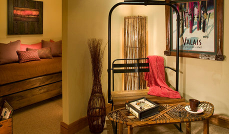
FUN HOUZZDouble Take: Did That Chair Come From a Ski Lift?
Clever homeowners find ways to repurpose chairlift seats indoors and out
Full Story
HOME OFFICESQuiet, Please! How to Cut Noise Pollution at Home
Leaf blowers, trucks or noisy neighbors driving you berserk? These sound-reduction strategies can help you hush things up
Full Story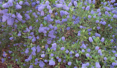
GARDENING GUIDESGreat Design Plant: Ceanothus Pleases With Nectar and Fragrant Blooms
West Coast natives: The blue flowers of drought-tolerant ceanothus draw the eye and help support local wildlife too
Full Story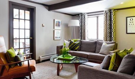
LIVING ROOMSCurtains, Please: See Our Contest Winner's Finished Dream Living Room
Check out the gorgeously designed and furnished new space now that the paint is dry and all the pieces are in place
Full Story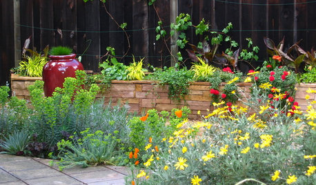
SUMMER GARDENINGHouzz Call: Please Show Us Your Summer Garden!
Share pictures of your home and yard this summer — we’d love to feature them in an upcoming story
Full Story
BATHROOM DESIGNUpload of the Day: A Mini Fridge in the Master Bathroom? Yes, Please!
Talk about convenience. Better yet, get it yourself after being inspired by this Texas bath
Full StoryMore Discussions


shelly_k