


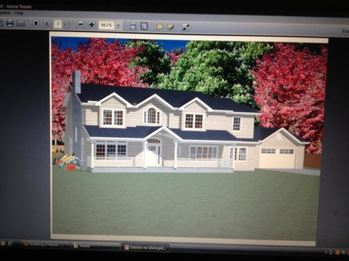
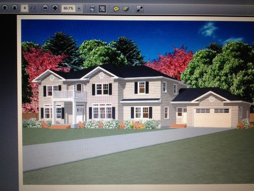
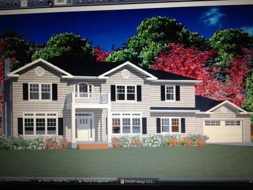
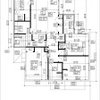
Returning with revised house design to review
rkalish
10 years ago
Sort by:Oldest
Comments (18)
Related Stories
ARCHITECTUREThink Like an Architect: How to Pass a Design Review
Up the chances a review board will approve your design with these time-tested strategies from an architect
Full Story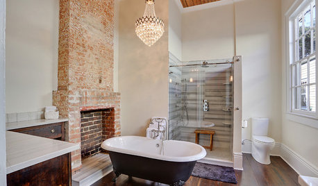
BATHROOM DESIGNRoom of the Day: Revising History in a New Orleans Bath
Original features mix with modern and vintage touches for a bathroom with surprising and beautiful character
Full Story
INSIDE HOUZZData Watch: Houzz Renovation Barometer Shows a Return to Normal
The majority of home renovation professionals report that business activity has returned to pre-recession levels, though challenges remain
Full Story
MOST POPULAR5 Remodels That Make Good Resale Value Sense — and 5 That Don’t
Find out which projects offer the best return on your investment dollars
Full Story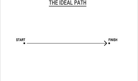
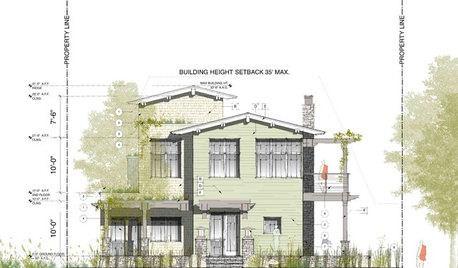
MOST POPULARThe Many Paths of Design, Part 1
Blame engineering issues, unforeseen revisions or even the Internet. As these diagrams show, it's probably not your fault
Full Story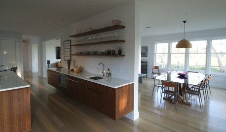
KITCHEN DESIGNThe 4 Things Home Buyers Really Want in Kitchen Cabinetry
For the biggest return on your kitchen investment, you've got to know these key ingredients for cabinetry with wide appeal
Full Story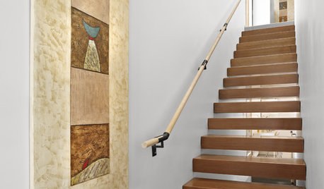
KNOW YOUR HOUSEStair Design and Construction for a Safe Climb
Learn how math and craft come together for stairs that do their job beautifully
Full Story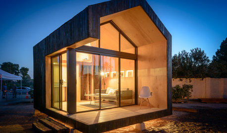
SMALL SPACESDesign Lessons From Tiny Homes
Microspaces in a Phoenix exhibition abound in innovative ideas we can all use
Full Story
FUN HOUZZBinge on the Design of ‘House of Cards’
Pull up a seat to Netflix’s addictive political drama for sets and fashions rife with intrigue
Full Story
KITCHEN WORKBOOKHow to Remodel Your Kitchen
Follow these start-to-finish steps to achieve a successful kitchen remodel
Full Story

LuAnn_in_PA
rkalishOriginal Author
Related Professionals
De Pere Architects & Building Designers · North Bergen Architects & Building Designers · Palmer Architects & Building Designers · Saint James Architects & Building Designers · Oak Grove Design-Build Firms · Placentia Home Builders · Annandale General Contractors · Centereach General Contractors · Jackson General Contractors · Jefferson Valley-Yorktown General Contractors · Medway General Contractors · Oneida General Contractors · Rancho Cordova General Contractors · River Forest General Contractors · Riverside General Contractorsbevangel_i_h8_h0uzz
rkalishOriginal Author
ctlady_gw
rkalishOriginal Author
palimpsest
rkalishOriginal Author
palimpsest
rkalishOriginal Author
bevangel_i_h8_h0uzz
dadereni
Annie Deighnaugh
rkalishOriginal Author
User
rkalishOriginal Author
palimpsest
rkalishOriginal Author