


Thoughts on this elevation
User
9 years ago
Related Stories
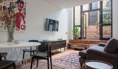
SMALL HOMESHouzz Tour: Thoughtful Design Works Its Magic in a Narrow London Home
Determination and small-space design maneuvers create a bright three-story home in London
Full Story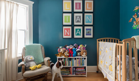
HOUZZ TOURSMy Houzz: Thoughtful Updates to an Outdated 1900s Home
Handmade art and DIY touches bring a modern touch to a classic Boston-area home
Full Story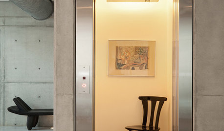
REMODELING GUIDESHome Elevators: A Rising Trend
The increasing popularity of aging in place and universal design are giving home elevators a boost, spurring innovation and lower cost
Full Story
GARDENING AND LANDSCAPINGBuild a Raised Bed to Elevate Your Garden
A bounty of homegrown vegetables is easier than you think with a DIY raised garden bed to house just the right mix of soils
Full Story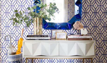
WALL TREATMENTSNew This Week: 3 Wall Treatments to Elevate Your Entryway
Use graphic pattern to raise your spirits every time you come home — no matter what your style
Full Story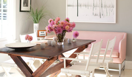
DECORATING GUIDES9 Things for Every Home’s Wish List
A splurge, some sparkle and a great place to read. Elements like these can dramatically elevate your interior design
Full Story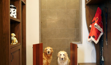
PETS15 Doggone-Good Tips for a Pet Washing Station
Turn a dreaded chore into an easier task with a handheld sprayer, an elevated sink or even a dedicated doggie tub
Full Story
DECORATING GUIDESDandelions Pop Up in Home Décor
Creative wall treatments, textiles and lights are elevating the embattled weed to art
Full Story
TASTEMAKERSChic and Timeless Decorating Ideas to Remember
New York design firm Carrier and Co. offers inspiration for elevating your room’s decor — whether traditional, modern or country-inspired
Full Story
KITCHEN DESIGNA Stylist’s Secrets for Giving Your Kitchen the Wow Factor
There’s more to getting a fabulous kitchen than designing and installing it. It's the little details that elevate its look
Full Story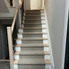


robynstamps
Annie Deighnaugh
Related Professionals
Martinsville Architects & Building Designers · South Elgin Architects & Building Designers · Castaic Design-Build Firms · Troutdale Home Builders · Vista Park Home Builders · The Crossings General Contractors · Burlington General Contractors · Asheboro General Contractors · Big Lake General Contractors · Clinton General Contractors · Leominster General Contractors · Nashua General Contractors · River Forest General Contractors · Saginaw General Contractors · Tabernacle General ContractorsDreamingoftheUP
mrspete
bpath
_sophiewheeler
renovator8