


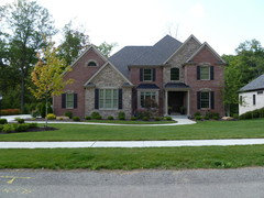
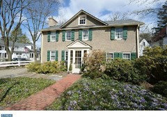
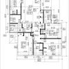
Opinion on 2 Elevations
pittkol
11 years ago

Featured Answer
Comments (21)

dekeoboe
11 years agochispa
11 years agoRelated Professionals
Riverside Architects & Building Designers · Winchester Architects & Building Designers · Castaic Design-Build Firms · Oak Grove Design-Build Firms · Rantoul Home Builders · Newark Home Builders · Warrensville Heights Home Builders · Florham Park General Contractors · Jackson General Contractors · Mount Prospect General Contractors · Oneida General Contractors · Panama City General Contractors · Syosset General Contractors · Vermillion General Contractors · Waipahu General Contractorslittlebug5
11 years ago
Annie Deighnaugh
11 years agopalimpsest
11 years agoLuAnn_in_PA
11 years ago
live_wire_oak
11 years agopittkol
11 years agopittkol
11 years agoredcurls
11 years ago
Naf_Naf
11 years agolyfia
11 years agopalimpsest
11 years agogalore2112
11 years agozone4newby
11 years agoUser
11 years agopalimpsest
11 years agoAnnie Deighnaugh
11 years agopittkol
10 years agopalimpsest
10 years ago


Related Stories

DECORATING GUIDESNo Neutral Ground? Why the Color Camps Are So Opinionated
Can't we all just get along when it comes to color versus neutrals?
Full Story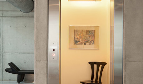
REMODELING GUIDESHome Elevators: A Rising Trend
The increasing popularity of aging in place and universal design are giving home elevators a boost, spurring innovation and lower cost
Full Story
GARDENING AND LANDSCAPINGBuild a Raised Bed to Elevate Your Garden
A bounty of homegrown vegetables is easier than you think with a DIY raised garden bed to house just the right mix of soils
Full Story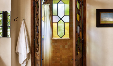
WINDOWSThe Art of the Window: 10 Ways to Elevate Your Bathroom
These window styles and treatments bring in natural light while creating a restful and rejuvenating ambience
Full Story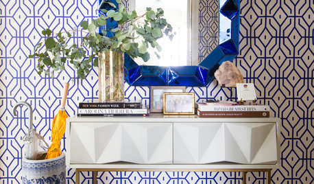
WALL TREATMENTSNew This Week: 3 Wall Treatments to Elevate Your Entryway
Use graphic pattern to raise your spirits every time you come home — no matter what your style
Full Story
DECORATING GUIDESDecorating With Antiques: Tables to Elevate the Everyday
They may have common uses, but antique tables bring a most uncommon beauty to dining, game playing and more
Full Story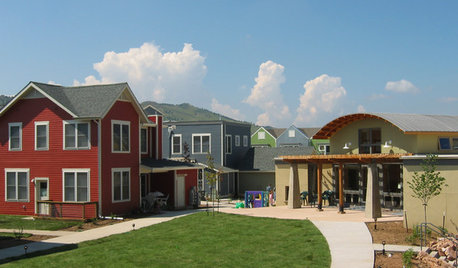
COMMUNITYTogetherness Take 2: Is a Cohousing Community for You?
Missing that sense of connection? Consider the new breed of neighborhood with a communal bent
Full Story
KITCHEN DESIGNA Stylist’s Secrets for Giving Your Kitchen the Wow Factor
There’s more to getting a fabulous kitchen than designing and installing it. It's the little details that elevate its look
Full Story
FURNITUREIconic Designs: 10 Modern Dining Chairs to Know
Elevate your dining space with classic chairs by some of the 20th century’s revered designers
Full Story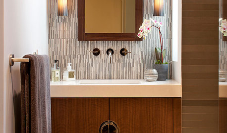
BATHROOM DESIGN8 Vanity Flair Fashions for a Chic Bathroom
Accessorize your bathroom or powder room with a vanity that elevates function to the realm of fashion
Full StorySponsored
Custom Craftsmanship & Construction Solutions in Franklin County
More Discussions


zone4newby