


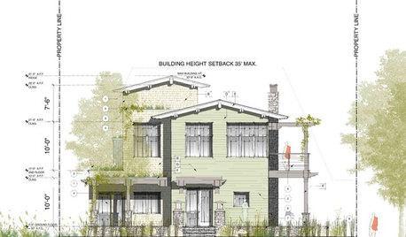
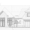
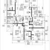
Plan and elevation for review!
User
10 years ago

Sort by:Oldest
Comments (44)
Related Stories
ARCHITECTUREThink Like an Architect: How to Pass a Design Review
Up the chances a review board will approve your design with these time-tested strategies from an architect
Full Story
DESIGN PRACTICEDesign Practice: The Year in Review
Look back, then look ahead to make sure you’re keeping your business on track
Full Story
MOST POPULARHow to Refine Your Renovation Vision to Fit Your Budget
From dream to done: When planning a remodel that you can afford, expect to review, revise and repeat
Full Story
GARDENING GUIDESGet a Head Start on Planning Your Garden Even if It’s Snowing
Reviewing what you grew last year now will pay off when it’s time to head outside
Full Story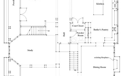
REMODELING GUIDESHow to Read a Floor Plan
If a floor plan's myriad lines and arcs have you seeing spots, this easy-to-understand guide is right up your alley
Full Story
LAUNDRY ROOMS7-Day Plan: Get a Spotless, Beautifully Organized Laundry Room
Get your laundry area in shape to make washday more pleasant and convenient
Full Story
REMODELING GUIDES10 Features That May Be Missing From Your Plan
Pay attention to the details on these items to get exactly what you want while staying within budget
Full Story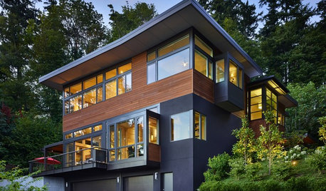
REMODELING GUIDES6 Steps to Planning a Successful Building Project
Put in time on the front end to ensure that your home will match your vision in the end
Full Story
ARCHITECTUREOpen Plan Not Your Thing? Try ‘Broken Plan’
This modern spin on open-plan living offers greater privacy while retaining a sense of flow
Full Story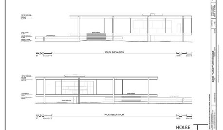
DESIGN DICTIONARYElevation
Capturing a 3-D structure in two dimensions, an elevation is an architectural drawing that puts the line of sight on a vertical plane
Full Story0
UserOriginal Author
UserOriginal Author
Related Professionals
Arlington Home Builders · Dardenne Prairie Home Builders · Fredericksburg Home Builders · Lansing Home Builders · Waimalu Home Builders · Westmont Home Builders · Boardman General Contractors · Clive General Contractors · Fort Salonga General Contractors · Gainesville General Contractors · Longview General Contractors · Mankato General Contractors · New Bern General Contractors · Valley Stream General Contractors · Austintown General ContractorsUserOriginal Author
bpath
User
Naf_Naf
jdez
Naf_Naf
bpath
UserOriginal Author
bpath
Naf_Naf
bpath
deegw
Naf_Naf
UserOriginal Author
UserOriginal Author
UserOriginal Author
bpath
Naf_Naf
chicagoans
deegw
bpath
DreamingoftheUP
frozenelves
stblgt
sombreuil_mongrel
mrspete
UserOriginal Author
UserOriginal Author
UserOriginal Author
bpath
ineffablespace
DreamingoftheUP
ineffablespace
lyfia
nightowlrn
UserOriginal Author
UserOriginal Author
UserOriginal Author
annkh_nd
palimpsest
User
User