


Elevation Updates - Hollyspring
dutty
12 years ago


Sort by:Oldest
Comments (4)
Related Stories

SHOP HOUZZShop Houzz: Easy Entryway Updates
Statement-making entryway furniture and decor to elevate your space
Full Story0
REMODELING GUIDESStyle Update: Tile Gets in Line
Install Your Tile in a 'Stacked Bond' Grid for an Clean, Modern Look
Full Story
RANCH HOMESHouzz Tour: Respectful Updates for a Midcentury Atlanta Ranch
An expansion and renovation give a Georgia home a bright new look while honoring the original profile
Full Story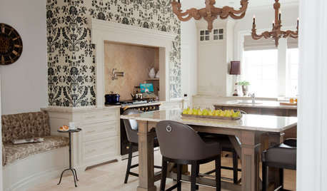
KITCHEN DESIGNKitchen of the Week: Updated French Country Style Centered on a Stove
What to do when you've got a beautiful Lacanche range? Make it the star of your kitchen renovation, for starters
Full Story
GREAT HOME PROJECTSUpdate Your Windows for Good Looks, Efficiency and a Better View
Great home project: Replace your windows for enhanced style and function. Learn the types, materials and relative costs here
Full Story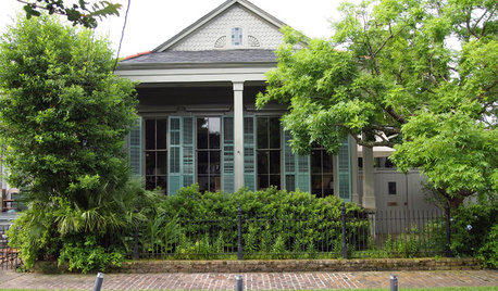
HOUZZ TOURSMy Houzz: Peek Inside an Artist’s Updated Shotgun Home and Studio
Gorgeous art and elegant style befit this New Orleans live-work property
Full Story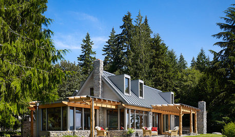
REMODELING GUIDESCurb Appeal: 10 Updated Architectural Styles
See how designers have customized classic home designs
Full Story
HOUZZ TOURSMy Houzz: Thoughtful Updates to an Outdated 1900s Home
Handmade art and DIY touches bring a modern touch to a classic Boston-area home
Full Story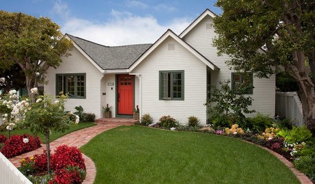
HOUZZ TOURSHouzz Tour: Updates Honor a 1930s Cottage's History
The facade stays true to the original, but inside lie a newly opened layout, higher ceilings and 600 more square feet of space
Full Story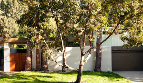
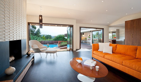
HOUZZ TOURSHouzz Tour: Modern Updates for a Midcentury Home in Los Angeles
Additions include a family room and a second-story master suite, but many other spots got some redesign love too
Full StoryMore Discussions


peytonroad
duttyOriginal Author
Related Professionals
Frisco Architects & Building Designers · Johnson City Architects & Building Designers · Makakilo City Architects & Building Designers · Oakley Architects & Building Designers · Winchester Architects & Building Designers · Ellicott City Home Builders · North Ridgeville Home Builders · Orange City Home Builders · Seguin Home Builders · Lomita Home Builders · Auburn General Contractors · Decatur General Contractors · Rolla General Contractors · Rosemead General Contractors · Spanaway General ContractorsGreenDesigns
duttyOriginal Author