


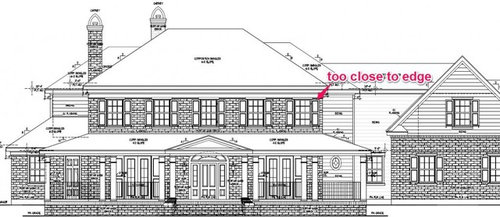
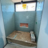
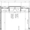
Window placement is making me crazy!
carsonheim
10 years ago

Sort by:Oldest
Comments (7)
Related Stories
COLORCrazy for Color? Your Kitchen Cabinets Want In
Make over your kitchen in spectacular fashion with just colorful cabinet paint? Now there's a bright idea
Full Story
THE ART OF ARCHITECTUREHow to Make Your House Feel at Home Where It Is
Take cues from nature for placement, materials, shapes and patterns, for a house that sits well in its surroundings
Full Story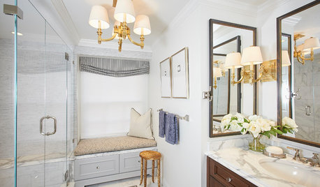
ROOM OF THE DAYRoom of the Day: Small Master Bath Makes an Elegant First Impression
Marble surfaces, a chandelier and a window seat give the conspicuous spot the air of a dressing room
Full Story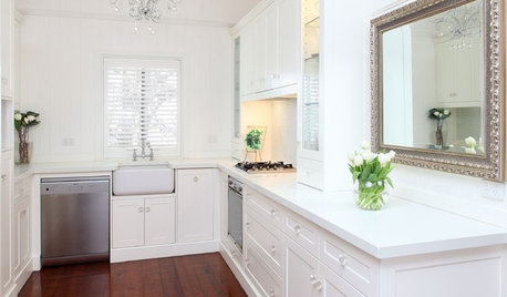
Mirrors Make an Unexpected Appearance in the Kitchen
A reflective surface can lighten up and open up your cooking and dining area
Full Story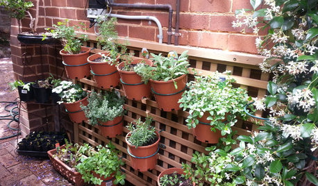
FARM YOUR YARD14 Crazy Places to Grow Edibles
Some Houzzers may lack ground for gardening, but they’re never short on imagination
Full Story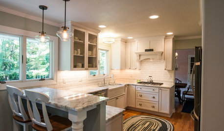
KITCHEN OF THE WEEKKitchen of the Week: 27 Years in the Making for New Everything
A smarter floor plan and updated finishes help create an efficient and stylish kitchen for a couple with grown children
Full Story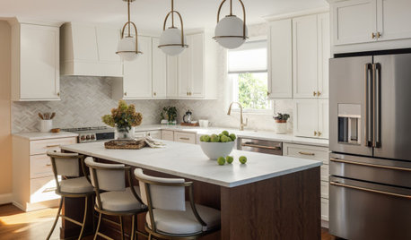
MOST POPULAR5 Remodels That Make Good Resale Value Sense — and 5 That Don’t
Find out which projects offer the best return on your investment dollars
Full Story
MOST POPULAR8 Little Remodeling Touches That Make a Big Difference
Make your life easier while making your home nicer, with these design details you'll really appreciate
Full Story
MOST POPULARSo You Say: 30 Design Mistakes You Should Never Make
Drop the paint can, step away from the brick and read this remodeling advice from people who’ve been there
Full Story
MOVINGMaking a Home Away From Home
Feeling like a stranger in a strange land? These tips can help ease the transition after a big move
Full Story

mushcreek
carsonheimOriginal Author
Related Professionals
Fayetteville Architects & Building Designers · Providence Architects & Building Designers · Oak Grove Design-Build Firms · California Home Builders · Miami Home Builders · Monticello Home Builders · Sun Valley Home Builders · Troutdale Home Builders · Wyckoff Home Builders · Bay Shore General Contractors · Dunkirk General Contractors · Martinsville General Contractors · Signal Hill General Contractors · Tamarac General Contractors · Troutdale General Contractorslavender_lass
ineffablespace
renovator8
carsonheimOriginal Author
carsonheimOriginal Author