


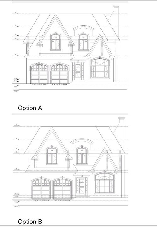
Please help me choose an elevation design
floppyfish
10 years ago
Sort by:Oldest
Comments (14)
Related Stories


GARDENING GUIDESGreat Design Plant: Snowberry Pleases Year-Round
Bright spring foliage, pretty summer flowers, white berries in winter ... Symphoricarpos albus is a sight to behold in every season
Full Story
UNIVERSAL DESIGNMy Houzz: Universal Design Helps an 8-Year-Old Feel at Home
An innovative sensory room, wide doors and hallways, and other thoughtful design moves make this Canadian home work for the whole family
Full Story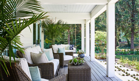
STANDARD MEASUREMENTSThe Right Dimensions for Your Porch
Depth, width, proportion and detailing all contribute to the comfort and functionality of this transitional space
Full Story
GARDENING GUIDESGreat Design Plant: Silphium Perfoliatum Pleases Wildlife
Cup plant provides structure, cover, food and water to help attract and sustain wildlife in the eastern North American garden
Full Story
GARDENING GUIDESGreat Design Plant: Ceanothus Pleases With Nectar and Fragrant Blooms
West Coast natives: The blue flowers of drought-tolerant ceanothus draw the eye and help support local wildlife too
Full Story

HOME OFFICESQuiet, Please! How to Cut Noise Pollution at Home
Leaf blowers, trucks or noisy neighbors driving you berserk? These sound-reduction strategies can help you hush things up
Full Story
DECORATING GUIDESPlease Touch: Texture Makes Rooms Spring to Life
Great design stimulates all the senses, including touch. Check out these great uses of texture, then let your fingers do the walking
Full Story
DECORATING GUIDES10 Bedroom Design Ideas to Please Him and Her
Blend colors and styles to create a harmonious sanctuary for two, using these examples and tips
Full Story


Chadoe3
maggiepie11
Related Professionals
Lafayette Architects & Building Designers · Four Corners General Contractors · Athens General Contractors · Aurora General Contractors · Buena Park General Contractors · Everett General Contractors · Geneva General Contractors · Greenville General Contractors · Hamilton Square General Contractors · Kilgore General Contractors · Livermore General Contractors · Mentor General Contractors · North New Hyde Park General Contractors · Statesboro General Contractors · Villa Park General ContractorsfloppyfishOriginal Author
floppyfishOriginal Author
Naf_Naf
floppyfishOriginal Author
Naf_Naf
bpath
floppyfishOriginal Author
floppyfishOriginal Author
Naf_Naf
Awnmyown
housebuilder14
lyfia