


Feedback on front elevation
shiltsy
9 years ago

Related Stories
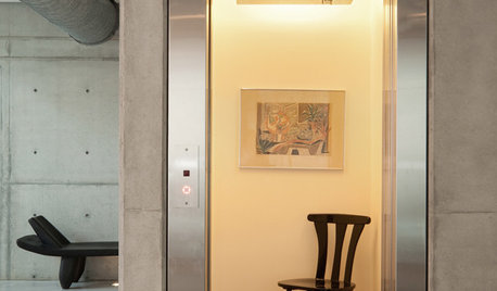
REMODELING GUIDESHome Elevators: A Rising Trend
The increasing popularity of aging in place and universal design are giving home elevators a boost, spurring innovation and lower cost
Full Story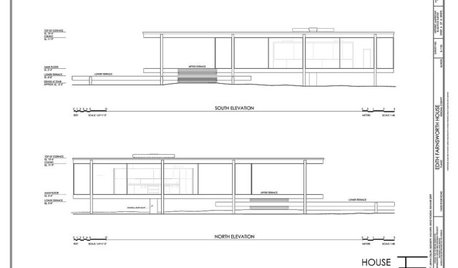
DESIGN DICTIONARYElevation
Capturing a 3-D structure in two dimensions, an elevation is an architectural drawing that puts the line of sight on a vertical plane
Full Story0
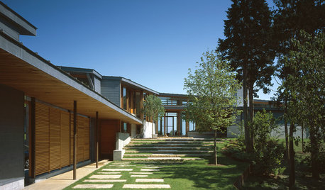
ENTRYWAYSSteps and Stairs Elevate Modern Exterior Entryways
Gently sloped or at a sharper angle, modern ascents on a home's entrance serve both architectural and aesthetic purposes
Full Story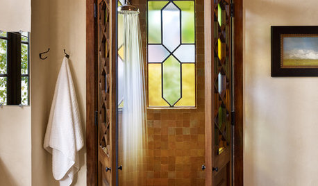
WINDOWSThe Art of the Window: 10 Ways to Elevate Your Bathroom
These window styles and treatments bring in natural light while creating a restful and rejuvenating ambience
Full Story
DECORATING GUIDESDecorating With Antiques: Tables to Elevate the Everyday
They may have common uses, but antique tables bring a most uncommon beauty to dining, game playing and more
Full Story
GARDENING AND LANDSCAPINGBuild a Raised Bed to Elevate Your Garden
A bounty of homegrown vegetables is easier than you think with a DIY raised garden bed to house just the right mix of soils
Full Story
WALL TREATMENTSNew This Week: 3 Wall Treatments to Elevate Your Entryway
Use graphic pattern to raise your spirits every time you come home — no matter what your style
Full Story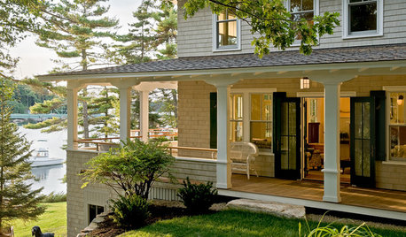
GARDENING AND LANDSCAPING7 Ideas to Get You Back on the Front Porch
Remember the good old days, when porches offered front-row seats to street scenes? They can be even better today
Full Story
DECORATING GUIDESSmart Solutions for Nonexistent Entryways
Barely enough space to hang your hat? Front door swings past your living room couch? These remedies are for you
Full Story
SELLING YOUR HOUSE7 Must-Dos on the Day You Show Your House
Don’t risk losing buyers because of little things you overlook. Check these off your list before you open the front door
Full Story


lyfia
lookintomyeyes83
Related Professionals
Baton Rouge Architects & Building Designers · Clayton Architects & Building Designers · Keansburg Architects & Building Designers · Morganton Architects & Building Designers · White Oak Architects & Building Designers · Miami Home Builders · Hillsdale Home Builders · Chicago Ridge General Contractors · Franklin General Contractors · Kentwood General Contractors · Leon Valley General Contractors · Monroe General Contractors · Norristown General Contractors · Tyler General Contractors · West Melbourne General Contractorslookintomyeyes83
shiltsyOriginal Author
live_wire_oak
sombreuil_mongrel
littlebug5
shiltsyOriginal Author
shiltsyOriginal Author
palimpsest
palimpsest
palimpsest
Nick
lmccarly
Annie Deighnaugh
GreenDesigns
mtnrdredux_gw
Naf_Naf
snookers1999
Perseco2012
shiltsyOriginal Author
Naf_Naf
shiltsyOriginal Author
shiltsyOriginal Author
lyfia
sombreuil_mongrel
shiltsyOriginal Author
lyfia
snookers1999