


Vanity Stain - Help me choose!
blackchamois
11 years ago

Related Stories


LIFEDecluttering — How to Get the Help You Need
Don't worry if you can't shed stuff and organize alone; help is at your disposal
Full Story
REMODELING GUIDESWisdom to Help Your Relationship Survive a Remodel
Spend less time patching up partnerships and more time spackling and sanding with this insight from a Houzz remodeling survey
Full Story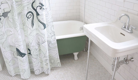
BATHROOM MAKEOVERSRoom of the Day: See the Bathroom That Helped a House Sell in a Day
Sophisticated but sensitive bathroom upgrades help a century-old house move fast on the market
Full Story
SELLING YOUR HOUSE10 Tricks to Help Your Bathroom Sell Your House
As with the kitchen, the bathroom is always a high priority for home buyers. Here’s how to showcase your bathroom so it looks its best
Full Story
COLORPaint-Picking Help and Secrets From a Color Expert
Advice for wall and trim colors, what to always do before committing and the one paint feature you should completely ignore
Full Story
LANDSCAPE DESIGNHow to Help Your Home Fit Into the Landscape
Use color, texture and shape to create a smooth transition from home to garden
Full Story

BATHROOM WORKBOOKStandard Fixture Dimensions and Measurements for a Primary Bath
Create a luxe bathroom that functions well with these key measurements and layout tips
Full Story
EXTERIORSHelp! What Color Should I Paint My House Exterior?
Real homeowners get real help in choosing paint palettes. Bonus: 3 tips for everyone on picking exterior colors
Full StoryMore Discussions


blackchamoisOriginal Author
treasuretheday
Related Professionals
Brownsville Kitchen & Bathroom Designers · Highland Park Kitchen & Bathroom Designers · Ocala Kitchen & Bathroom Designers · Vineyard Kitchen & Bathroom Designers · Fremont Kitchen & Bathroom Remodelers · Hanover Township Kitchen & Bathroom Remodelers · Manassas Kitchen & Bathroom Remodelers · Saint Helens Kitchen & Bathroom Remodelers · York Kitchen & Bathroom Remodelers · Cornelius Glass & Shower Door Dealers · Emeryville Glass & Shower Door Dealers · McDonough Glass & Shower Door Dealers · Napa Glass & Shower Door Dealers · Cleveland Window Treatments · Clinton Window Treatmentsenduring
cat_mom
kmcg
phiwwy
blackchamoisOriginal Author
Gracie
blackchamoisOriginal Author
kirkhall
leenamark