


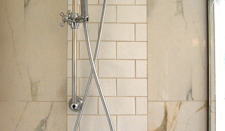
How to Choose Grout OR, Kill Me Now!
Twinkle837
9 years ago
Featured Answer
Comments (12)

romy718
9 years agolast modified: 9 years ago
jlc712
9 years agolast modified: 9 years agoRelated Professionals
Brownsville Kitchen & Bathroom Designers · Henderson Kitchen & Bathroom Designers · Salmon Creek Kitchen & Bathroom Designers · Saratoga Springs Kitchen & Bathroom Designers · Bensenville Kitchen & Bathroom Designers · Wood River Kitchen & Bathroom Remodelers · Hoffman Estates Kitchen & Bathroom Remodelers · Payson Kitchen & Bathroom Remodelers · South Park Township Kitchen & Bathroom Remodelers · Fort Myers Glass & Shower Door Dealers · Fort Worth Glass & Shower Door Dealers · Saugus Cabinets & Cabinetry · Whitehall Cabinets & Cabinetry · Kent Window Treatments · Westfield Window Treatmentsjterrilynn
9 years agolast modified: 9 years agoazmom
9 years agolast modified: 9 years agocatbuilder
9 years agolast modified: 9 years agoTwinkle837
9 years agolast modified: 9 years agojerzeegirl
9 years agolast modified: 9 years agomelle_sacto is hot and dry in CA Zone 9/
9 years agolast modified: 9 years ago
enduring
9 years agolast modified: 9 years agoTwinkle837
9 years agolast modified: 9 years agoenduring
9 years agolast modified: 9 years ago

Related Stories
REMODELING GUIDES9 Ways Grout–Yes, Grout–Can Add to Your Design
Choose From a Palette of Grout Colors for a Warm, Unified Look
Full Story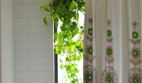
MOST POPULARThe Perfect Houseplant for People Who Kill Houseplants
If you can fill a jar with water, you can keep golden pothos vine happy — and it will pay you back with cleaner air and a greener home
Full Story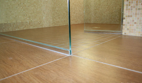
TILEEpoxy vs. Cement Grout — What's the Difference?
Grout is grout, right? Nope. Cement and epoxy versions have different appearances, durability and rules of installation
Full Story
HOUSEPLANTS8 Houseplants You Can't Kill
They're forgiving and let you forget. Houseplants don't get any easier than this
Full Story
COLORWhen Color Could Kill: Stories From the History of Paint
Delve into paint's storied past — what you learn about its history and modern incarnations may surprise you
Full Story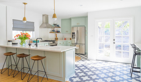
KITCHEN DESIGNTrending Now: 25 Kitchen Photos Houzzers Can’t Get Enough Of
Use the kitchens that have been added to the most ideabooks in the last few months to inspire your dream project
Full Story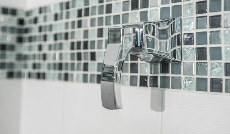
TILE3 Key Steps for Grouting That Looks Its Best
Get your grout right to keep your tile beautiful and for an installation that will last
Full Story
HOUSEKEEPINGHow to Clean Grout — Stains and All
If your grout is grossing you out, this deep-cleaning method will help it look new again
Full Story
BATHROOM DESIGNConvert Your Tub Space Into a Shower — the Tiling and Grouting Phase
Step 3 in swapping your tub for a sleek new shower: Pick the right tile and test it out, then choose your grout color and type
Full Story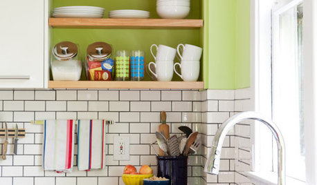
KITCHEN DESIGNSubway Tile Picks Up Gray Grout
Heading into darker territory, subway tile offers a graphic new look for kitchens, bathrooms and more
Full StoryMore Discussions


Nancy in Mich